Their Winnipeg: Pages from a Magazine’s History. Part, the Second. by Meeka Walsh
I eased into the life of art magazine publishing and it into mine in the most natural way possible, my engagement an extension of the way I’d always lived. It was 1977. Talk in the community—and here I assumed the entire community—was at a high pitch of excitement. A magazine about art in Manitoba was about to begin publication. It would, in a sort of way, be my life manifest in print. I’d always known artists, always had art and art objects around me. My mother and grandmother had opened a very small antiques shop together, when I was a baby, assembled at the outset from their own shelves of fine things too good to pass up. Aesthetic attention to the surrounds was as much a part of dailiness as choosing between peanut butter or cheese on bread at breakfast.
Openings at the Winnipeg Art Gallery, at the private galleries in the city, among which my mother’s now expanded antiques shop was numbered; new plays at the Manitoba Theatre Centre, in the early days under the direction of John Hirsch; performances of the Royal Winnipeg Ballet; symphony concerts; contemporary dance and experimental theatre in church basements, empty warehouses, social hall stages; street performances, readings, lectures. All of it was here and had always been, as I understood it, and a magazine that commented on the full range was such an obvious component, the only question to ask was why wouldn’t it have been there all along? So, Arts Manitoba it was—three splendid, ambitious, smart and comprehensive issues conceived, edited and produced by the omnivorous sky gazer Robert Enright. I subscribed—I thought everyone did. I read the magazines, applauded; many did too, but that apparently wasn’t sufficient. One year, three good issues, and then no more. Four years passed. A small group assembled, and we agreed that Arts Manitoba should begin again, this time with some structures beyond the ambition and will of an editor acting largely alone.
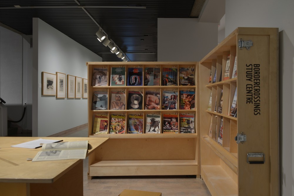
Border Crossings Study Center at the Mendel Art Gallery, January – March 2015. Saskatoon, Saskatchewan.
We would have a Board of Directors, would apply for federal and provincial funding, would hire someone to staff an office, handle subscriptions, maybe sell advertising, and we’d rent a space from which to conduct all this orderly business. The struggle was epic, the will tougher. We would publish an arts magazine with a regional focus set against our own broader backgrounds and interests, would do it quarterly, and it would flourish. A year passed; it was the end of 1983 and four issues had been published. I was one Board member among eight. Meetings revealed that publishing a quarterly magazine required more attention to operations than was being applied. Debt loomed; we floundered, many fled, but a stubborn core of us remained, supporting the Editor. We divided up the tasks, and I found myself a de facto Managing Editor responsible for everything but the content. I slid sideways, or maybe up, becoming Chair of the Board while continuing as volunteer Managing Editor. Like a cultural Goldilocks, I tried all the position titles on for size while functioning as Managing Editor, adding assistant Editor to my list of titles, having now left behind the position of Board Chair. In a small office—two full-time people—one remarkable woman, Debbie Russell, who was responsible for daily accounts, subscription records and all matters clerical, and me, along with Robert Enright who was working full-time at CBC and doing his editing at night—it was inevitable by proximity, necessity and affinity that I would increasingly be involved in determining and shaping editorial content. In the spring of 1993 the position the board identified as the perfect fit—chair, porridge bowl and all—was Editor, and so I remain.
I referred to the magazine in its earliest years as Arts Manitoba. That geographic designation was changed as quickly as we recognized that boundaries and borders existed only to be crossed, pushed, traversed and manipulated. For us, for me particularly, borders and outside edges provided the necessary vantage and surest lookout point. Sixteen years into my role as Editor I’d say—on that point I haven’t budged.
Typically, magazine editorials provide a brief introduction to, or summary of, the contents that follow. In Border Crossings, the editorials called “Bordernotes,” when they addressed the issue’s contents, did so in the context of a broader topic, focusing on cultural policies or on issues relevant to culture at large. A year or so into my editorial tenure “Bordernotes” became brief essays—meditations or reflections sometimes paralleling the subjects being addressed on the pages that followed but more often topics corresponding to books I was reading, to a subject that was a stone in my shoe, to topics of worry or celebration. Happily these pieces have found some readers. As the noted American painter Robert Motherwell had said about communicating, in an interview with Border Crossings in 1989, “What could really be more interesting, or in the end more ecstatic, than those rare moments when you see another person look at something you’ve made and realize that they got it exactly, that your heart jumped to their heart, with nothing in between?” I concluded my first “Bordernotes” with that quote and hold to it still. In fact it has served as something of a guide in my shaping the magazine—the drive to communicate, a determination to be inclusive and broad in content choices, and most particularly in the kind of writing that fills the pages. Always, I hoped the writing would be clear, accessible and available to anyone who was interested. The seriousness of the commentary, thoroughness of the research and evenness or fairness in the approach were the understood and necessary underpinnings. And Motherwell’s idea of “nothing in between” was exactly right. I value highly the opinions and writing of good critics; I read them with greedy eyes. There’s never too much. I also want to hear about art, learn about it, at its source. I trust the unmediated views of the artist. I want it coming straight from them, hence the fondness for, and regular appearance of, artists’ interviews. More later.
Preparing this essay prompted the return to my first “Bordernotes” that I’d titled “Silences.” Like a parent smiling with some benevolence on the deeds of her progeny, I look back with a bit of satisfaction on this debut editorial. Not because the writing was so accomplished—it was fine—but because from then until now I’ve stayed the course. From nascent hectoring up to the present, my suspicion, impatience, dislike and mistrust of politics and bureaucratically driven decisions, especially as they apply to that unruly subject “art,” has held fast. As least once a year I address the topic anew (alas there’s always cause), not to count the anti-bureaucratic asides that rise consistently in the body of my other essays. It’s not that awareness of, and deep gratitude for, public support aren’t constant companions. It would have been and would continue to be impossible to have published Border Crossings without the support of federal and provincial publishing programs. In Canada it’s the only way culture can exist. More generously, it reflects our shared sense as Canadians of the essential place art holds. It’s just that a necessary tension must exist in order that the art produced in these supported and scrutinized systems be independent in content and manufacture, and hold excellence as the ultimate goal.
In proposing the Border Crossings Study Centre, the project’s curator Cliff Eyland made reference to an early prototype for a public reading room conceived and drafted by Russian artist Aleksandr Rodchenko. Designed for the Exposition Internationale des Arts Décoratifs et Industriels Modernes in Paris in 1925, the Workers’ Club existed as a prototype only. Other more recent iterations were included in the proposal, among them reading rooms by Joseph Kosuth, Bruce Barber and the Martha Rosler Library. In Canada, I was pleased to find in my research materials at Border Crossings’s office that the idea had been engaged and implemented by Montreal artist Angela Grauerholz in her work Reading Room for the Working Artist, where she designed and had built reading/working tables and chairs based on Rodchenko’s first model, accompanied by other components in what she describes as an “environment of contemplation.”
Another contemporary conception of a reading room was the hybrid form designed by artist and cultural activist Dmitry Vilensky in 2007, which has parallels both to the Border Crossings Study Centre and to Border Crossings’ editorial direction or program. Vilensky called his project an Activist Club, and his interest resided in what he identified in a conversation with Lolita Jablonskiene, Chief Curator at Vilnius’s National Gallery of Art, in Printed Project, Issue 10, as the “actualization of the concept of the worker’s club, how it could be fitted into the space of a contemporary institution with all its limitations.” In a particularly intense market-driven period where the notion of the capitalization of art has long been assumed, his interest is in an alternative to the institutional space where art may be seen as only an afternoon’s entertainment. Vilensky’s Activist Club and Rodchenko’s Workers’ Club, which served as its initial model, are conceived as social centres, recasting the functional, active role of museums. Vilensky says, “The discussions about the future of social centres can be connected with the concept of the worker’s club developed in the Soviet Union because they share an approach to the value of art and the people that participate in its production.”
Assembling the 111 issues (to date) of Border Crossings and locating them in a compact and portable library reading room is an extension of the magazine’s mandate and intention. Border Crossings has always held art making to be a primary, significant value in contemporary society. Its producers and audiences are citizens of a culture we build and sustain together. Borders and edges are the locations for art. It’s a productive tension, a timpanic tautness that hold the centre and the edges at a necessary distance, a distance that allows space for creation and examination. Hence the persistent wariness that appears with regularity on our editorial pages in relation to bureaucratic hegemony.
In the conversation with Dmitry Vilensky, Lolita Jablonskiene comments that Rodchenko’s project had been designed in such a way that the concept would be universal, could be exported and readily implemented anywhere, and she asked Vilensky how, in his Activist Club he finds a balance between the didactic or educational and participatory elements. The participatory element is essential in his project’s design was his response, and he pointed out that the notion of universality is not the imposition of a single, overriding perspective. He said, “True universality is built upon singular, local and differentiated experiences exactly as Marx noted [in The Communist Manifesto]. From the numerous national and local literature there arises a world literature.”
The particularity of the local set against the broad concept of the international has been Border Crossings’s plan dating from the first issue published in fall, 1985, when the magazine assumed its current name. As a focused program, the local, national and international would find themselves sharing space between our covers. Borders were geographic, political, social and permeable. The best from here, which we resolutely identified as the centre, mixed with the best across the country and as far as we could reach, would hold up just fine. Not only hold up but flourish once seen in that broader context. By stealth and intent Border Crossings would do what it could to make the local international. Reports would indicate the plan has met with some considerable success.
With the art maker we value the audience, too, seeing reading as an active role, always seeking receivers, subscribing to Barthes’s notion of the reader as a necessary player in the act of art making, essential in art’s extension and varying, provisional completion. And this audience could be anywhere. Magazines are ready travellers, slip easily across borders at the bottom of a suitcase, rolled in a pocket, up a sleeve, posted in an envelope, sitting ready on library shelves all over the world.
As for the local/international mix, here’s a small selection of cover text from the earliest issues to the present: Jim Dine, Wanda Koop, Larry Glawson, Dubravka Ugresic, Garry Geddes, Nan Goldin; Suzy Lake, Yoko Ono, Patrick Friesen, Orlando; Robert Frank, Guy Maddin, Ken Lum, Claudia Cuesta, Anne Michaels, Angela Grauerholz, Jackie O; June Leaf, Marcel Dzama, Eric Fischl, Pierre Bonnard, Leon Rooke, PK Page, Janice Kulyk Keefer; David McMillan, Duane Michals, Helmut Newton, George Steeves, Brenda Pelkey; William Wegman, Carol Wainio, Richard Avedon, David Garneau, John Hejduk, Simon Hughes, Jake Kosciuk, Paul P; Julian Schnabel, Gina Rorai, Cliff Eyland, Monica Tapp, Eliza Griffiths, Karel Funk; AA Bronson, Nancy Spero, Roger Lemoyne, Caroline Dukes; David Altmejd, Dana Schutz, Jeff Ladouceur, Benny Nemerofsky Ramsay, Carlos and Jason Sanchez, Winnipeg’s 26, Erica Eyres, Karen Azoulay, Shawna McLeod, Melanie Rocan; Ann Hamilton, Aganetha Dyck, Andrzej Pluta, Edith Dekynt, William Eakin, Robert Kroetsch; Wim Delvoye, Guy Maddin, Erwin Redl, Steven Shearer, Art Green, Neil Farber, Lee Henderson; The Winnipeg Alphabestiary, Walton Ford, Fastwürms, Carrie Walker. And that’s just a random some.
Early on we published thematic issues, most often one each year. As Editor I came to recognize this was a publishing format that corresponded to my sense of the magazine’s being an exhibition space, a place audiences could enter. Reading would be an occasion to move around a topic in a multi-dimensional manner, like being in a gallery, a theatre, a social space. Here one topic would be engaged by a number of artists, writers, critics. Points of view would be multiple, cohering around a subject which, while focused, would shift or expand and be altered, amended and augmented by these various perspectives. With these issues, as closely as I plan, I’m always surprised when each is done. It’s as though the assembly were organic, taking on a life and entering the culture as its own entity however familiar I am with every component of each issue in bringing it to print. Readers comment on Border Crossings’s ability to surprise and be current and even in some instances anticipatory.
Some of the thematic topics are broad and returned to often, like Painting and Photography. Landscape is another the magazine has looked at more than once, and as motile as is the subject, so it can be apprehended anew each time. We published an issue called “The Rebirth of Venice: Remaking a City of Art” in 1995, then in 2001 when Winnipeg’s Plug In ICA mounted the exhibition representing Canada in the Canadian Pavilion, winning the only gold medal ever taken home by Canada, Border Crossings was there again, hosting, celebrating and launching a big issue titled “Canadians in Venice” with Janet Cardiff and George Bures Miller on our cover, confident in advance that they would be the winners. The Body in art and therefore in society has been a topic addressed thematically more than once. An abiding subject, it will appear again. The magazine has looked at First Nations Art and Culture, Abstraction, Work, War, Drawing, we called an issue Young, we’ve looked at Animals, something called Strange Beauty, at Machines, Art and Technology, Words & Pictures and at that city of myth and legend—Winnipeg.
The magazine has always published interviews, more under my tenure since, as I wrote earlier in this piece, it’s a form I favour for the magazine. These aren’t conversations that would be found in lifestyle or celebrity magazines. Entrapment and exposées aren’t the magazine’s style. It has been the case that artists, comfortable with us, acquainted with other interviews we’ve published and therefore confident about the seriousness of the magazine, become engaged in the important social act that intelligent conversation is and have found themselves more than candid in their responses. If we feel their candour has extended beyond what they would actually be comfortable seeing in print, it’s not included on the page. Betrayal and sensational revelations would be anathema to the regard we have for artists and art making. Each time Robert and I are invited into an artist’s studio, which is indeed a personal and unguarded space, we acknowledge the privilege it is. Every conversation has been revelatory. Art is alchemist’s work.
If we’ve published two interviews in every issue, we’ve now amassed 222 conversations with artists. I’d wager it’s more and those are just the ones that find their way into print. Many others are conducted as research. And research is the operative word. This is first person, primary material, carefully prepared for and then edited many times over before being published, and all are accompanied by a contextualizing introduction when the interviews are published. These are artists responding thoughtfully, attentively, to the subject of contemporary art making.
I’ve always figured that an interview conducted by Canadians, and therefore from a Canadian perspective, is a Canadian piece whether the subject is Swiss-born photographer Robert Frank or Iranian filmmaker Shirin Neshat. I’d say that that ineffable Canadian quality would be in evidence. And these interviews are different. Artists at a high point of making work or exhibiting, often feeling they’ve been questioned by curators, critics, themselves, an audience to the point where they felt they had nothing more to add, found themselves nonetheless pleased after an interview with us that something new, a new observation or response, a deeper inquiry into their motivation or impetus, had been gently drawn from them in the course of the conversation, and it was new again. By artists, critics, gallerists, audiences, researchers, scholars, these interviews are considered among the best. This accounts for the regularity with which they are quoted at length in artist’s monographs, referred to in critical pieces, selected by international galleries for reprint and are used in their entirety—introductions included—as catalogue texts in Canada, the United States and Europe.
While increasingly over the years the magazine’s focus is visual art, it is language that is its essential quality. Images aside and the prevalent, i.e., visual, way in which it is received—I think of it, conceive it, as a reader’s magazine and, therefore, its primary means of communication is language. Here I am demanding. However weighty and significant an argument might be, if it isn’t carried by accessible language that at the very least informs and at its best delights, it isn’t functional. And while language is the carrier, the vehicle of transport, it should be more than that. Without being gratuitous, it should be self-referential. That is, it should indicate an awareness and use of its own history, full of resonances that key the readers to a familiarity with the best precedents. I like tropes; it’s a poorer life that isn’t augmented by the reassurance of metaphor, an indicator of memory, recent or historic. This is like this, recalls that, amplifies a perception, enriches an introduction to new sources that then are accretive and available to additional understanding. This, in part, is why I like artists writing about art in their own or parallel disciplines or venturing with more than just an opinion into an area outside their own. They understand the creative act and the courage necessary to engage in it, and they bring to the task the scrutiny and consciousness that they apply to their own work.
Here is a natural bridge to talking about the form of the review. I value it highly and give over to the review section called “Crossovers” at least 25 per cent of every issue. Crossovers offers a chance to travel, to cross the country, to pay attention to what’s happening wherever reviewers are. Most often the subject is visual art exhibitions, less often than I intend—books. Major exhibitions that tour and will have been seen by a broad audience make perfect sense. Alternately, reviews bring to an audience, who may themselves not have travelled, the experience of the event. When I talk to writers about the kind of reviews I want, I tell them that ideally the writing should be equivalent to the work written about. A sense of the event and its significance should be carried by the language. Otherwise, why publish it? If an exhibition is accompanied by a catalogue, that broadens its reach. If a major book is published with the exhibition I want to know—how is it? If the exhibition is the work of a promising young artist in an artist-run space or small commercial gallery where often there is no accompanying publication, this review may be the only record of the show ever having existed outside the artist’s own documentation.
The tone I want in the review is that of an interested advocate rather than a negative or mean-spirited critic. Making art in any discipline is an act of bravery and optimism in the sense that something is being made—even if the focus of the work is critical—rather than dismantled or destroyed. With some exceptions, there must be something constructive, instructive to say about the project being considered, even if it’s only to point out from a knowledgeable vantage where the work has gone off track, could be better, is less accomplished than previous work.
This is a magazine of record, once in print it’s there for all time—the stuff of sleepless nights. The writer of a review well written understands that focus, concision, context and description are required from the first word. Not to suggest that the review lacks personality or style. I tell new reviewers who inquire about house style—read back issues. Like the interviews published in Border Crossings, the reviews are picked up by galleries and included in artist’s bibliographies. They’re good, they’re full of information, are much anticipated, and coveted. If finances allowed, I could easily double the section in every issue.
Even considering my assertions that Border Crossings is a reader’s magazine, it is a material, visual entity. After 110 issues in an 8 1/2-by-11-inch format, saddle-stitched or later perfect bound, issue 111 is now 9 by 11 3/4 inches. Its appearance seems to exceed the measurement’s increase. No one could point a finger citing capriciousness; after more than 27 years a change seemed due. The new format, new typeface, new design are elegant iterations of the always strong content with the addition of a little luxe, calme et volupté.
Border Crossings is improbable. The glue that binds it is will and stubbornness and a total dedication to make it work, as it is, where it is, against all odds.