Intuitive Discipline
An Interview with Joanne Tod
We see an immaculate long hall in an institutional building. The floor is polished so highly it seems to be its own light source. The walls and ceiling are white. On the left is a bank of uniformly sized windows through which no view is given—a wall of windows, in effect. On the right, the wall is interrupted by one well-defined door frame. The angle of the view is such that the doorway offers no clues. On either side of it, mounted mid height, are two long shelves with coat hooks—all white. On one unit a row of white lab coats or robes hangs evenly. The length of the hall narrows perspectively and ends in a doorway which is almost the width of the hall. While that hallway leads to and from some place, no one is using it. It is so precise, airless and apparently uninflected by human presence that it appears never to have been traversed. This is a photograph of clinical stillness by Lynn Cohen, titled Untitled, 2010.
There is another immaculate long hallway in an institutional building and its floor too has been polished to reflective perfection. It could be the surface of a light-dappled pond at Monet’s beloved Giverny. The walls are white. On the left is a wall of floor-to-ceiling windows, the light making them appear more opaque than transparent. Solidly framed doorways are cut into the wall on the right and here too, the angle of our perspective allows no entry. The hall narrows to a doorway at the end almost equal in width to the hallway itself. There is no intimation of rubber heels squeaking just out of earshot or a door clicking shut on a meeting about to begin. Someone is taking care of this immaculate space but no one is anywhere present. This is Joanne Tod’s painting, Semaphore, 2014, an oil on canvas measuring 72 by 54 inches; at six by four and one-half feet it is commensurate with a measurement of the hallway which is its subject. It’s a still, un-centred or off-centre painting with some sense of alarm(s) contained in its space. Signal for help in semaphore if needed. Here is the EXIT with the red alarm situated under it for emergencies only and the large glass-fronted cabinet for the firehose set into the wall opposite. Three points of chromatic heat: the exit sign, the emergency alarm bar and the enamelled wheel next to the firehose. This painting gives us uncomfortable space, and in the interview which follows Tod explained it had been painted in response to a personal trauma. Most of the paintings from this body of work, “Slipstream,” 2014–2015, are hallways, stairways, portals—built structures in which to neither pause nor rest—entrance and egress only—the painting itself handsome and so full of knowledge.
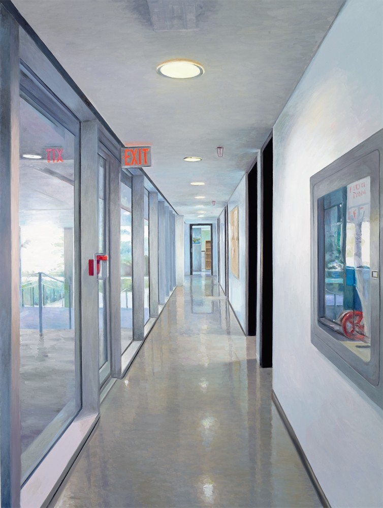
Semaphore, 2014, oil on canvas, 72 x 54 inches. All images courtesy the artist and Nicholas Metivier Gallery, Toronto.
What is comfortable, though, and pleasurable is the work from “Kingdom Come,” 2006–2009. In the catalogue for the exhibition at Nicholas Metivier Gallery in 2009, Joanne Tod noted that she wanted viewers to be drawn into the psychic and physical space of the museum. And she does draw us in with the stealthy beauty of the work, an act of deliberate seduction, and then presents them for their delectation—and with her typical engagement of ambiguity—with an opportunity to examine and question what a museum is. It’s a place, she told Border Crossings, that is special, “an exaltation of the best of the best,” but it also represents, she wrote in her catalogue statement, a range of other values and actions: proprietary and intellectual rights, history, war loot, scholarship, and the list could go on. In this largely museum-focused work she has also given viewers mindful beauty. Askance, 2006, is a painting of a wall of 19th-century paintings installed in a pale-panelled gallery, comfortable, calm and orderly. Never mind the subjects of the subject of her painting. It is bourgeois comfort, well painted, gilt frames, all faces turned to us with polite interest. Perhaps on a different floor in the same museum are Stolen Antiquities, Fifth Avenue, 2006, Ça Ira, 2008, Firth of Fifth, 2008. Read first for content, we are taken in by the objects rendered, and become museumgoers ourselves. But read further we see process and intention in Tod’s layering of reflections, which bring both clarity and distortion. This, she says, allows her to introduce some elements of abstraction.
Her carpet runners, Principle of Oxford, 2009, in particular, obfuscate or confuse the subject; this one is a patterned vertical column which gains volume toward the top of the canvas, a carpet runner which is a length to flat carpet following the form of the stairs on which it is laid, giving it a sculptural dimension and serving to present, as Tod points out in the interview, a nice paradox.
Sweet Mystery, 2008, is another vitrine painting and its subject is a Chinese porcelain vase decorated in cobalt blue with fishes, plants and waterlilies. It anticipates the body of work Tod produced as the inaugural artist invited to work with the Gardiner Museum in 2012. Tod created her own painted-on porcelain works, responding in contemporary manner to pieces she selected from the museum’s collection. I found particularly beautiful two subtle, small dishes, both in blue on a white porcelain ground. One a meta painting, tiger and dish on dish, Tiger and Bamboo, and the other, Salt Plate, which she rendered from a Ming Dynasty plate, where her application covers only a small portion of the plate on which she worked. Her production for this show also included three extremely fine paintings of porcelain pieces in the collection. Stronger overall, perhaps, because of her comfort with the medium.
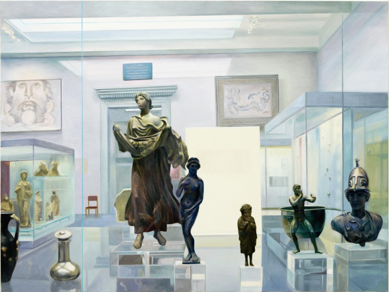
Firth of Fifth, 2008, oil on canvas, 48 x 64 inches.
Tod is standing behind us as viewers looking at Venturi Effect, 2014, she says. But if she were behind us we would be included in the image too. I think instead, when I look at Venturi Effect, of Manet’s A Bar at the Folies-Bergère, 1881–82, which looks back and forward in an enigmatic confusion, trying to visually locate and place the viewer. Displacement, Tod says, interests her.
Joanne Tod’s work has always been political, sometimes overtly so, sometimes by indirection. But the intention has been there throughout. When we asked her if she felt a painter’s work should reflect the world around her, her response was unequivocal. “It’s my duty.” But there’s something else as well, that I see. It’s the way in which she regards and represents her subjects, where people appear in her canvases. I would say her work exhibits the important mannerly and humane qualities of consideration and respect.
This interview was conducted by telephone with the artist in her Toronto studio on July 22, 2016.
Border Crossings:I know very little about your life before you became an artist.
Joanne Tod: I was always interested in drawing and it would occupy me for hours on end. Then when I got to public school in grade 7 I had a teacher named David Cowan and he recognized I was keen. He encouraged me and was extremely supportive. As a 12 year old he was responsible for my first art sale. I did an indelible ink drawing of an old oak tree that he bought from me and I was absolutely thrilled. Of course I had a huge crush on him because he was a hip dresser with a Thunderbird convertible. Compared to the rest of the teachers, he was pretty conspicuous and stylish. As it turned out, David was the first homosexual I ever knowingly met. After I left high school I kept in touch with him while he was at the Teacher’s College in Peterborough. He would bring me in to do drawing sessions with up-and-coming teachers. I was 14 years old. Then he went on to Queen’s University where he taught in the Education Department and we continued to be friends. Regrettably, he died of AIDS about 20 years ago. The main thing for a young student was the support and interest from someone I respected and who respected me. It was seminal in my continuing on to become an artist. He commissioned me to do several things over the years, so I started out understanding that if I was going to be an artist, I had to try to earn a living doing it. That was a very important first lesson and it continues to this day.
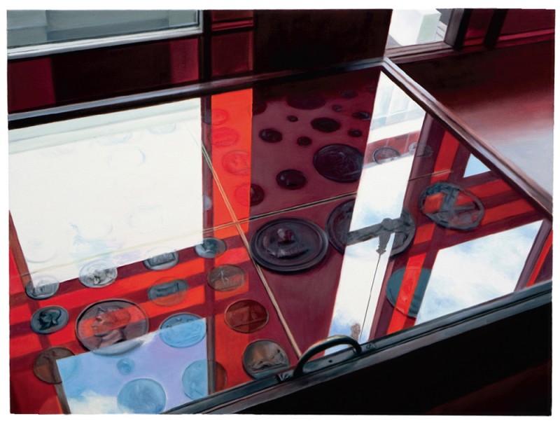
Blood Money, 2008, oil on canvas, 36 x 48 inches.
You went to OCAD from 1970 to 1974. What effect did it have on you?
Just after I graduated I did a series called Mao - Six Uncommissioned Portraits (1979). They were deliberately ironic takes on the vocabulary of colour-field painting. One, called Reds on Green, depicts Mao with another communist leader, so it’s a play on words. It was also directly reflective of the language used for that sort of painting. My work is, on some level, didactic and that’s something I want. It was my way of saying to the audience, I know about colour-field painting but I’m choosing to paint in a figurative manner.
Photography has been an important tool in your painting. Did you start taking photographs when you were at OCAD?
Yes, and all the way along. I studied darkroom techniques and my father actually built me a darkroom at home in Mississauga, so I was doing experiments in photography on my own. I enjoyed the whole process of the analogue image. I did some experiments with masking tape and film. I would pull the film out of the camera in a darkroom, stick on masking tape, roll the film back into the spool, and then go and shoot it. I would get these random interruptions. Then I’d carefully fill in the area that had been exposed and would get double exposures that were totally mechanical. I showed them in Paris at the Canadian Cultural Centre.
Did photography infiltrate your painting as well?
Yes. Coincident with that experimentation in photography I was doing paintings with interrupted surfaces where two activities were operating simultaneously. I would put masking tape down and paint overtop and then expose what had been protected by the masking tape. So something parallel was happening in both painting and photography.
I remember a piece you did in 1990 called Matters of Principle that shows an exploded car but the flames on the vehicle are in the style of Pop art.
That is exactly the work that is pertinent here. The car was tilted on an angle but the fire was burning at a 90-degree angle to the viewer. Even though the picture plane was skewed, it was obeying the principle that fire burns straight up.
When I first saw The Magic of Sao Paulo, the painting you did in 1985, I was attracted to the figure of Elizabeth MacKenzie. There was something in her looking out that made me think of Manet’s Olympia. Amway Consciousness (1984) seems to employ the same visual trope of playing with the gaze. Was Manet a painter you had your eye on?
Absolutely. I’ve also always enjoyed Hogarth and Daumier, artists who were dealing with social satire.
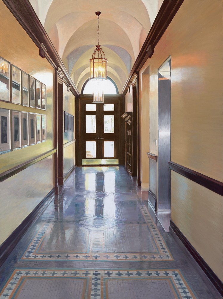
Liquidity, 2015, oil on canvas, 72 x 54 inches.
Portraiture has been on your mind from 1981 on. What was it about portraiture that appealed to you?
It was a challenge. Can I rise to the occasion and make a respectable faithful representation of someone and get paid for it? That has always been a strong part of my agenda. I don’t consider it a compromise, particularly in light of how commercial the art system is now. I’m simply trying to position myself. As a feminist I think the only thing that is going to save the world is if women have financial autonomy. I’ve always felt very strongly about that and I have “paid to play.” So portraiture is a job but it’s a fun job. I get to meet the most incredible people and learn things about them that nobody else knows. The Hal Jackman portrait was commissioned for the University of Toronto. The painting is huge, 96 inches high, and it’s in the Governing Council Board Room. It’s three times the size of the neighbouring paintings. Hal said we have to have some barbs in the portrait, so he’s reading The Varsity, which is completely antithetical to his politics, and in the background is John Waterhouse’s The Awakening of Adonis. He is a huge pre-Raphaelite fan, so the bare-breasted woman introduces a slightly titillating factor. He said, “That’ll keep people awake in the board meetings,” so I did it. And that big black lampshade is almost like a censoring device that is not quite censoring anything.
Often what you think you’re seeing in your paintings is not what’s there. When you look more closely you realize things are more complicated than what you initially thought.
As I said, my work is often didactic. So verisimilitude is important to me and I think that people, whether they admit it or not, are seduced by it. Otherwise, why would we have this burgeoning industry of virtual reality and 3D imaging? I’m simply playing to an innocent pleasure that suspends disbelief. Once that occurs, there is an opportunity to apply another level of meaning, one that gives a certain intellectual satisfaction or ambiguity and paradox.
The quality of realist painting is measured by its resemblance to what is being depicted, but then illusion becomes part of the realist proposal. Are you operating in the space between those two conceptions of what a realist painting can be: that it is both real and illusory?
That’s exactly the area I’m interested in inhabiting. I think there is a satisfaction factor too. If I’m going to be delivering a difficult message, which I have done perhaps more so in previous work, then beauty is something that is useful to me. Beauty and realism are not the same thing.
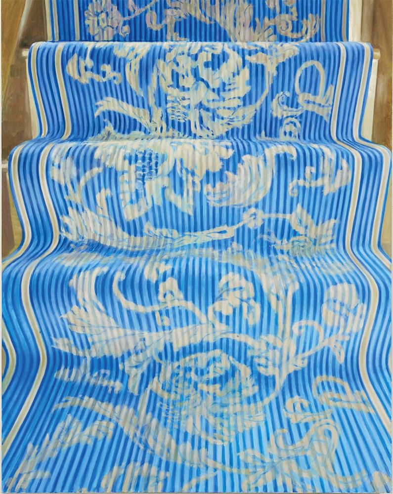
The Principle of Oxford, 2009, oil on linen, 60 x 48 inches.
But one can have attributes of the other. If I look at Serpentine Fire (2015), the presence of the material is startling. Does that beauty come out of the accuracy of the depiction?
That painting is the title of a song by Earth, Wind & Fire that was popular in the ’70s. I always loved the song and the lead singer of the group, the late Maurice White, was a Mason, so the lyrics have some kind of symbolism and are also about heroism and drug addiction and sex. It’s a weird, mysterious lyric. This beautiful marble staircase is in the middle of a building near the Nicholas Metivier Gallery. The thing about cell phone photography is that I know immediately if the painting will work by looking at the images at that moment.
I want to pick up on your use of song lyrics. There’s And He Shall Be Levon (2012); you’ve got a piece called Firth of Fifth (2008), which is a Genesis song title; and Kingdom Come (2009), is a Coldplay song. Are these deliberate references to song lyrics?
Isn’t that weird. I made Firth of Fifth up and didn’t know there was a song by that name. It’s obviously an inflationary advance on the Firth of Fourth. I was also inspired by a postcard I received from the late composer, Toru Takemitsu, which showed the Firth of Fourth bridge.
And the Elton John reference in And He Shall Be Levon? The plate from the Gardiner Museum show depicts Elton John as Peter Pan and his husband as Captain Hook.
There I was playing off the song title, and that plate was made to be displayed alongside several other plates of kings and queens together in the exhibition. I would like to give Elton John his plate.
Let’s talk about the museum. What is it about the museum as an institution that you find so compelling?
It’s like a three-dimensional rendering of my experience. My life as an artist has so much to do with actually attending things in museums. I wouldn’t describe it as a hallowed space, because that’s exactly what museums like The Tate and the San Francisco Museum are trying to avoid by going for crowd-pleasing and user-friendliness, but a museum is still a special place. It has to be an exultation of the best of the best. What’s not to like about that? It’s laudable, even if contemporary work is difficult and sometimes challenging.
Blue Bailu and Yellow Displacement, both from 2012, are cleanly rendered objects. At the same time you begin to play with perception. We can be looking at an object but what’s going on in the rest of the painting makes that object more obscure or difficult to read. What are you doing with the relationship between clarity of perception and a sense of obfuscation?
Just that. You can see the object but it also adds another layer of reality. It is in a vitrine and there are shiny reflections on it. I have painted myself in those reflections, so I am taking account of the actuality of the real moment. It is always a layering. I mean, how do you ever get to the real centre of anything? Sometimes I don’t know what I’m looking at in the reflection, so it can be a lovely opportunity within the structure and rigour of the representation to let loose and paint the floral pattern, or whatever is in that little bit of abstraction within the painting.

Tiger and Bamboo, 2012, plate, hand-painted vitreous china, 8 inches.
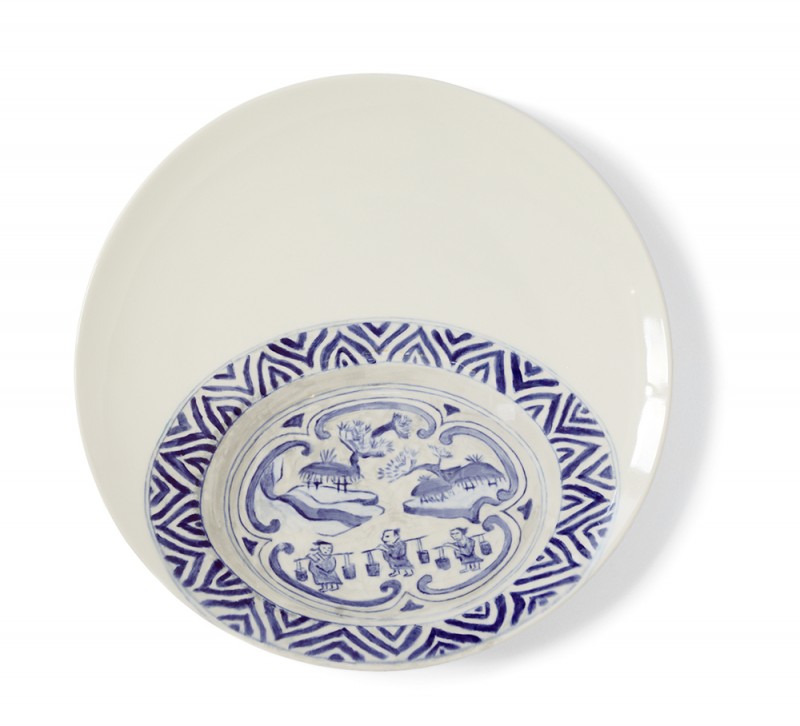
Salt Plate, 2012, plate, hand-painted vitreous china, 11 inches.
In Stolen Antiquities, Fifth Avenue (2006), are you using Photoshop?
I don’t ever use Photoshop unless I’m making a birthday card for someone. It simplifies things but it also enhances what I consider the excitement factor. I can take 200 pictures of something and I’ll be looking at thumbnails and inevitably I come back to certain ones. I don’t edit anything. I have to have the moment.
So the rendering is what’s there to the camera eye rather than what is in your eye?
Yes, and cameras are getting better and better. When I was using my digital camera there was a certain amount of parallax and distortion, I always adjusted for that. I like parallel lines and not parallax but the camera phone does a much better job. I adjust things when I am working on the canvas.
Old Money is an image that is easy to read and Blood Money, a similar subject, is not. You have large areas of reflected light that act like structures inside the painting. It is more difficult to discern what you are looking at.
Blood Money is a display case of medallions in Sir John Soane’s Museum in London. They don’t allow photography but I wrote to the director and said I wanted to take photographs for scholarly purposes, so they let me do it. Old Money was taken from the British Museum.
What makes you choose the subjects you do? Like a pistol or a ship, or a stair runner? What is it about any subject that you find engrossing enough to recreate?
It depends. I have painted quite a few staircases and stair runners. There is a paradox with a stair runner because it is a carpet that has been subjected to a dimensional surface, so it becomes a sculpture. A stairway is a passage, a conduit. But it is also a kind of nothing space. It isn’t considered a thing. I suppose I am trying to rehabilitate the idea of ‘thingness.’
You told me in a conversation several years ago that you are essentially a closet formalist. I sense in looking at these works that you haven’t entirely left formalism behind.
I keep threatening to do abstract work. There is a lot of intuition involved and that may be the pay off. My process in choosing is intuitive but my methodology is very disciplined. It has to conform to a standard of verisimilitude, or else it won’t work.
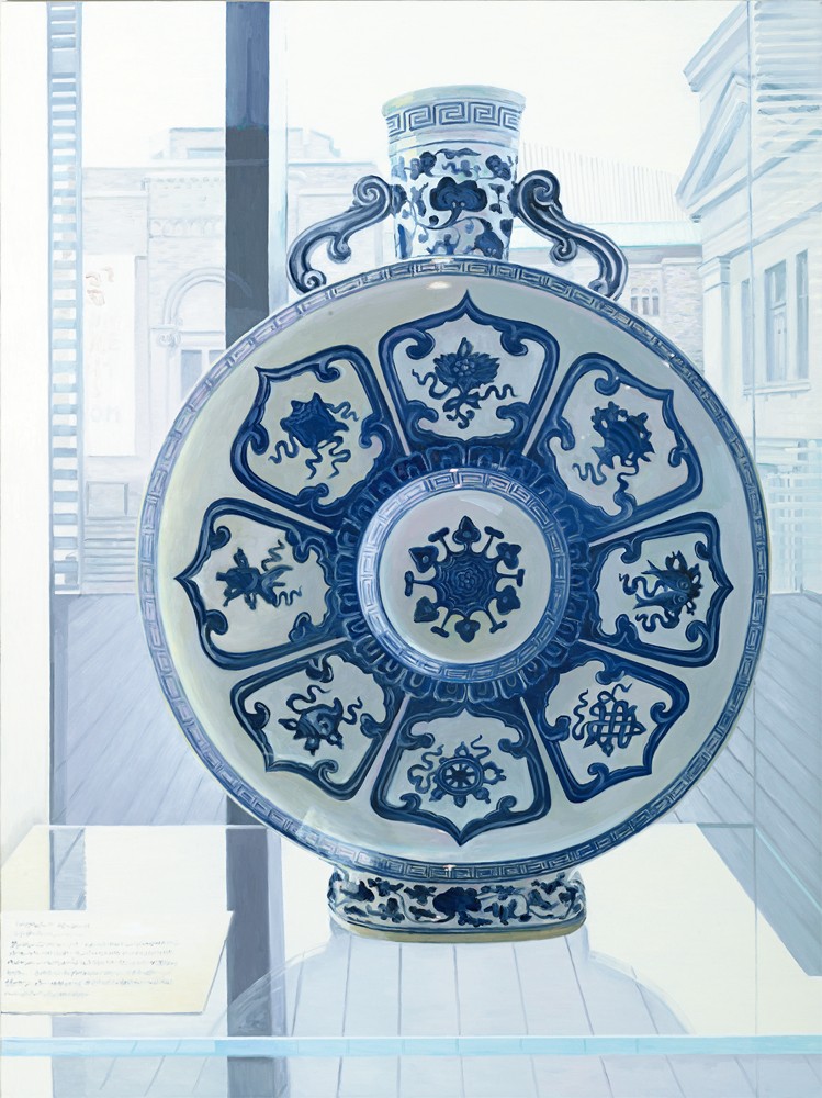
Blue Moon, 2012, oil on linen, 72 x 54 inches.
When I look at some of the paintings I don’t always know what I’m looking at, and that’s true to perception. Is your painting then a reflection on the way we perceive the world, or is there something equally painterly involved in rendering the surface the way you do?
I am trying to make it interesting by doing both those things. I have to say that people spend a lot of time looking at my work and I know how hard it is to keep people engaged. I’ve spent enough time in New York to know what exhibition viewing is like: you just keep walking. So when people spend time with my work it’s a mark of success because it’s compelling enough for them to figure out, how was it made? I do try to get a cohesive autonomy of surface with very little texture.
In some senses the subject of your painting is about the difficulty of perception, or the tricks that perception can play on us. There is a readable subject but there is also a mechanical subject.
I would also say that the medium is the subject.
So you don’t doubt painting. What you’re doubtful about is our capacity to perceive what the world really is? I’m getting into the question of epistemology. There are ways your paintings ask, what can we know when we actually look at something?
Yes, so consensus is really important. And it’s satisfying when there is consensus. It’s like playing on a sports team; there is a thing that happens when a group of people is experiencing the same thing. That kind of agreement is very pleasurable for me.
When you went into the Gardiner did you know that not only were you going to make ceramic paintings but that you would paint on ceramics?
Yes. I thought it would be fun and it turned out that there was a real element of fun in this exhibition. It was like a treasure hunt; the museum made a map with all 35 of the items. You had to use the map because my pieces were quite integrated into the historic work.
Is there a difference between a traditional surface, like canvas or linen, and painting on the surface of porcelain? Did you have to adjust your technique?
Yes, because you really don’t know what you’re going to get when it comes out of the kiln. It looks great when you paint on the glaze, but you have to apply three layers.
And is it often different from what you thought it was going to be?
Always. There was something scary and really engaging about that. The problem was I had to sit down to do it and I hate sitting down to work, so that was gruelling in its own way. And the plates had to be sanded and wiped down and then sanded again to make them smooth. On that occasion I had an assistant to help me.
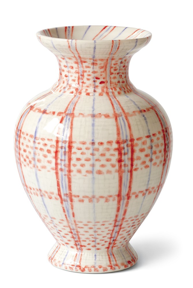
Lampedusian Vase, 2011, vase, hand-painted vitreous china, 6 inches.
Rachel Gotlieb, the Senior Curator at the Gardiner, refers to your “irreverent eye” and I had a sense that the title of the exhibition, “Invited Invasion,” was chosen in that spirit. It makes it sound as if you’re the barbarian at the ceramic gates.
In a way I guess I was. Rachel liked my work, so I proposed the idea of painting plates, never having done it before, but I thought it could work. I went to The Clay Room, which is an interesting place on Danforth in Toronto where they have all the bisque forms, all the different ceramic colours and the kiln. I used conventional domestic pottery shapes, although there were catalogues of other forms I could have ordered.
There was a time when artistic hierarchies were debated in the art world. It was a discussion of art versus craft. Is that even a question anymore? Lately a number of artists known in other media, like David Salle and Tom Sachs, are making ceramics. Do you buy into the distinction between craft and art?
Not any more. There are many artists working with ceramics today. Think of Grayson Perry, and more locally Stephen Andrews and An Te Liu. Now, if it’s done well, anything goes. It wasn’t that long ago that photography was subject to that kind of hierarchical reading. Irreverence aside, when I look at works like Lampedusian Vase (2011), or Lovers (2012), I can’t help but recognize the beauty of their rendering. Beauty makes its appearance in the ceramic work in the same way that it does in your paintings. It was important for me not to depart too much from my normal painting style as a way of ensuring that there was continuity and a deliberation of purpose.
Let’s talk about some of the ceramic pieces. I think the shift you make from the 16th century Punic War plate to Occupy Toronto (2011) is inspired.
It was my first one. Occupy Toronto was happening at the same time I was familiarizing myself with the Gardiner Collection to see which pieces I was truly interested in. I spent hours going through the collection and coming back and photographing certain items. So I knew which ones I wanted to use.
How is it that you picked Brad and Angelina for Eve and Adam (2011)? They look like they’re doing a prelapsarian photo shoot.
In this case I wasn’t using only my own photography. I used found imagery as well. I was searching for an embracing couple and I watched people posing on the red carpet for the Academy Awards and there they were; they were in exactly the same pose as one of the plates in the Gardiner with Adam and Eve.
In your version the snake manages to wrap himself around both of them in a way that doesn’t happen in the source plate.
I was being naughty there. It was slightly risqué with Los Angeles in the background.
When you picked a source plate or vessel was it because you liked the shape or the image on it and had to find something to have a dialogue with, or did you have images in mind you wanted to do and then found objects in the Gardiner Collection that embodied that idea?
A little of both. It was a coincidence that the Punic War plate worked so well with Tent City in Occupy Toronto. Then in Elm Tree Blues I took the lady and gentleman in a garden gazebo with a musical instrument and a dog from L’Amour and The Fluter and turned them into myself and David Clarkson, I took that from a photographic image. The musical instrument is a guitar, the dog is a little French terrier, and I made a mug instead of copying a teacup.
So you use autobiography and a sense of play, but the work also deals with some pretty heavy subjects, like murder and war. Is it your sense that a painter should reflect the nature of the world in which she finds herself?
It’s my duty, really. I feel it wouldn’t have any meaning for me if it weren’t so. That has always been part of my agenda.
I suppose that also explains what you mean when you say your work is didactic. If you have a duty, then there is a message that has to be communicated.
Yes, and sometimes the message is below the surface and occluded. It doesn’t have to bang you over the head.
So you’re not prepared to allow the viewer to be a passive consumer of the images. You want the engagement to be one where there is give-and-take on either side?
I would say that is the same with every self-reflecting artist.
Robert Longo has rendered Freud’s study in his massive drawings, and other artists have also looked at this subject. What was it that so attracted you to it?
First of all, London is my favourite city. I had a book of off-the-beaten-track museums, including the Museum of Brands, Packaging & Advertising in Notting Hill, which is filled with commercial product packaging from a bygone era. It’s terrific. Freud’s house was also in the book, so I decided to go. This was the house where he lived for the last 10 years of his life, and where he died. I was riveted when I went in because there were so many antiquities and carpets right there in the open. In my exhibition at The Spoke Club I had included carpet runners and some Greek antiquities, so the Freud House resonated with me. It was kind of cool to have an uncanny experience in Freud’s room with his couch. And the couch too, had oriental tapestry on it. The carpet was apparently given to him by a grateful female patient. But you’re not allowed to take photographs and I found out you can rent the museum, so I paid my two hundred pounds and had an hour where I photographed everything. I chose that vantage point because it looks like someone is crawling on the ground toward the great master.
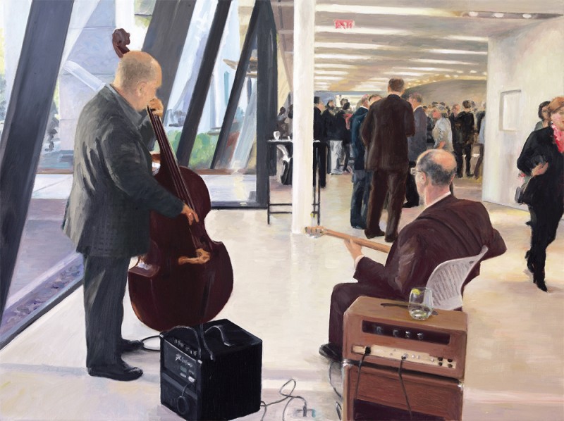
Gig, 2014, oil on linen, 18 x 24 inches.
You dealt with issues of race and representation in the ’80s. Have you continued to wrestle with those issues?
I wouldn’t be inclined to make that kind of work now because I don’t think it would be acceptable. It would be met with, “How can you speak about the experience of the other?” At the time I was questioned in that way and my response was that I was involved with African music, I saw African people every week and we danced and sang and got dressed in change rooms together. These are my friends. So I felt I had some justification in doing what I was doing. A lot of that work was influenced by the type of imagery you would find on social realist posters. When I was in art school half of my friends were so-called Marxists.
I look at paintings that are almost a decade apart— In The Kitchen was done in 1975 and Decoration Knows No Bounds in 1984. Both deal with the kind of Asian bondage that Araki has made famous. Those seem to me to be incredibly brave paintings to have been done in those years.
My boyfriend at the time was renting a darkroom in a house and I was over there having coffee one day and the owner of the house was really upset. Apparently, she had been shopping and when she came back to her car there was a Japanese bondage magazine on the seat. She was going to throw it away and I said, “No, let me look at it.” It was somewhere between yoga and some sexual practice that I had never imagined but I could see the wrists and the ankles were carefully swaddled, so the women wouldn’t be getting rope burns. I could see how being suspended wouldn’t be so bad. At the time, it seemed really spectacular because it wasn’t a well-known fetish.
I go back to a painting like Amway Consciousness in which the woman is Asian. You’re clearly riffing on Olympia, but you clothe your model. When you’re quoting from some experience that is new to you, you go further than when you quote from canonical art history. You do a similar thing in Dejeuner sur verre.
That’s an interesting point. In the Kitchen was also a feminist commentary on the situation of women metaphorically tied to the kitchen. There was obviously an ironic intent. In an extreme way, Decoration Knows No Bounds (1984) is a montage. The two young smiling Asian women on either side of the suspended figure are taken from postcards I got when I was in Japan, where I found some bondage magazines. I was never personally into that practice but it was fascinating to me. So I made a painting that I perceived at the time to be about this anomalous polarity in Japanese society. On the one hand there is extreme macramé yoga and on the other, these two cute little Hello Kitty schoolgirls. What’s really mysterious to me is the puerile infantilized girl stuff in Japan that persists.
Is your palette given to you through your subject or is it a field of investigation? I’m thinking of both the ceramic work and the more traditional paintings.
As I said before, I try to resist the underpainting so that I can keep the luminosity of the paint when it is applied thinly the way I do. That’s a technical thing. But I would say that like most people, I have favourite colours. There are certain go-to colours that I love because they are really mixable with other things. I rarely use black unless I am painting something that is black.
Is Rose Dore your favourite colour?
I love Rose Dore. It’s almost 80 dollars for a little tube, so I use it sparingly. When I graduated from OCAD I got a scholarship of $2500, which was a lot of money at the time. So I went to Gwartzman’s Art Supplies and bought boxes of oil paint in every colour. I’ve bought other paint in the meantime but I still have boxes of that scholarship paint. It’s so good.
A painting like Liquidity (2015) is perfectly named. That floor surface you get is a shimmer. You’re very adept at rendering a reflective surface that both holds you outside and that you feel you can fall into and disappear. Is it a question of just learning as you go along?
Yes, and I make it a practice. I’m observant. I’ll be looking at something and often in the back of my head I’m thinking, that’s Cadmium Lemon. I have internalized what certain colours look like. I’ve put in my 10 thousand hours. I’m getting better at it and like anything else, when you do it all the time, you don’t have to think about it as much when you are actually doing it.
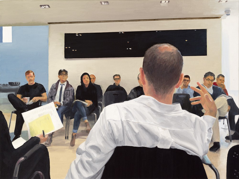
Venturi Effect, 2014, oil on linen, 18 x 24 inches.
Back in 1991 you said you liked being a contrarian; that being in opposition to something was a useful place to be. Do you still feel that way?
Less so. I think my agenda has broadened and so have my interests. In the beginning I did feel I had to be a pugilist defending my turf and my methodology in the face of what was a dominant and popular form of expression at the time. So I have put my dukes down a little because there is tons of realist painting and people who are dealing with contemporary representation. I fit right in to that. I’m less contrary now, unless it’s something about which I intend to be deliberately critical.
You have a painting called Palimpsest (2014) of a blue electric guitar. It makes me think that all objects and places are palimpsests because no matter how they are rendered, there is always something underneath the surface that has to be found or reflected in the image.
I would say that is right. In this case it is a literalization, a hide-and-seek between the foreground and the background, a little visual roman-à-clef that you have to figure out. Do you remember those Magic Eye illusions? You would hold them up close and when you pulled them back they would become three-dimensional. I was thinking about that kind of phenomenological acknowledgement, where you can see two things equally present; one is real and the other one is not.
Again, that’s your notion of the semblance of reality and the illusion of reality. They’re still operating full on in the work.
Yes, they are.
What is the Venturi Effect about?
That is a photograph I took of Dean Richard Sommer at a faculty meeting, where he is gesticulating in a very characteristic way. It’s placing myself in a situation behind the viewer. It’s the same thing with the two musicians in Gig (2014). Where is the action taking place? Here are two musicians playing in front of a group of people who are not even listening to them. It’s about displacement.
That notion of displacement is something in which you have been interested for a long time. It’s not just a spatial displacement but a psychological displacement as well.
That is true and applicable in a lot of ways.
You often create asense of darkness in light. In While Rome Burns (2006) you have naked nymphs in the foreground and crucifixes in the background. The title itself picks up on Nero and his fiddling while Rome is destroyed. As viewers, we are obliged to entertain two competing realities.
Yes, and also our own reality because it is a commentary on what is happening to us right now. Rome is burning; everything is crashing and becoming dire in so many ways.
One of the things that strikes me immediately about the interiors you’ve been painting, like Semaphore (2015), is they are peopleless places. There is evidence of human presence but no actual people.
I was recovering from a personal trauma and had to force myself to work again. All I could think of was just getting through. I was literally like a somnambulist being sucked into the space because I had no volition of my own.
That is interesting because as a viewer I experienced an inexplicable sense of discomfort. It’s difficult to pin down but somehow it throws off your sense of equilibrium.
That’s good. Mission accomplished.❚
…to continue reading the issue, order a copy of Issue 139: Painting here, or SUBSCRIBE and receive a limited edition Border Crossings tote, screen-printed late summer 2016 in Winnipeg, MB.

