
Certain Things in a Certain Way
An Interview with Jonathan Lasker
I can think of few contemporary artists who have been as successful in developing and employing a repertoire of shapes, forms and motifs as the American painter, Jonathan Lasker. Throughout a rigorous and intense practice now in its fourth decade, he has refined a pictorial language and visual syntax that is uniquely his own. A painting by Jonathan Lasker is unmistakable. What is most intriguing about his shapes and linear forms is their lastingness and flexibility. As he intimates in a 2010 painting called The Rules of the Game Do Not Change, the procedures available to make a painting are set, as are the component parts available for that making. Lasker admits that nothing is ever abandoned; things are only temporarily set aside, and in any new painting an old visual trope could be easily reprised. “All the stuff could come back,” he says in the following interview. “When I’m coming up with the idea for the painting, there is definitely a lot of poking about. This vocabulary can create a lot of pictures; if I go into one thematic form or another, it somehow generates new pictures.”
Lasker recognizes that his vocabulary is “a recurring and consistent language.” In a 2014 painting, he calls the components of this language Pictorial Objects; it is commonplace in his aesthetic domain that the painting names, and then is named by, its content. In this case, the objects are five kinds of black lines in various thicknesses and applications, from scriggly automatic drawing to carefully rendered bars of dense pigment. These linear variations set the stage (he is a visual dramatist) for a pair of shapes, one pink and the other turquoise, that are almost heads, each covered in a weave of interlocking lines. Pictorial Objects hints at the possibility of transforming into Pictorial Portraits. Lasker is aware of the way in which viewers tend to turn his objects and figures into things. He points to an unfinished painting in his studio as an example of this tendency towards a kind of soft anthropomorphism. “That pink form is not figurative but it is a figure within the painting.”
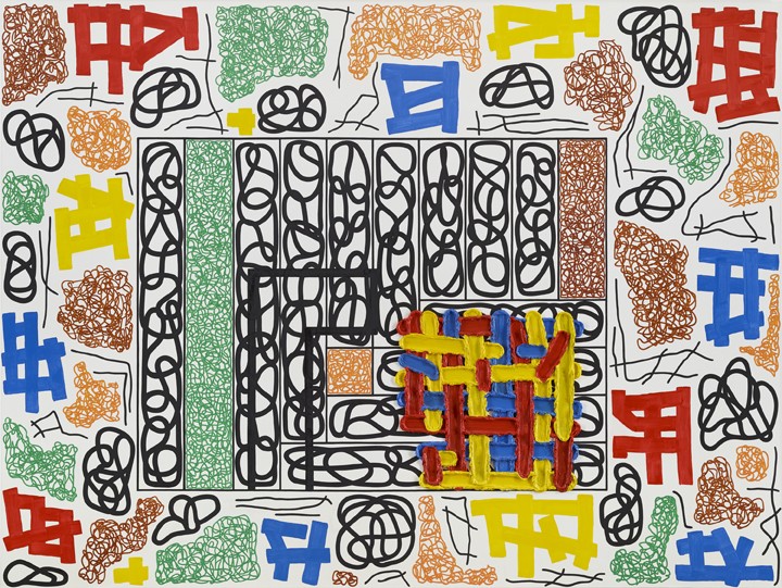
The Universal Frame of Reference, 2014, oil on linen, 90 x 120 inches. All images courtesy Cheim & Reid, New York.
Among the work in his exhibition at Cheim & Read in January of this year was The Universal Frame of Reference, 2014, a 90 x 120-inch masterpiece that he regards as the “magnum opus” of a certain way of working. (The painting was just purchased by the National Gallery of Canada). For Lasker, making a painting is a way of tracing, to use his own fine conception, “how thought can shape itself forward.” As he told us, “Mentation has a lot to do with what these paintings are about.” That considered movement is both aided and confused by the names he chooses for his paintings. The titles are invariably containers for ideas which hint at how the picture might be read and understood. They present irresistible, and sometimes baffling, conundrums: Things Have Reasons, 1998, The Quotidian and the Question, 2007, The Placement of Objects in an Uncertain Universe, 2013. At his own admission, they are also oxymoronic and argumentative, and the direction they send us in may be more hindrance than help.
When he calls a painting Drawing Blanks, 2003, that is exactly what he is doing. On a large canvas with an intricate multicoloured ground, Lasker places six different shapes, four of which are white; they comprise the drawn blanks of the painting’s title. Drawing blanks is the visualization of a vexing process of composition. The absence on the painting’s surface is echoed in the imaginative absence that has produced the painting. In one way, Lasker is playing the Adamite game; he gets to name his world into being and meaning.
But what are we to make of his naming a 1994 painting The Divergence of Truth and Beauty? The title calls to mind John Keats’s famous Ode on a Grecian Urn, a poem written in 1819 that presents the eponymous vessel as both “an unravish’d bride of quietness” and the site for “mad pursuit and wild ecstasy.” It is a complex embodiment that Lasker doubtless admires, given his propensity for conflict and the oxymoronic. But Keats’s slow-cadenced ode to aesthetic and ethical harmony concludes that Beauty and Truth is one and the same thing, inseparable over time and space.
It is useful to keep in mind the artist’s own caution about the doubleness of his naming. When he calls a painting The Art of Good Appearance (1997), he is focusing our attention not on what the painting is, but on what it is not. It is a riot of scribbled lines, awkward shapes and uncongenial colour. (That said, it’s bad appearance makes a really good painting). But on the surface, its quality of goodness is as ambiguous as the divergence of philosophical conditions that Lasker identified in the earlier work. One of his signal achievements is his unparalleled ability to make abstraction a felt thing, to register what he calls the “thinghood” of the paintings. I’m reminded of another poem, this one published in 1926 by the American poet Archibald MacLeish. In Ars Poetica, he writes that “a poem should be palpable and mute / As a globed fruit.” In the Ars Pictoria that Lasker has been producing for over 40 years, he has made work that is visceral and palpable, but decidedly not mute. As he says with some pride, “My paintings are very unapologetic. I’m personally a mild-mannered Clark Kent kind of guy but my paintings go into bars and start fights.”
The following interview was conducted in the artist’s 8th Avenue studio in New York on June 28, 2016.

Installation view, 2016, Cheim & Reid, New York.
Border Crossings: I want to start by talking about The Universal Frame of Reference, 2014, because it seems to include many of the kinds of marks and forms that you have used in your painting, as if it were an inventory or an alphabet. What does it say about your pictorial language?
Jonathan Lasker: The real driving force behind that picture was spatial. It was about painting space in picture-making. There is a picture within a picture in that painting. It came out of a drawing I had done when I was away and I was testing these marks around the margins and I realized that the space of the picture self-exploded to the outer margins. That interested me because I had never really seen that before in picture-making. That’s what excited me about the process, but other people see the painting the way you describe it. My work is often seen as vocabulary, and of course it does have a recurring and consistent language. In this case, it is true that all the constituent elements of the picture within the picture are to be found in the margin reference, as if a glossary for the picture.
When you say you were testing the marks, what is the test? What is it relative to?
Literally to the scale of the implements. I was making a drawing in an unfamiliar size on a paper larger than the picture scale and I was doing it with implements I don’t normally use here in New York. I wanted to see if the density and the breadth of the mark seemed to be the right scale. I tested it outside the margins of the picture and so it came as a kind of accident. There have been several paintings based on this way of working but The Universal Frame is the magnum opus of them all.
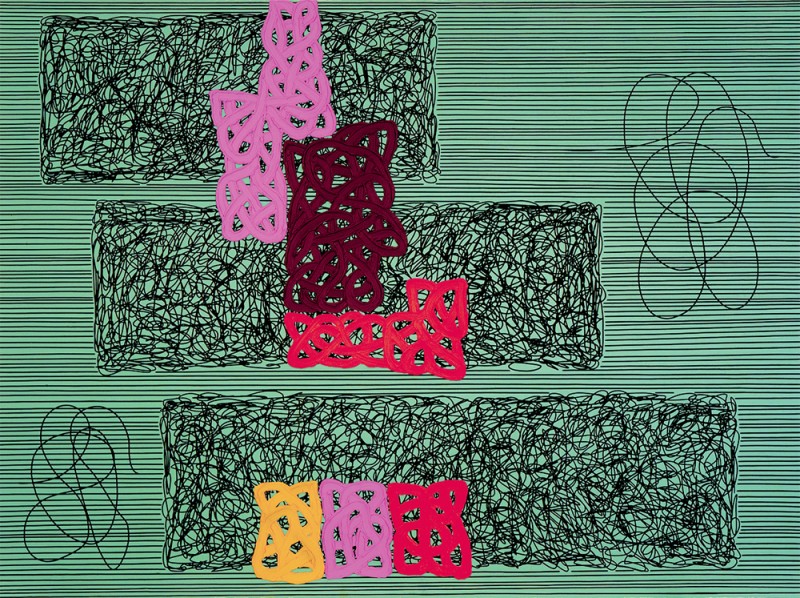
When Dreams Work, 1992, oil on canvas, 90 x 120 inches.
What happens when you shift scale as dramatically as you do in the larger paintings?
There is never a direct transfer. It’s not like I graph up from the small oil study to the large painting. Sometimes I do measure things to try to get the scale to cohere to the scale in the study.
So is it proportional?
It is never quite proportional. There have been a couple of small versions of this particular painting, The Love of the State, the first one was around 2000. I had done three or four 16 x 12-inch paintings but I always thought it would be interesting to do it large. When you are working on 16 x 12 inches the breadth of the mark is going to feel bigger than it can possibly be on the larger scale, so you don’t scale up one-to-one. You find a reasonable scale for the larger painting and you also have to see where the viewer’s body is in relationship to the painting. The viewing space is going to be roughly where we are now, about 15 or 25 feet away from the painting, and the viewing space on a small work is very intimate. So there is a scale shift that you have to anticipate. It is something I’m very practised at.
Is it something you just understand in your painting bones?
Yes, but I do have to be on my game or I can screw up. There is a lot of give and take in these paintings. There is a lot of gamesmanship and pre-planning to the point where they are almost designed, but at the same time things happen where you go from scale to scale in the larger paintings. I sometimes have to improvise, particularly when I paint the red, yellow and blue forms. They are never exactly as they are in the study. These paintings are planned out in advance and they look simple, but they actually get very complex. An impasto form like in The Universal Frame of Reference can take four or five 14-hour days. Those strokes take 45 minutes to an hour to build up and then it is a question of how much air and light there is, the density of the form, and the amount of transparency between the form that is in front and what you see of the ground behind it. There is a kind of chiaroscuro going on, so it is actually fine-tuning, but you’re fine-tuning with 45-minute-long paint strokes instead of little dabs. It actually does everything against the concept of action painting. They are like ‘anti-action painting’ paintings. But action painting comes back sooner or later; there is no escaping it. In the end, it is always the process of painting.
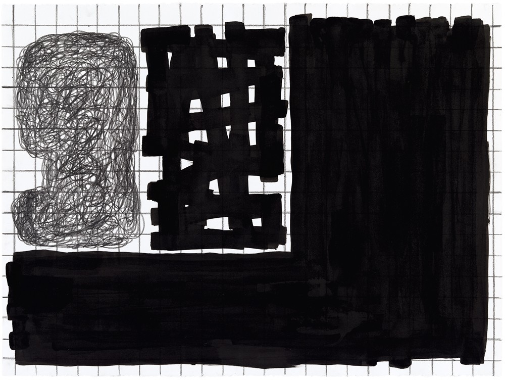
Untitled, 2013, graphite and India ink on paper, 22 x 30 inches.
Are you constantly surprising yourself in the making of a painting?
Not constantly. Quite often the painting just succeeds, but then sometimes it doesn’t and you know that when you get into the large scale. There are certain things that have to be improvised. Whenever there is wet on wet painting, the improvisation becomes enhanced. It really depends upon whether there is an allocation of wet on wet. If there isn’t it can more or less fall in place, but if there is then it becomes a whole different ballgame. Sometimes these paintings are so painstaking that they prohibit the pleasure of paint. I don’t really paint them for my own pleasure. I paint them for the effect. At this point they really are tough to execute, and if you’re a little bit obsessive and you’re trying to get that form just the way you want it and to resonate in a certain way, it can be arduous. I have always been that way in my approach to painting. I am now looking where I might go back to more painterliness. As soon as you’re layering you really have to know what you’re doing because you are doing one discrete element and putting another discrete element on top of it. If you don’t have a game plan, you can’t do a picture. It is literally impossible.
…to continue reading the interview with Jonathan Lasker, order a copy of Issue 139: Painting here, or SUBSCRIBE and receive a limited edition Border Crossings tote, screen-printed late summer 2016 in Winnipeg, MB.