The Painted Whirred: Ed Ruscha’s Spin on Language
Words, and the letters they’re made from, are a personal matter to Ed Ruscha, who has come to be regarded as one of the most influential artists to have emerged in the 1960s. More than any artist of his generation, or any other generation, for that matter, he has staked out the suggestive territory where language and art intersect, and his presentation of the visual conversation between them has been variously wacky, wicked and wry.
One of his earliest paintings to contain letters also includes his surname: E. Ruscha, an oil on canvas from 1959. It shows evidence, in the agitated background brushwork, of a residual engagement with gestural abstraction, but what is most noticeable are the letters that run from one edge of the composition to the other. Ruscha is already having his way with language. The conceit in the work is that the artist has forgotten to plan ahead; he begins to spell his surname and runs out of space, obliging him to reposition the “H” and the “A,” so that they end up forming a stand-alone, comic exhalation. The first four letters are rendered monumentally, the “R,” “U” and “S” in black, and the “C” in red, while a black arrow directs our attention to the truncated “H” and “A.” Ha! The joke, then, is on no one and for everyone; generous, playful, even a bit goofy.
Ruscha has said that his paintings “are anonymous backdrops for the drama of words.” The types of drama in which he operates most comfortably are comedy and farce, with an occasional whisk of the tragic mixed in for serious measure. His humour is everywhere, especially in the unusual combinations of media and their messages: Pepto-Bismol and caviar on canvas spelling out L.A., 1971, his hometown since 1956; chocolate and rose petal stain on linen in Well, Roughly, 1971; red cabbage stain on raw canvas becomes Devil or Angel, 1973; cilantro stain and egg yolk on raw canvas for Walks, Talks, Flies, Swims and Crawls, 1973; and blackberry stain on moiré form the first A Blvd. Called Sunset, 1975, one of his many signature coinages. Then there is the mad delicacy of Baby Tears, 1974, made from egg yolk on taffeta. For a painting that has almost no physical presence, it packs a TKO-style emotional whollop.
His technical skill is another source for the visual punch the works carry. The privileging of word over ground in his description of how the paintings function leaves out the scrupulous care he takes in painting the anonymous backdrops for his surface wordplay. Ruscha reiterates the drama of Luminist skyscapes, a borrowing he acknowledged in naming his contribution to the 2005 Venice Biennale, The Course of Empire, a title taken from the Thomas Cole series from 1834. Ruscha has looked closely enough at the Luminists to be a graduate of the Hudson River School of Painterly Backgrounds.
Much of Ruscha’s humour articulates a wily contradiction. In I Remembered to Forget to Remember, 1984, he composes a double negative with an escape clause; the three phrases come at us out of a red-yellow sky in ever-increasing scale, so that what we’re left with is “To Remember,” an insistence on a function the painting has undermined. His preference is for the ambiguous, or, more accurately, for a certain slippage between language and surface. The retiring sentiment and the faceted, slightly arch font in Those Golden Spasms, 1983, get no support from the cool grey tone of the background on which it sits. Then you realize that the phrase itself is eccentric. You would expect “handshakes” to be golden, or perhaps “memories,” but throwing “spasm” into the mix turns everything topsy-turvy. “Art has to be something that makes you scratch your head,” he told Artnews in 1991, and his compulsion to make us scratch away hasn’t diminished over the course of his almost 50-year career.

Marble Shatters Drinking Glass, 1968, oil oncanvas, 20 x 24”.
Words and images have a layered pedigree in modernist art. The earliest use of language, other than the incidental appearance of lettering, signs and newspapers in Manet and Cézanne, is in Cubism, where words function in a disruptive way. Ruscha inherits this tradition but his disruptions lean equally towards the conceptual and the pictorial; his words are puns that have both verbal and visual dimensions. In this sense, his wordsmithing borrows less from Braque and Picasso than it does from Duchamp, the rough absurdities of Dada and the literary playfulness of Surrealism.
Ruscha did conduct a brief flirtation with Magritte in a 1977 oil called No End to the Things Made Out of Human Talk. On its literary side, the title is an affirmation of the language base from which Ruscha derives his art; from an art historical perspective, the painting reframes Time Transfixed, 1938, Magritte’s iconic image of a train emerging from a fireplace. Ruscha has said it is one of his all-time favourite paintings, and in registering his admiration he uncomplicates the original by removing the mirror, mantle clock, candlesticks and the train. The fireplace is seen from the same angle, but in place of the smoking locomotive there is a regular fire and a feeling of spatial enclosure. (Interestingly, there are two small oil-on-canvas studies for the painting, a rare example of Ruscha doing preparatory studies; both have appreciably more vigorous fires in the hearth than appear in the finished painting.)
Ruscha’s praise for the Magritte says something about the practical workings of his own imagination. “Trains don’t come out of fireplaces, but smoke does come out of their smokestacks and smoke does go up fireplaces,” Ruscha reasons, “and that brings you to some sort of rigorous truth.” In further complimenting Time Transfixed, he suggests that the struggle between the unreality and the reality of the painting “is the right kind of struggle to make a great picture.” In his version, Ruscha creates a space where the fireplace smoke has nowhere to go, so all the implicit comforts of the image disappear in the inevitability of an unpleasant claustrophobia. Only then does the richness of the title become apparent: the ‘no end’ of things made from human talk is both a trap for the senses and an escape for the mind. Ruscha is Prospero, insinuating a doubleness on an island of his own making. Or, arrangement of the words on the page could be transferred to canvas. It’s in this sense that Ruscha has said he is the only artist he knows who came to painting through photography.
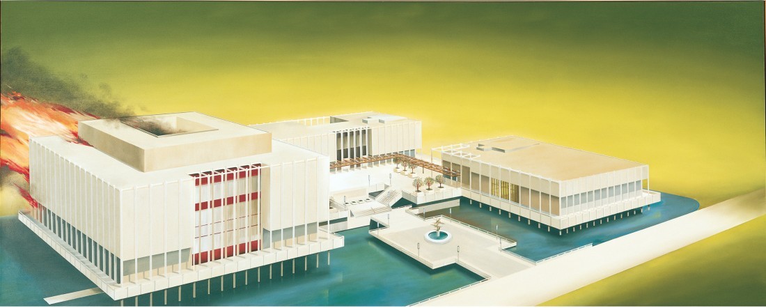
Los Angeles County Museum on Fire, 1968, oil on canvas, 53 ½ x 133 ½”. Gagosian Gallery.
Devil or angel? It’s a playful question that Ruscha uses as the title of a 1973 painting. He has even produced a series of paintings where he is prepared to work out the percentages for each of those figures. (It is merely circumstantial to point to another painting done in 1973, which uses his own blood as pigment to fix the word “Evil” on satin.) Ruscha has subjected the Roman Catholic tradition in which he was raised to the same irreverent questioning that has generally characterized his art making. The verbal message of an acrylic called Inferno, 1989, is mitigated by the gorgeous blue, purple and black ground on which the word is applied; in A Certain Form of Hell, 1983, subtle tonal field are the words that make up the painting’s name. “Heaven,” the final word and the one with the most buoyant meaning, barely hovers above the dark line of the water; the celestial placed in its lower registry. The title of the painting and the way its words add up to an idea are a precise and resonant description of the word world that Ed Ruscha has been composing since he painted E. Ruscha in 1959. In his own right, he has been able to inhabit a very particular kind of heaven.
The following interview was conducted in LA shortly after Ruscha returned from London, England, where his exhibition “Busted Glass” was at the Gagosian Gallery from October 2 to November 17, 2007.
BORDER CROSSINGS: I want to start with the “Busted Glass” works on exhibition in London and ask what interested you in making that series of drawings.
ED RUSCHA: I’ve been breaking glass for quite a while and only recently did it work out to be flat pieces.
BC: There’s a photograph with a broken glass and a Q-tip from 1968 and there’s also the painting Marble Shatters Drinking Glass. So glass has been with you for a while.
ER: In the beginning, yes, and, like most of my work, I would use a guide of some sort, either a piece of folded or rolled-up paper or ribbon, and then I would more or less study them. But as time went on, I began doing these things spontaneously and I would make up my own broken glass.
BC: I couldn’t help but think initially of Lucio Fontana and his cut paper pieces, and even Duchamp and his broken glass. In addition to your own interests in the subject, were there other artists you thought about when you began?
ER: I don’t think so. It’s almost like accidental graffiti or something. Things are not meant to be broken; things aren’t meant to be vandalized or painted on walls. Maybe it’s the fact that they’ve gone a step beyond their original intention. You know, a piece of glass is supposed to be in a frame for a picture, or in a window, and if it’s to go to the next stage, the only next stage is to have the damn thing broken.
BC: And then be rendered meticulously as a trompe l’oeil drawing.
ER: Yes, I guess I circulate in that world. My work has been there before, where I would paint images of items and objects in their actual size.
BC: So your marble is the size a marble actually is?
ER: That’s right. It was like being faithful to a still life. Maybe I was limiting my galaxy of ideas to actually focus on a small canvas, 20 by 24”, which seems to be a constant format of mine. While they’re actual size, they are still small enough that they began making the space around them bigger and bigger. It’s just my way of piddling with the universe.
BC: Is there also some operative notion of fidelity to the object and the way it is in the real world?
ER: Yes, it’s putting myself in a relative position to that object. Originally I had done a can of Spam that I faithfully made actual size. It seemed like I was abiding by one of the strict rules of nature in representing this thing in its actual size.
BC: I admire your fidelity to realism but your diet could have been improved upon.
ER: And to think I actually used to eat that stuff. In the early days Spam had those twist-off tops and if I’m not mistaken, it came out of the World War II idea of supplying canned meat for soldiers. I think Spam was an acronym for something else, just like Jeep was.
BC: You did a drawing called Surrealism in 1966 in which the word itself is suspended in a cloud of bubbly marbles. Early on you mentioned Man Ray, Magritte and even Salvador Dali. What was your interest in Surrealism?
ER: Well, it’s not as though I studied these people. It was just that by being in art school I would accidentally trip over them. Duchamp was the first person who really affected me and then Kurt Schwitters and Man Ray and all the Surrealists. I wasn’t following any dogma and if they wrote a manifesto, I didn’t know what it was. I was more interested in the overall picture and the romance of whatever they had going on at the time. So it’s not their work that has directly influenced me as much as their activity as “Sportsmen of the Universe.” But then everything I’ve ever looked at has influenced me, including photographers like Walker Evans and Robert Frank.
BC: You see evidence of the influence of Evans and to some extent Frank in the photographs you did on your European Grand Tour.
ER: Yes, I think I was aping those artists in some ways.
BC: In those photographs, you can already see that you’re interested in signage—which is a Walker Evans device— something that you take in your own direction later on.
ER: He was able to see these things and notice them to be valuable enough to capture with his camera, so you see this guy as an explorer who actually discovers things. Walker Evans had the total picture of things. I came from the dust-bowl era of Oklahoma and he really captured that. It wasn’t just that but also the individual subjects. The way he got everything was quite amazing.
BC: There is a photograph of you having lunch in Venice with Magritte and you did a painting in 1977 called No End to the Things Made Out of Human Talk. It looks like an on-fire version—minus the train and the mirror— of Magritte’s Time Transfixed.
ER: It’s not a takeoff but it might be in bed with that painting. I wasn’t making a comment on Magritte when I did that, but it has some similarities, doesn’t it? Although his angle of vision was up above the fireplace and mine was almost at floor level.
BC: For me, the major difference is you’ve got fire in your painting. You seem to have this thing for the combustible. In Damage, not only is the title word on fire but, much to the dismay of the LA County Museum, you also set the building on fire in an oil-on-canvas painting. Is there some fire-and-brimstone Ruscha that you’re freeing up here?
ER: I also see it as sidestepping from the concept of broken glass. Pictorially, each one of these subjects— like glass or fire—is intriguing to me. And depending on how I use it in a picture, it can effect a certain space. I don’t know, I’m sort of chasing my tail on the subject.
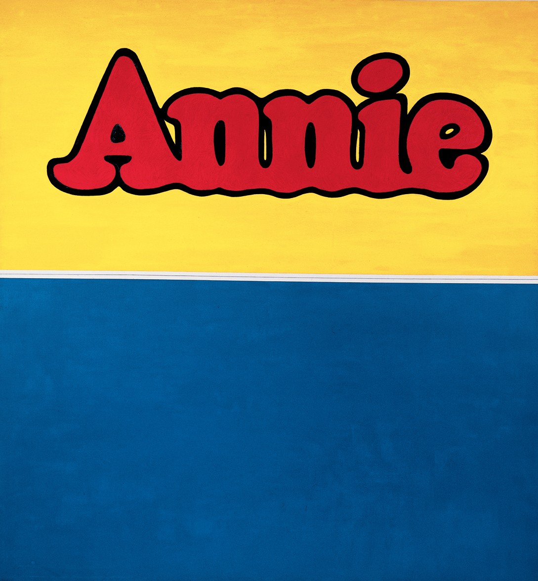
Annie, 1962, oil and pencil on canvas, 71 ½ x 67”.
BC: What was it about the Jasper Johns that was so transfixing? You talk about his work as an atomic bomb that went off inside your head when you saw it.
ER: The context was important. It was in a magazine and it was a small black and white reproduction. I was in art school, basically studying Abstract Expressionism, which was considered at that time the only real way to approach painting. Johns’s work was absolutely counter to that and, curiously, it was mostly condemned by the instructors who didn’t understand why you would ever paint a picture of an American flag. Why would anyone do such a thing, especially deadpan? They would say, “You can paint that, but it’s a symmetrical thing in the middle of the canvas. Why would you do that when you can off-centre it and make it more interesting?”
BC: Were you serious when you said that seeing that piece made you want to become an artist?
ER: That’s right. It was enough to help me see something completely different; it absolutely, 100%, grabbed my attention. The combination of those little faces and body parts, all done in that magic box method, made it really toxic.
BC: Toxic to your Abstract Expressionist tendencies, which you obviously left behind? Because in 1961 you do Boss, which looks like an homage to Jasper Johns.
ER: It probably was, with the impasto, having things lift off the surface, and making something that wasn’t flat. It had a loving impasto look to it that I look back on and see as something that can even be considered old-fashioned.
BC: There is a certain nostalgia about it. And it is so well painted. You told the art writer Willoughby Sharpe that you were dead serious about everything you’d made and it’s clear that one of the things you were dead serious about was that homage.
ER: That wasn’t a specific homage, although I did do some to US cities. When I was 15 years old, I hitchhiked all over the country and I would come to places like Sweetwater, Tennessee, and Vicksburg, Mississippi, and Dublin, Georgia—and eventually I began to make pictures out of the words of those cities. Chattanooga was another one. The word “boss” also had dual meaning. First of all, it was a label for farmers’ work clothes, really blue-collar workers’ uniforms. I think the company is defunct now. But it also had that meaning of hot, or “boss.” We used to say, “That’s so boss.” It was the early form of “awesome.”
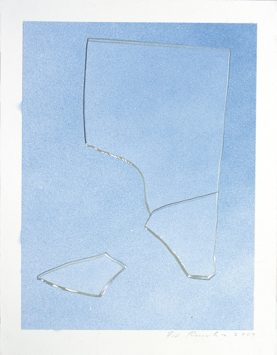
Shattered Glass #2, 2007, acrylic on museum board paper, 12 ¼ x 9 3/8”. Gagosian Gallery.
Buy #106 to read the 18-page interview!