Phyllida Barlow
Phyllida Barlow has just turned 70, but her reputation has escalated sharply only since she retired from a long and influential teaching career in 2009 and was taken on by Hauser & Wirth. Now she has the annual commission for the Duveen Hall. Tate Britain director Penelope Curtis told Barlow she didn’t have to fill the cavernous space—100 m long and 15 m high—but that’s her way, and she went as big as possible with the eight interrelated elements that constitute “dock,” giving “thanks to all for letting me let rip!”
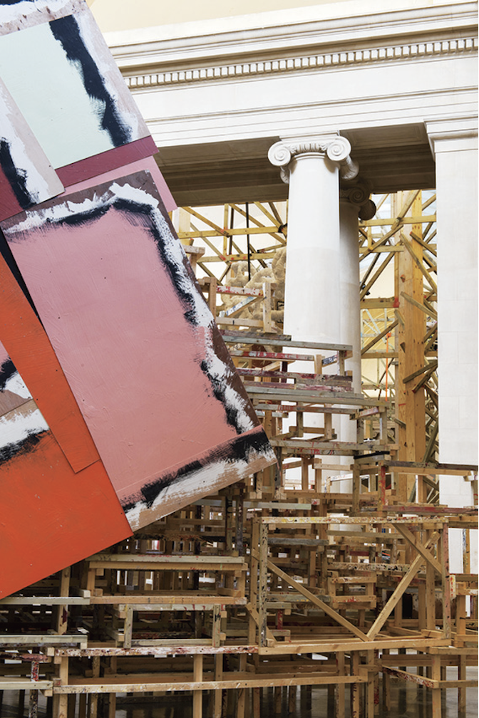
It makes most sense to start from outside, by looking for a container-laden barge on the Thames, then imagining it turns inland. On entry we’re confronted by untitled: dock: 5hungblocks, our progress impeded by low-hanging container-like forms in the typical Barlow materials of polystyrene and plywood. Next is crushedtower, a column 12 m high. It looks as if it’s just a roll of paper held together by tape, so mimicking and mocking the phallic authority of the first public gallery in Britain to be specifically designed for the display of sculpture. Then comes untitled: dock: emptystaircasehoarding, an unruly grid-come-staircase of crates, which acts as a divider and obstruction. It screens those first works off from hungprongsplastercoils and hungcowledtubes, which dangle their shapes from a ramshackle frame just ahead of crashedlintel/brokensculpture/paintedtarps, spread across the floor in an apparently collapsed version of its predecessor. Moving from putative post-sculpture to sculpture-in-waiting, 5stockedcrates presents a structure—stabilized by boulders, were they not of polystyrene—on which high shelves hold what one imagines are the typical contents of Barlow’s studio before she makes something of them. We finish with hungcontainer, a giant tube suspended horizontally. Down the length of the hall, then, the viewer is pulled into the interplay of image, material and process which is typical of Barlow. Those label styles, determinedly unassertive lower-case titles, by the way, are on the Internet but not available on site, where there is no leaflet, no titles on the wall and no staff knowledge of them. That’s a detail, but shabby in a bad way when the show is up for six months and plenty of space is found for the sponsor’s information.

Phyllida Barlow, dock, 2014. Photograph: J Fernandes, Tate Photography. Courtesy Tate Britain.
Still, it’s a dramatic and engaging journey down the hall, and immediate reaction was overwhelmingly positive. In the British national papers Adrian Searle judged its “oafish magnificence” to be “in every way tremendous” and Alastair Sooke praised how excitingly and dangerously “Barlow dramatizes the central sculptural tension between form and formlessness.” True, Waldemar Januszczak complained of “the drab, grubby, effortful, paint-splattered art-class aesthetics of the 1970s,” which he “didn’t like the first time round,” but another way of putting that is that Barlow has stayed true to her roots. The critical question ought to be, “does Barlow make anything fresh of that language?” I think she does, though she reminds me more of Franz West than of any British peers; a similar sense of hot pastel colours and lumpen shapes, and a focus on the physical encounter with sculpture—though where you wear a West adaptive, you edge past a Barlow obstacle.
So “dock’s” monumental tilt at pretension is big fun. But what underlies it? I’d say Barlow contradicts the historic expectations of sculpture: that permanent value is achieved through the control of the artist to make objects grounded in gravity which maintain an objective distance from the audience as they generate a sense of authority.
Permanent value? For marble or bronze read foam board, scrim and wadding, bought cheap from builders’ merchants; and Barlow’s rickety versions of the monumental are typically deconstructed and recycled into other installations. Moreover, “dock’s” fallen and unbuilt elements emphasize transition—as if, in Barlow’s words, the work “has neither arrived nor departed.”
The controlling hand of the artist? Barlow has spoken of how she enjoys “just letting materials do their thing—lean, collapse, and have weight….” That sense of materials behaving as they will, not as they’re made to do, is a big part of the work’s energy.

untitled: dock: crushedtower, 2014. Photograph: J Fernandes, Tate Photography. Courtesy Tate Britain.
Grounded in gravity? Much of “dock” is suspended above the viewer, occupying the space awkwardly by its refusal of the floor. The gallery’s classical heft is infested by rudimentary self-standing structures. That none of the work is supported by the ceiling or walls serves to confirm Barlow’s independent spirit.
An objective distance from the audience? The installation physically involves and choreographs its viewers by how it gets in the way, forces them to look up, and generally frustrates them: “as soon as you have an image, you lose it,” says Barlow.
Authority and seriousness? Barlow’s carnival of forms satirizes sculpture’s literally and symbolically heavier traditions. One neat irony is that, while “bigger is better” sounds like just the kind of masculine bragging she undermines, it applies to her own practice: sheer scale allows Barlow to parody the monumental more effectively, and to “divide and rule” its patriarchal space. Geometry’s rigour, too, is broken: the struts on the holding structures gesture at regularity but fall short, and though most of them perform a structural role, some are decoys, and all flirt with the decorative.
So tradition is set aside, but with such good humour it’s a tribute of sorts. If we’re looking for a means of coming to grips with the history of the Tate and giving it a place in the stream of the everyday, then “dock” is more effective than the pallid aerial film realizations provided by Simon Starling last year. Perhaps we can extend that attitude: we could do worse than live in the manner of a Barlow installation. Expanding into the space available, we’d prick pomposity, but good- heartedly; accept that life is messy—in Barlow’s words, that “our habits fight against the rituals of organization”—we’d let our inner stuff hang out; and we wouldn’t fret about how long things are going to last. ❚
“dock” is on exhibition at Tate Britain from March 31 to October 19, 2014.
Paul Carey-Kent is a freelance art critic in Southhampton, England, whose writings can be found at <paulsartworld.blogspot.ca>.

