Art Fair Carnivalesque
An Interview with Eric Fischl
The following conversation between Eric Fischl and Robert Enright was conducted by phone to the artist’s studio in Sag Harbor on August 3, 2016 as research for the Borderview “Painting Paintings” that appeared in the current Painting Issue of the magazine. Border Crossings would like to thank the artist and Skarstedt Gallery in New York for the images accompanying this conversation.
Border Crossings: You were doing paintings about the relationship that exists between artists, dealers and collectors as early as 1991 in pieces like The Collector and The Collector’s Family. What made you come back to that theme?
Eric Fischl: Since the early ’80s I had been doing paintings that have paintings or works of art within them. They were mostly dealing with people and the objects they surround themselves with. I think probably the Collector paintings were focusing on my milieu a bit more specifically. But it was writing my memoir that forced me to look at what the art world had become since I’d been a part of it and the shift it had made, which was very painful to write about. It revealed a profound level of disappointment that I had avoided acknowledging but once I did through writing the book I felt, ‘Okay, now I can focus on that’. It led to the Art Fair Paintings, which embody the egregious, bizarre, carnivalesque and tragic qualities that are the world today.

Portrait of the Artist as a Battered Head, 2015, oil on linen, 68 x 80 inches.
You’re a participant to the extent that you make things that end up in that world. Do you go there as a painter/ethnographer?
First of all, up until I decided to focus on art fairs I had never been to one. I had avoided them for reasons that were part of where I came from in the ’70s and the ’80s. One of the things we would talk about as artists was that you didn’t want to get close to or admit to the blatant commercialism of the art world. We just didn’t want to be there. It was like a cow going to check out the slaughterhouse. Then the art world began to move into the art market, art fairs became ubiquitous, and everybody was involved. It wasn’t going to go away and it was within that context that I felt I should look at it. I went as a spy. Nobody knew what I was looking at when I was pointing my camera at things; they had no idea what I might be seeing, so I was left alone. After the first show of Art Fair Paintings people started to get what I was doing and then I would find them actually manoeuvring into my camera. They wanted to be seen as part of this thing and that became a different set of problems.
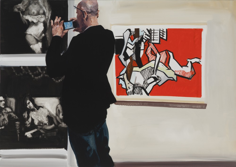
Does it matter when I look at a painting like Her if I know who the person is?
They are real people, simply because I can’t make people up, but it doesn’t matter if you know who they are. In most cases, I don’t know who they are either. I think of it as something closer to going to the movies where, hopefully, the actors become characters rather than celebrities.
One of the advantages about paintings that have the art world as their setting is that you get to paint meta-pictures. That comes up most conspicuously in “The Krefeld Project” (2004). In this kind of work how do you make the choice about which paintings, sculptures and photographs to include?
They are all meant as backgrounds that have a certain effect on the scene. In the Krefeld paintings, for example, in the dining room scene where the couple is fucking there is a Max Beckmann in the background. It’s not just any painting by Beckmann but a painting of a woman holding up a hand mirror in which she is regarding herself. She is more involved with looking at the painting of the woman looking at herself than she is in looking at him. That kind of almost narcissistic self-examination seemed like a good backdrop for a couple who were spontaneously and passionately engaged in screwing and where a particular kind of ennui was part of the woman’s experience. I also felt I should give the characters in this house an art collection and they’re German so I chose three artists who German collectors adore—Bruce Nauman, Andy Warhol and Gerhardt Richter. Also, the Nauman was his iconic neon piece from 1967 called, The True Artist Helps the World by Revealing Mystic Truths, which has such a profoundly deep irony to it, especially in the context of an haute bourgeois environment. I was playing off those assumptions and edges.

Watch, 2015, oil on linen, 68 x 80 inches.
Does an equal irony open up when you include Jack Pierson’s False Gods piece? It’s hard not to read a level of ironic observation in the title.
First of all, it was ironic for him to create the work and then for me to put it in that context was a way of reinforcing that irony. Maybe it was too buried in the painting but there is also a Sarah Lucas sculpture in the foreground, which is the lower half of a female seen from behind. On either side of this female torso there is an old man in a wheelchair looking at the sculpture, and on the other side is an eleven-year-old kid looking at the same thing. So it’s a coincidence of old male/young male regarding the female muse. Then the false gods possibly apply to the art, as well as to the adoration of the female gods.
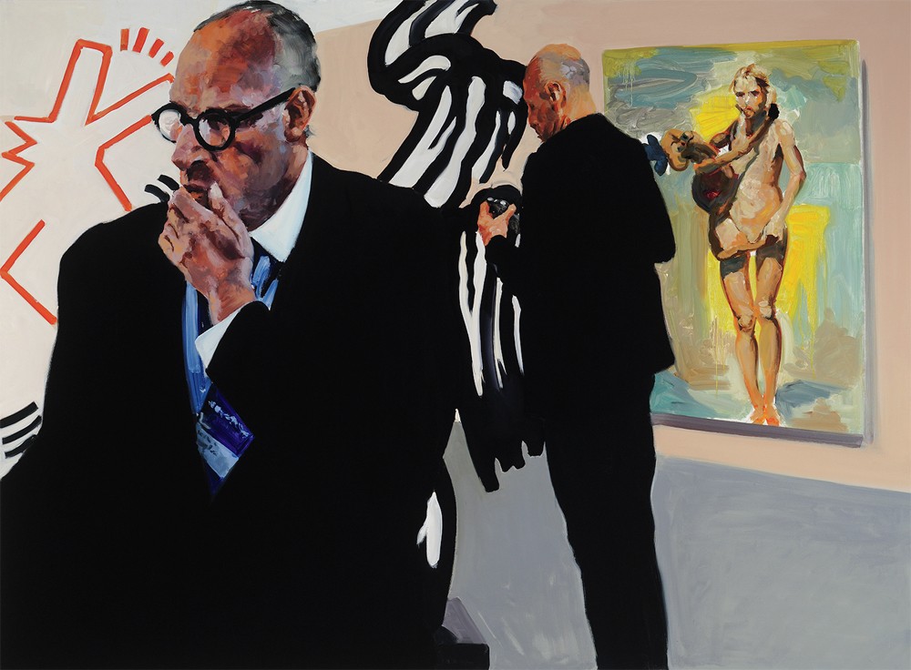
In The Disconnect, along with a Lichtenstein and the edge of a Keith Haring, you include one of your own paintings from 1987 called Girl with Doll. What does putting your own picture inside the meta-picture do?
I wasn’t saving myself from the critique. I am as much a participant as is any other artist, so I was acknowledging that. It’s also a different kind of picture, asking for a different kind of attention than either the Haring Barking Dog or the Lichtenstein Brushstroke.
In Rift Raft there are two kinds of quotation going on; there is the Warhol silkscreen and then a Christopher Wool on the left. But whose is the middle painting?
One is more closely copied from a Christopher Wool, while the middle one is more of an imitation, an idea of a Wool. But they are both within the spirit of a Wool and then there is the Double Car Accident Warhol.
I get how the Warhol might work in a painting that presents a bifurcated vision of the world. But I’m not entirely sure how Christopher Wool fits into that scenario.
Both the Warhol and the Wools are once removed. The Wools are not really Abstract Expressionist painting; they are actually devoid of emotion or emotional content. I think they are deeply cynical paintings about the emptiness of painting. The Warhol has this ironic distance; it’s simply the reproduction of a tragedy rather than a recreation of the experience. I put them in as a signifier of a decadence I feel is part of the art world.

People… Puff… Poof, 2015, oil on linen, 68 x 80 inches.

False Gods, 2015, oil on linen, 56 x 76 inches.
She says, “Can I help You?” He says, “It can’t be Helped.”, 2015, oil on linen, 48 x 68 inches.
The other kind of quotation comes in the figure wearing the orange life jacket. He looks like an aging version of one of the characters in The Old Man’s Boat and The Old Man’s Dog, or one of the predatory sailors on the beach in Pizza Eater, both from 1982. So what I see is a reprisal of figures from your own earlier paintings.
I wasn’t particularly thinking about foregrounding that but I accept the connections you’re making. If they’re there, they are intuitive. When I was painting the kid in the orange life preserver I wasn’t even aware that he could be both a child and a grown-up but both of those are absolutely part of the reading. There is an ambiguity about what he is.
The young black child with the piece of turquoise cloth across the waist and the two-part composition makes me think of A Visit to/ A visit from/ The Island. It has the same structure where you have catastrophe on one side and leisure on the other. I gather you were consciously reprising your 1983 two-part painting in Rift Raft?
Yes, that was deliberate but it wasn’t my idea. I actually hadn’t thought about reprising it at all. I had painted the art scene painting on the left and I was having dinner with Ross Bleckner. We were talking about the craziness of the art world and about what was missing from that 1983 painting and he said, ‘Why don’t you do another one?’ I thought, ‘I already have the painting it would go with’. So I went home and created the right hand panel.
Was the refugee crisis the reason it was on your mind?
Absolutely. Our global world is so complicated. I find myself in a place where I’m feeling something but I can’t connect to it. I can’t aid it in a way that would seem big enough for the disaster and it leaves me with a feeling of hopelessness as well as helplessness, and that’s a pervasive experience today. And it’s in contrast to this other incredibly privileged reality that is as emptied of importance as the other one is overloaded. And neither place is tolerable for exactly opposite reasons.
It’s a complicated world and an equally complicated painting. I want to get at the operation of your picture-making and picture-meaning. Let me ask you about the structure; the first thing is your use of black and the way it becomes a structural device; and the second is the architecture of the figures - you have a series of figural triads and quartets. On the far left there is the three black-clothed figures; there is the nudes and the bearded hipster, and then the danger and salvation section where the life-saving figures are dressed mostly in blue. The painting seems to be built around clusters of activity in a way that reminded me of Renaissance composition.
First of all, I was thinking of The Raft of the Medusa, which is what the painting’s title alludes to, as well as to the event you’re seeing. I was definitely thinking about how to compositionally structure a disaster and the device that made the most emotional and psychological sense just happened. I had never done this before; the hipster guy you’re talking about has an impossibly large hand. I wasn’t necessarily setting out to do that but I chose to leave it because the hand appears at a vortex where the content is meant to be meditated on. The enlarged and absolutely impotent tool of the hand right in the middle of this painting does two things for me. One, this desperate child is screaming for help so close to a hand which can’t move to offer help, and then the other measure of his impotence is that he’s leaning against a voluptuous naked woman, is surrounded by naked women, and is absolutely apathetic to the sexual arousal that his position should cause. By the way, those are not actual nudes. They are John de Andrea sculptures.
The women do have a posed quality that makes you think you’re observing an art class.
On the one hand it is art and sculpture and not the real thing and at the same time it is painted in such a way that it doesn’t actually signal they are sculpture so much as naked women and why is everyone not paying attention. For me, everything—the disaster, the energy and the decadence of that world—funnels down onto that ineffective hand. As a painter, I am very connected to the hand.

Rift/Raft, 2016, oil on linen, 98 x 220 inches. All images courtesy the artist and Skarstedt, New York.
When we talked about the Matisse Retrospective in New York in 1994 what stuck with me was your close attention to the way Matisse painted hands. And with the hipster it isn’t just the elongation of the hands, there is also the noticeable redness at the knuckles and joints. In the same way, you can’t avoid the intertwined fingers of the standing nude with her arms raised above her head. Those ten fingers are a mangle.
That gesture of the interlocked hands is de Andrea’s but obviously the way they’re painted knots them together in a way that is more like a weaving than one hand simply grasping another. That’s what I like about it.
One of the complications in this painting is your use of black both as a unifying colour and as an absolutely confusing one. To stay with the hipster for a moment; the relationship between his body and the black-haired nude women is preposterous. His shoulder leans into her hair and they become indistinguishable; a similar kind of inability to separate component parts happens on the left-hand leg of the child being rescued on the right hand side of the panel. His leg blends into the hair of the distressed looking women in the water. Your blacks are confusing in this painting in ways I have never seen before. Is there something that you are doing with black that is both unifying and disruptive?
Nobody has ever talked to me about my blacks, even though everything seems to revolve around the particular qualities of the blacks in these later paintings. I was painting them in a way that felt right without trying to analyse what their meaning was: is this dark enough, is there enough lightness in this black? I was working with painting issues around the blacks. At the same time I was saturating them because I wanted them to flatten out, I wanted them to silhouette and to be a strong compositional element that kept dividing the scenes.

Her, 2016, oil on linen, 90 x 68 inches.
When you mention The Raft of the Medusa it is obvious that one of the structures here is a hierarchical one where there is always a character at the top of the heap, so to speak. In the upper right, the figure’s leg leans down and creates something like an abstract space. Then there is a triangle in the water that is shaped like a shark-fin but it is hard to figure out exactly what it is.
I debated whether to take that out or not and every time I tried to block it out with my thumb I thought, no, it actually needs to be there. As to what it is, I don’t know myself. It was just something that was in the photograph I took those figures from, and it wasn’t particularly clear what it was there either. A lot of the painting process is one in which you make decisions to leave something rather than to construct something. You’re painting away and you knock something in and you build a painting around it and you never get back to it because somehow that was all you needed to get everything else going. I’m not remembering specifically my choices in that regard but there was something about that collector who was sitting there, the way he was contained, the way he was passive, the way he seemed comfortable in that place. And his head is almost dead centre, so you enter the rest of the painting through him. Part of my wondering was what would it look like if we saw the scene from his point of view.
My eye went to him and then almost automatically to the three black figures on the left hand edge because of the virtuosity of the painting. I don’t think I’ve ever seen a more beautifully painted hat than the one on the figure whose face we can’t see but who looks like a 17th century Spanish priest.
Yes, who is that person and what does he want? He did look like some sort of priest. The beauty of the art fair is that you see all kinds of people who have come as characters. I have no idea why those people were dressed the way they were but they were sitting and looking at their cell phones. Those two weren’t sitting next to each other but I put them in that relationship.
The boat looks more like a pleasure craft than a refugee boat. It is a dominant colour and has a dominant scale, especially compositionally where it sits at the top of the painting. What were you thinking in your decision about the position and palette of the boat?
It came from a photograph of a boat that had got stuck on a rock, so that was easy because I wanted a shipwreck. The boat was red but I keyed it up a lot more. I have never done anything as aggressively radical as slam that redness. It’s almost like a pendulum swing of a blade. I didn’t think I could get away with it but it worked.
This seems to me to be one of the most radical paintings you have ever done. How do you regard it?
The art fair environment is a very surreal space where you get this clash of worlds. It is architecturally and structurally temporary; and it is visually incoherent because you have these planar spaces that open up unexpectedly into another space, and sometimes into yet another space, and each of them has art in it that is mutually exclusive and contradictory. There was something else; the flatness of it took me back to the kind of abstract paintings I was trying to make as a student and never could quite handle. At the time, I didn’t know why I would do a pure abstraction. I wanted it to be more than a compositional exercise. But now with a narrative and the figures and the spatial breakup of the collapsing and contradictory push-pull space—all those things came to the fore in my memory as a particularly interesting painting problem. So it got very exciting for me.
I’m thinking of paintings from the ’90s like Call of the Ball and Brother and Sister. Compositionally those paintings were sometimes difficult to read. The compression and the scale of the parts seemed off. Something of that is going on here too, although it is the relationship between the figures and their disengagement that is striking, rather than the proportion of the figures one to the other.
In the paintings you’re referring to I was definitely trying to distort the pictorial space but it was more like I was playing around with focus length. I was trying to develop a language of focal length as a way of introducing—or re-introducing—a psychological narrative to the moment, making the figures in the background larger than the figures in the foreground. But specifically in the ‘Art Fair Paintings’ I’m dealing with a different kind of planar and compositional space, where flat shapes bang up against one another and form triangles and rhomboids and rectangles, which was more the kind of abstraction I was doing when I was a student. The other thing is it gives a sense of thinness, which is part of the emotional content and commentary I am going after. There is a thinness to it; it feels like a collapsing world.
The Disconnect, 2015, oil on linen, 56 x 75 inches.
Which leads me to your title for the show and the name of its major painting. It plays off riff-raff, the pejorative term we use for society’s undesirables and cast-offs. That reading of the title corresponds to the right hand side of the composition.
I wouldn’t make it specific to the right hand side. To me, they’re all riff-raff. It’s just two different kinds. It also plays off the literal aspect: this painting has been cleaved in half and has created a rift between two unbridgeable and urgent realities.
So the rift is political, social, cultural and aesthetic, although you see a closer relationship between the two halves of the painting than a casual looker might appreciate. They two halves could be read as being almost dialectical.
I think that structurally it is dialectical. But one thing I like about painting paintings within paintings, is that you have an artwork that sits on the wall or is in the background and it’s an artist’s projection. They are actually pushing out from the wall asking for attention. Every artist is asking for a particular kind of attention related to their feelings or their thoughts. So in my paintings you have a pressure coming from the background pushing forward. And then you have a viewer looking at the painting and the viewer is pushing back trying to meet what the artist is asking for, and they come together in that middle space in which nobody is paying attention to anything. It creates an interesting kind of disconnect, a physical sandwiching of energy at cross-purposes.
A lot of the paintings inside the paintings are about the female body; Wesselmann, Chuck Close, Carroll Dunham, you even have Helmut Newton’s Big Nudes on the wall in Her. What does it mean for the viewer to engage Dunham’s Pop sexiness in a series of paintings in which you also see the female body being dealt with in more subtle ways. I guess this is a way of asking how much pressure you want to put on the reading of the works as they push out from inside the painting?
The bottom line is that all of these paintings are about men and women and desire and fulfillment or lack of fulfillment or disconnection. In the painting with Carroll Dunham you are looking at this naughty boyish exuberance—they’re funny and energetic and sexy—and they are backgrounding an old guy, inappropriately dressed in hipster clothes as a way of looking younger, trying to connect with a young woman who absolutely won’t have anything to do with him. So those things are happening and collapsing simultaneously in the painting. In Her I should have put a question mark after the title because I think it is a male gaze that is engaging the painting. There are three different ways that the male is projecting interest in the female, the stylish Helmut Newton, the aggressive Picasso and the intelligent, funny and ironic Lichtenstein. But every one of them is about men looking at and thinking about women.
In that painting you execute a fascinating play on perspective. The Picasso literally comes off the wall and its two-dimensionality invades the three-dimensional space of the Lichtenstein sculpture. Parts of the painting are in front of the sculpture.
That mash-up of those two is probably the closest I will ever get to a Vuillard. It is one of the most exciting passages that I’ve ever painted. I love the way those two things work together, the way they congeal, separate, and fight each other.