Wanda Koop
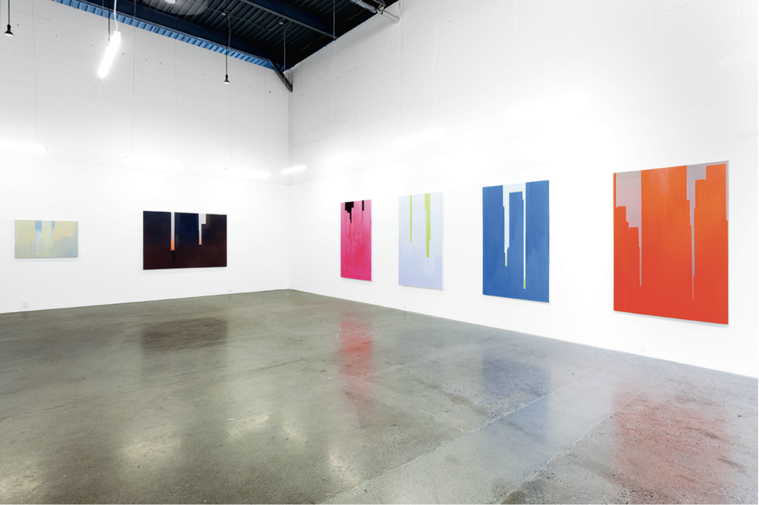
It is fitting that Wanda Koop’s work, which has consistently embraced the possibilities of scale along with its aspirations, be encountered in a space like the massive Toronto arm of Montreal’s Division Gallery. Especially when one considers the subject of her new series: close-cropped views of high-rise architecture. All of the works in the show—a staggering 55 paintings in total (all dated 2016)—are titled “In Absentia,” framing the assembled works as a cycle. Together they represent a year’s worth of intense studio activity spurred by a four-month residency in New York City.

Wanda Koop, In Absentia (Ivory - Deep Purple), 2015, acrylic on canvas on stretcher, 54 x 78 inches. All images courtesy the artist and Division Gallery, Toronto.
While the subject common to all of the works in “In Absentia” is ostensibly the city and its buildings, there is hardly a skyline to be found, and this to my mind is a good thing. Instead, Koop has trained her gaze on the much more ineffable atmosphere around, between and in many cases, within the mammoth structures many now call home. Most often these interstitial spaces appear as vertical slivers of sky that play ground to the skyscraper’s figure. However, the fact that these “zips” (to borrow a term from Barnett Newman, whose oeuvre surely serves as one of Koop’s models here) occupy far less visual real estate than the towers themselves should not indicate a privileging of the latter over the former. Koop’s achievement in these works is that she has placed the viewer in a direct relationship with both the forms of the city—large, impersonal facades—and with the feelings evoked by these forms: the possibility of a life amidst such aggregations of power and capital. Her atmospheric interruptions into these monoliths speak to her “prairie soul;” her investment in a sliver of sky, no matter how attenuated.
The press release accompanying the show makes reference to New York real estate developers including “air rights”—a sales pitch euphemism for high-rise condo views—in their descriptors. It goes on to cite the planned confusion between the real and the virtual in the modern city, which is designed to inflate both property and prosperity. For an artist like Koop, who is grounded in the realities of a studio-based painting practice (the pigments, brushes and the real sense of touch), the virtual view has long proven to be a fruitful subject, as it offers her a means of reflecting on our current world with the old medium of paint on canvas. I’m thinking here of her numerous works that offer landscape views mediated by long distance targeting and surveillance devices. But then again, painting has trafficked in the virtual view— the picture window—ever since the invention of the moveable support. And this remains largely true no matter how much some proponents of abstraction would have it otherwise.

In Absentia (Ultramarine Blue - White), 2016, acrylic on canvas on stretcher, 20 x 16 inches.
Almost all of the works present architecture as fragmentary closecropped silhouette, with few instances of a building that is contained within the frame of the work. The result of this is that the architecture of the painting—the right-angle framing edge of the support—becomes a key feature of these works. In terms of their manufacture, like Koop’s best work, the majority of these pieces read as pretty close to “one-shot” paintings (to borrow a phrase from Kenneth Noland) in that there is very little fuss and a great economy of means; this is all the more impressive given the scale of the works, with the largest being 10 x 13 feet, and many in the range of 5 x 7 feet. Among the largest, In Absentia (Horizon Orange – Shadow Grey) is a monument of bruised warm greys, its stained surface appearing to have been achieved in the first watery pass. In many of the works, superimposed washes of acrylic paint—as many as 30—work hard to deliver a subtle incandescence, while avoiding histrionics. Koop’s favoured mood seems to be a lovely evening gloaming, evoking a strong sense of atmosphere suffused with a sense of possibility and longing. At other times the crepuscular veils can be read as that same atmosphere tipped through the looking glass of modern architecture’s mirrored facades. Aiding in this aim is Koop’s sure hand with colour, along with her subtle tweaking of figure and ground, again executed on the quick.
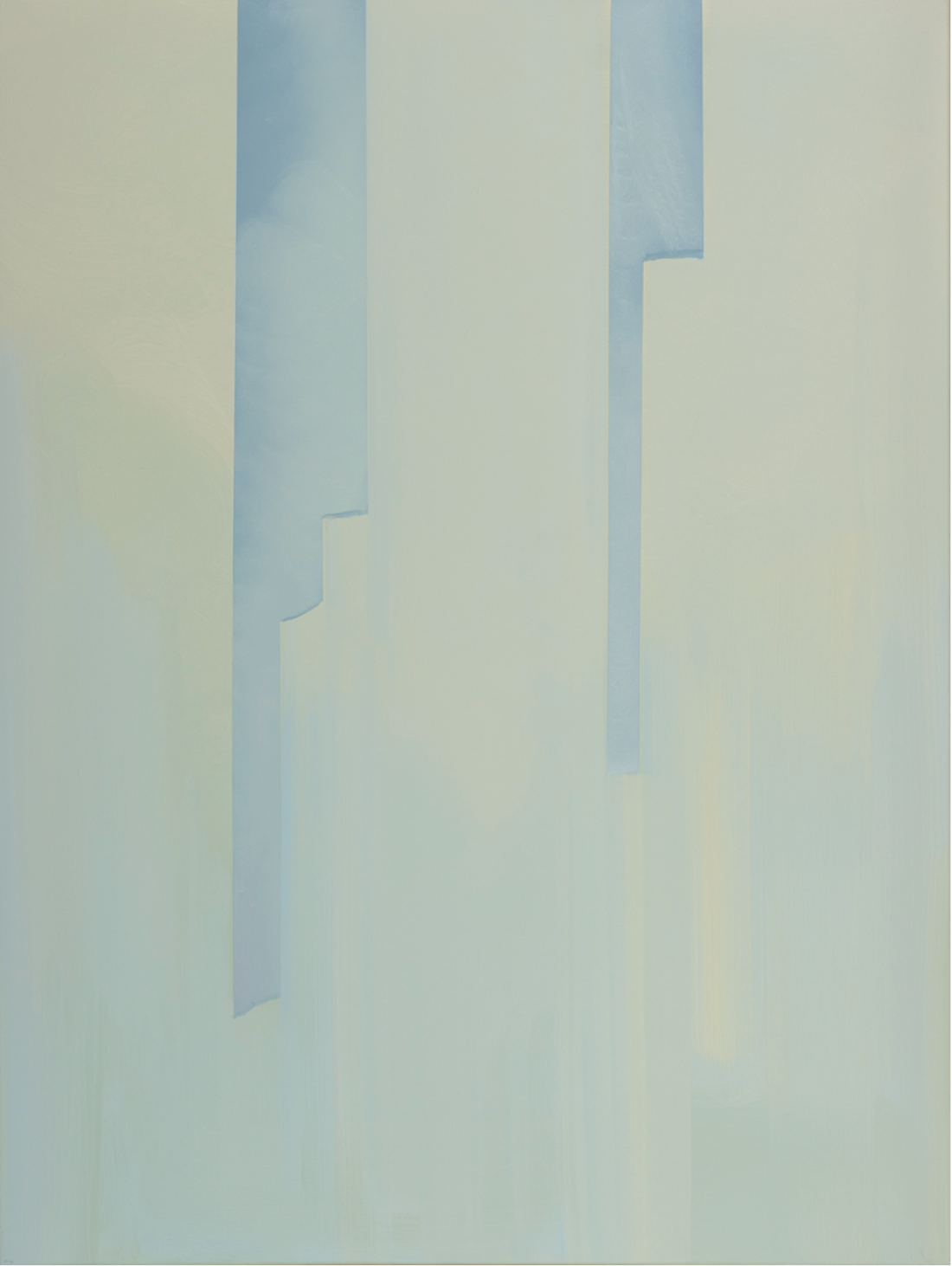
There are many moments when the spaces around the architecture seem more “there” than the buildings themselves—a phenomenon aided by her use of fragmentary compositional strategies. Nowhere are these fragmentary forms more on display than in the near pure abstraction of a number of pieces encountered near the entrance, In Absentia (Amber — Deep Magenta) being a good example. This, and a few other works like it, feature little more in the way of pictorial incident than two or three vertical runs situated at opposite edges of the picture’s surface, inscribed in an otherwise near uniform, barely perceptible tonal gradation of colour. It’s a nice curatorial play, with the more radical iterations of the series placed near the entrance where they risk a little disorientation. Koop’s claim in this work, to the full space between representation and abstraction within a very tight set of formal constraints, is exemplary. There is much that younger painters, who too often try to generate too much heat from what, by this time, has become a pretty thin program (representation combined with abstraction!), can learn from Koop, who navigates the broad expanse between the two great poles of painting with conversational ease. Her method shows trust both in constraints and process, and in the give and take that goes on in the studio.

In Absentia (Misty Blue), 2016, acrylic on canvas on stretcher, 40 x 30 inches.
A less sure curatorial hand is in evidence in the final room of this labyrinthine show, devoted to a large collection of what the artist calls “notes,” small paintings exploring ideas quickly dashed off, or what to me first seemed to be a series of experiments going off in all imaginable directions at once. While I can see the appeal of such a move, and I enjoyed the generosity of being let in on the process, overall I found the room to be in need of either parsing, or a clearer curatorial structure that would serve to anchor the evidence of so many racing thoughts.
That being said, there’s a charming miniature work on hand here that betrays the drive at the heart of “In Absentia”—that of the young artist wishing for a life in the big city. The work in question—Note for In Absentia – Nocturnal is the only work in the show that relents on the otherwise favoured strategy of close-cropped fragment. Instead we are treated to the postcard view, cursory to be sure (and better for it), but tourist-worthy none the less: a night scene measuring 22 x 30 inches, with a skyline’s worth of gridded city lights quickly stippled onto an inky ground. It shows an old idea: the city as a collection of jewels, crowned here no less by the Empire State Building. Including this “note” in a show comprised of so many tough, forward-thinking works is a generous move, made by an artist known for both rigour and generosity. ❚

Installation view, “In Absentia,” 2016, Division Gallery, Toronto. Image courtesy James Limit Photography.
“In Absentia” was exhibited at Division Gallery, Toronto, from August 27 to October 8, 2016.
Mark Neufeld is an artist working in Winnipeg, who teaches at the University of Manitoba School of Art. Most recently, he exhibited May 6 1908: A Film Adrift in The Cosmos at the Kamloops Art Gallery, as part of the exhibition “Ideas & Things,” and Re-Enactments at Gallery 1C03, University of Winnipeg.

