The Shape of Colour: Excursions in Colour Field Art 1950-2005
Barnett Newman was a proponent of minimalist painting, and Mark Rothko of colour field expressionism. But “The Shape of Colour” at the Art Gallery of Ontario has something to say you don’t already know. You think that a colour field show would be all painting, all blinding colour. But think again.
Colour field art, we know, saturates the unprimed canvas with pure fields of colour that emphasize chromatic contrast. The movement hit its peak in the mid-1960s, but got swallowed up by the minimalism and conceptualism active around the same time. This exhibition doesn’t necessarily opt for revenge, but instead provides a lively discourse that plays between historical and contemporary works, looking ahead at the combinations of both. Making direct reference to Clement Greenberg’s formalism as restrictive, this large-scale group show, which includes 36 artists, breaks out of the all-too-familiar modernist criticism and lets the colour do all the talking. The AGO has gone full circle in bringing back elements of Greenberg’s “Post-Painterly Abstraction” exhibition from 1964 to show that colour field abstraction is not all about formalism.
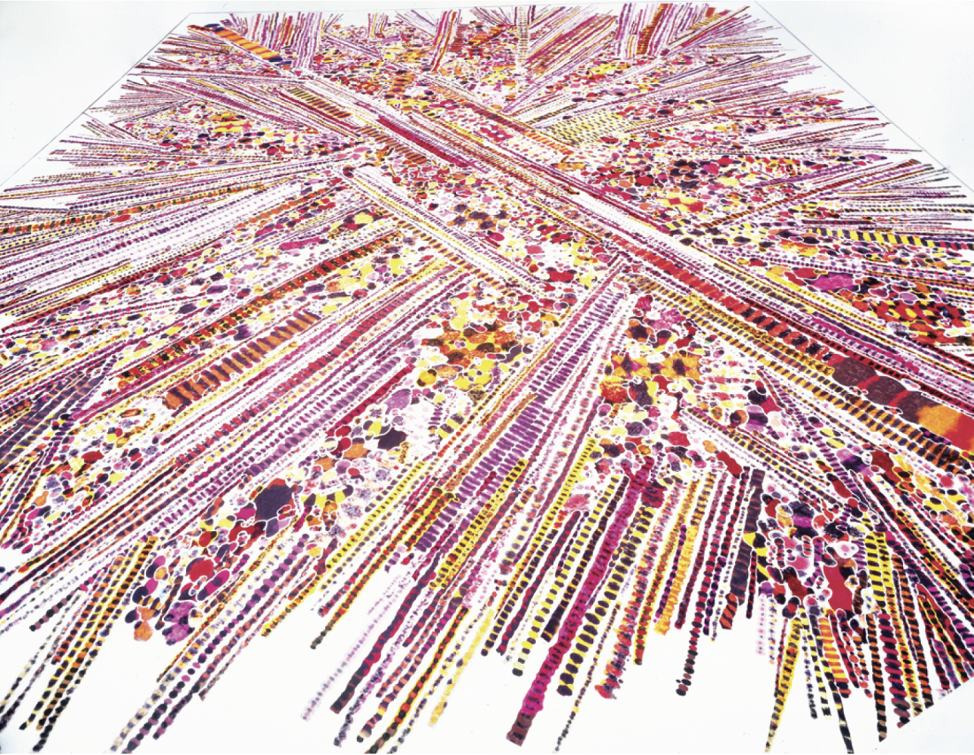
Polly Apfelbaum, Sun Club, 2002, synthetic velvet, fabric dye. The Carol and Arthur Goldberg Collection, New York. All photographs from “The Shape of Colour: Excursions in Colour Field Art 1950-2005,” Art Gallery of Ontario. All photographs courtesy the AGO,
Peter Halley’s Red Cell with Conduit is clearly representative of the Neo-Geo movement that materialized in New York City in the 1980s. As he did in an early painting, Halley employs electric, fluorescent red, geometric lines to connect prison cells and conduits that refer to social and architectural diagrams. By using Roll-a-Tex as a material under the paint, his work, reminiscent of stucco ceilings, makes a connection to the human-made commerce system. Halley’s work demonstrates how the radical simplifications of Minimalism began to rebuild form and content.
Like Halley, Yves Gaucher makes strong connections to minimalist abstraction but Gaucher engages colour in different ways, exploring monochromes as modular planes and octaves. He uses the background as an open field, rather than as a rigid, topographical structure. Music is a stimulus for his paintings (making connections to the sounds of Anton Webern). With his comprehension of rhythm and colour, he is noted for humanizing abstraction. His painting in greys and icy blues takes uniformed tones and makes them fresh again.
Fred Sandback’s yarn construction uses the white wall in the same way the raw canvas was utilized in colour field abstraction—to saturate space. The salmon pink and aqua blue yarn in Sandback’s piece frames selected rectangular perimeters of the gallery’s white walls. His minimalist inclinations lend themselves to the absence of decorative qualities and lean away from the traditionally defined media of Frankenthaler, Still and Gottlieb’s oil on canvas work. Sandback introduces the conceptual advantage and meaning in Minimalism and shows, with his yarn rectangles, the weightlessness that accompanies the lack of materiality.
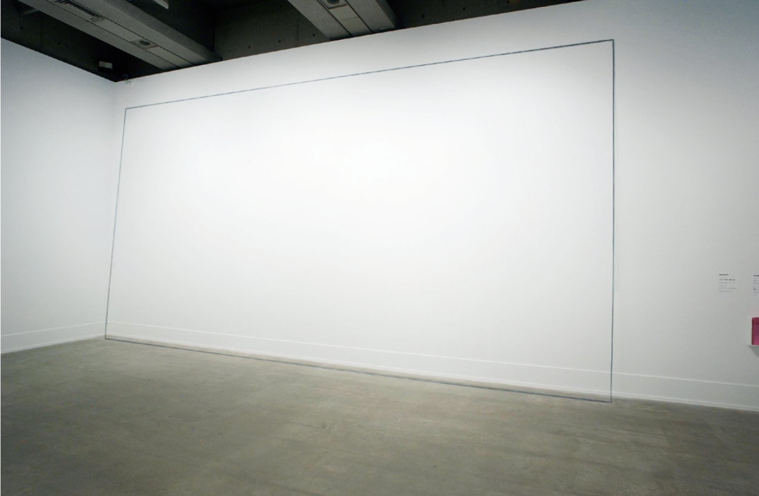
Fred Sandback, Untitled (Two part Construction), 1983. Courtesy Art Gallery of Ontario and Sean Weaver.
Conceptual ideas are connected to the practice of painting with Agnes Martin’s The Rose. Martin’s piece is an unusual one, where she uses pencil on canvas with a deep red overlap on the grey lead lines. Martin sparingly employs symbols of passion in her work, leaving surfaces as minimalist experimentations combined with poetic sensibility. This work opens a new facet to her mysterious personality.
Polly Apfelbaum’s velvet cutouts gently overlap one another on the ground to create a large installation floor painting. Much like the traditional colour field staining technique on raw canvas, her pigment dye leaves marks on the shimmering velvet. Rather than using a repetition of circles or sticks of fabric, Apfelbaum combines small fragments of material with long, braid-like strands of ribbon. She tests the dependence of the wall by neglecting its use, combining painting and sculpture in a meticulous way. On the surface, they look luscious. Up close, they open up to a complex structure of organizing and arranging paint into pieces as integral elements of her construction.
Toronto’s Anitra Hamilton challenges the broken-record history of Abstraction by coding her stripes with military ribbons. As the exhibition’s curator, David Moos, says in his arresting catalogue essay, “Deriving her colour combinations from various military medals of the world’s armies, she presents elongated renditions of war decorations as a critique of formalism. The painting operates in the gap between form and content, making the understanding of the work contingent upon the realization of larger narratives.”
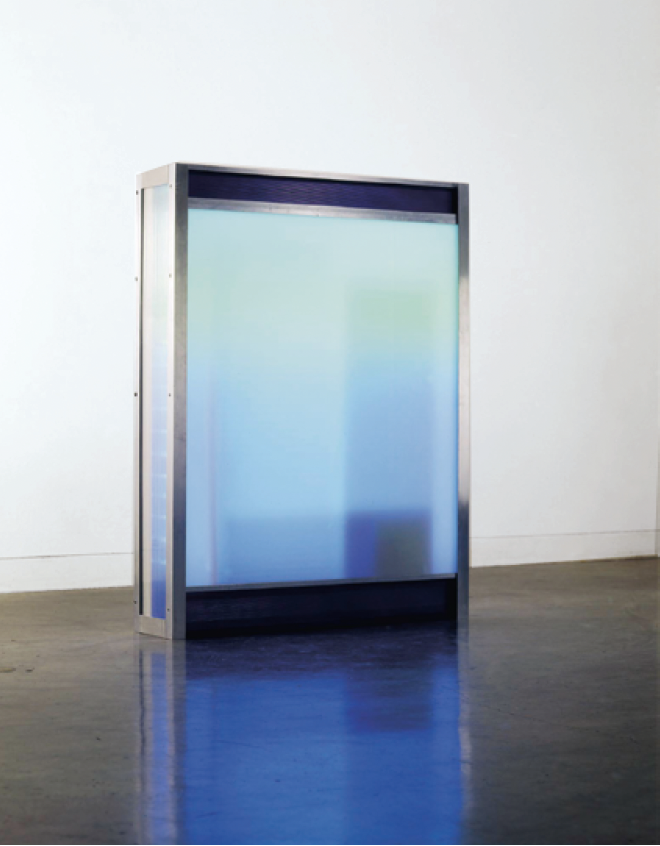
Robert Youds, I Feel the Air of Another Planet, 2004, neon light and transformers, Plexiglas, polycarbonate, aluminum, steel, plastic. Courtesy of the artist.
“The Shape of Colour” leaves open the discourse about American and Canadian Abstraction. (Of the 36 artists included in the exhibition, nine are Canadian.) “The Shape of Colour” embodies the outer-dependent nature Abstraction currently has, clinging to culture, politics and the digital world as a reflection of our current existence. Although the show uses a large visual vocabulary, it recognizes painting as a central touchstone of contemporary art. The meaning of colour is extended by the mediums taken to express it.
With the stucco, velvet, slick and stained surfaces, the show encourages a tactile relationship with colour. It also lets art theory take a back seat so our eyes do all the talking. Artists reclaim the critical authority in this show, providing an opportunity for an open discourse without the constraints of art criticism’s created tastes and histories projected onto the work. And artists do speak for them-selves. As Mark Rothko once said, “Tradition of starting with drawing is an academic notion. We may start with colour.” ❚
“The Shape of Colour: Excursions in Colour Field Art 1950-2005” will be on exhibit at the Art Gallery of Ontario in Toronto from June 1 to August 7, 2005.
Nadja Sayej is a journalist, artist and MFA student at Hunter College in New York City.