The Art of the Book: The Four Humours Press
The Four Humours Press is committed to excellence in book design and production. In this concern the press continues a tradition of fine printing which emanated from William Morris’s concept of the book and developed through the private press movement.
The movement began in response to the dismal state of nineteenth century book design. Unimaginative use of printing machinery spurred on by relentless competition had produced a majority of drab, badly-spaced, and under-inked books. Reacting to this ugliness and seeking scope for the standards of the arts and crafts revival William Morris established the Kelmscott Press in 1891.
Privately-owned presses had, of course, existed before Kelmscott. The aristocratic and hobby or pleasure presses had flourished throughout the eighteenth and nineteenth centuries. It was the magnitude of Morris’s experiment which inspired the private press movement.
Morris’s concerns were aesthetic and not commercial. He wanted to print the most beautiful books possible and, predictably, he turned to the incunabulist printer for his model. Central to his concept was the necessity of retaining absolute control over all the art and craft aspects of the book making process. Morris designed three proprietary type faces, reinstated two facing pages as the basic design unit, acquired the finest handmade papers, inks and binding materials, and insisted on superior bindery and press work. The Kelmscott books have been described by Holbrook Jackson as “museum pieces, typographical monuments — beautiful and ineffectual angels beating in the void.” Clearly, Kelmscott did not point the way typographically. Morris’s impact lay, not in his choice of the medieval book as his ideal, but in his demonstration that whatever kind of book one chose to print, it could be printed beautifully.
There was some direct imitation of the Kelmscott ‘monuments’ by the private presses which appeared in England, America, and Europe but many applied Morris’s level of production to a different kind of book, one which is notable for a restraint of design based on the arts and crafts concept of fitness to purpose. The books of this period employ typographical design to communicate, rather than intrude upon, the author’s thought and image. They are void of ornamentation, relying instead on clarity of type, excellence of design and quality presswork.
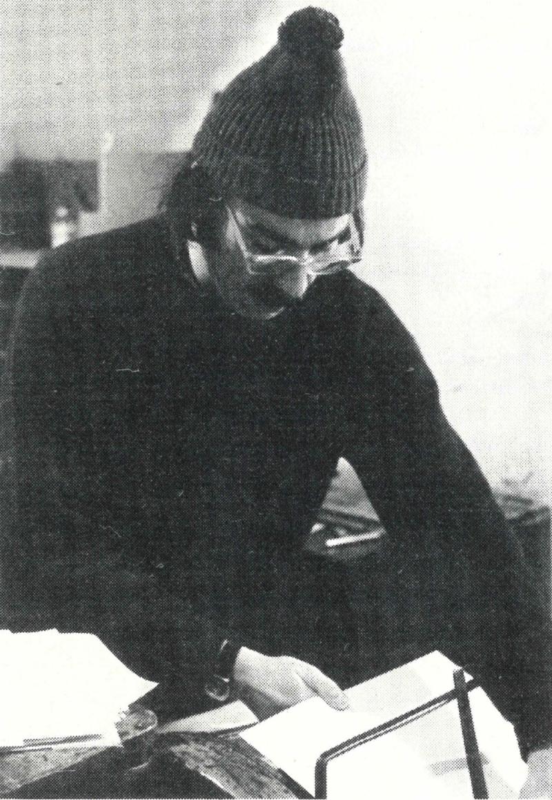
Myron Turner feeding paper at the Chandler and Price 8 x 12 Gordon Press. - Photo by Brian Hirsch
The post-Kelmscott private presses directed the printing revival towards the everyday book world of the twentieth century. Many of the best typographical designers — among them Bruce Rodgers and D.B. Updike in America, Eric Gill and Stanley Morrison in England — found in the private press movement a vehicle for experimentation. Private press books became recognizable if not always recognized standards to the commerical printer. In turn, improved printing materials and the best of the traditional and modern type faces became more readily available.
Many of the later private presses were defined by literary as well as aesthetic objectives. Rejecting the earliest presses’ fascination with the classics, they produced books of which no edition was in print, or of contemporary authors, often the little known and the experimental.
The Four Humours Press was established in 1972 by Susan and Myron Turner. They were impelled into the private press movement — one which is surprisingly underdeveloped in Canada — by both an ideal about books and a desire to create a publishing outlet for Canadian poets. All editorial, design and craft functions are performed by the Turners with the exception of bindery work which is done by hand commercially. Although Myron Turner had an editorial background neither he nor his wife had previous design or printing experience, their education developed as they went along — an education which they feel is a continuing process. The private press movement is traditionally made up of amateur craftsmen and the Turners welcome this classification realizing that this allows them a freedom of scope unavailable to the professional.
Between 1972 and 1975 the Turners produced three books of contemporary poetry at the Press. This was a period of fundamental exploration, of discovering the possibilities and limitations of their printing equipment and of studying and experimenting with various approaches to typographical design. In each of the books printed during this time the Turners tested the dimensions of traditional typographical design and handcraft techniques in an attempt to establish viable points of reference upon which to base future productions.
The Press’s first book, Myron Turner’s prose poem The River and the Window was begun in early 1973 and took 7 months to complete. It is printed — at times a bit lightly — in black ink on deluxe book paper on a Chandler & Price 8xl2 Gordon press, the press used for all the Four Humour books to date. The type is 11 point Baskerville, an 18th century transitional face decided on by the Turners for their initial production after a careful examination of type specimen books. The problem of giving to a prose poem the look of poetry is solved by setting the lines with an open 4 point leading. This retains the feeling of poetry more successfully than standard close line prose spacing and combines well with the overall vertical stress of the type to give the type page an open and flowing texture. The title page, designed by Edward Dore, is printed in brown and black. It utilizes display Baskerville and nicely introduces the symmetrical typographical style of the book. The rhythm of the preliminary pages is, however, broken somewhat by the use of asymmetrical design for the cover title which is placed at the foot of the book. Mark Nisenholt’s line drawings harmonize extremely well with the type page and are very competently printed.
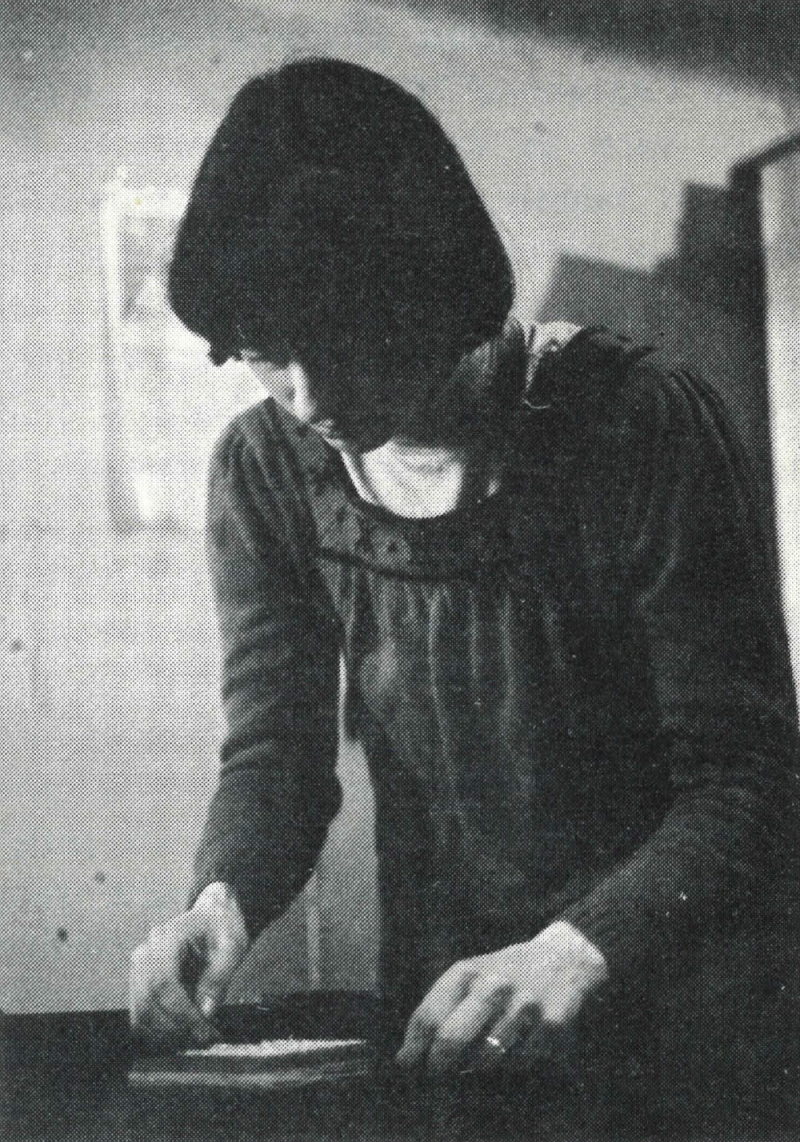
Susan Turner tying up a page of type. - Photo by Brian Hirsch
Kenneth McRobbie’s What is on Fire is Happening, the Press’ second book is set in Goudy Old Style, a Venetian design created by F.W. Goudy in 1914 and modelled on Renaissance lettering. It is a wide, curved face with surprisingly short descenders. This results in a page which is, at times, rather heavy and would benefit from larger margins, a feature which is, unfortunately, impossible with the bed size of the Turners’ Chandler Price press. Titles are set in Italic with the text in Roman, an arrangement which is quite effectively reversed for the contents page. The italic face is light and relatively upright and a cursive ornament is employed with the poem titles to supply additional weight. While this allows for needed contrast, the use of this ornament is occasionally obtrusive, particularly when joined with the roman title printed in red and nicely balanced between the author’s name and imprint in black. Illustrations by Tom Lovatt complete the book. Although the Turners experienced some press difficulties while working on McRobbie’s book, the eventual run is the largest yet produced by the press. Improved presswork is evident throughout in a blacker and more consistently printed type page.
Traditional design elements are used with increased familiarity and control in Andrew Patton’s Poems and Quotations. For this book the Turners chose the humanist Centaur type face combined, as is usual, with Arrighi Italic. The former, designed by Bruce Rodgers in 1914, is modelled on the 15th century type face of Nicholas Jenson and is quite decorative, as is the italic, which is notable for its calligraphic terminals and occasional swash character. The large initial letters were designed for the book by Margaret Tettero who also supplied four illustrations. Separate page grids are used depending on the length of the poem and although the integrity of the two page design unit is not violated, a disturbing interruption in rhythm results because of this layout technique. The type page is printed in blue and has a silky delicate texture which combines well with Tettero’s fine line drawings. There is an overall impression of gracefulness reminiscent of 18th century French productions. The harmony is a very delicate one which does at times lapse into a conflict of excessive decoration. Yet the page, when successful, is extremely powerful, the first poem being particularly effective with its sharp black illustration above a small area of clear blue type — clearly the best page produced by the Turners up to that time.
After the completion of Andrew Patton’s book the Turners left Canada for a year’s residence in England. By doing so they came into direct intercourse with the roots of the private press movement, an experience which served to expand and refine their art and craft perceptions. If in Canada the Four Humours Press existed in virtual isolation, in England the Turners found themselves immersed in a culture which maintains the highest regard for the minor arts, a regard evident in the accessibility of traditional and contemporary book work and in the quality of everyday graphic design. Throughout the year Susan Turner attended design courses at the London College of Printing, gaining there a fresh sense of modern typographical design and its application to the book. It was a period of transition, of developing design sophistication and a sense of the validity of hand craftsmanship — perspectives which are clearly reflected in the Press’s most recent production, Douglas Smith’s Thaw.
Thaw is set in 11 point Baskerville, with poem titles in Baskerville bold, a combination which sets off the titles admirably while retaining the overall texture of the type page. An interesting design feature is the use of Gill Sans and Gill Kayo display faces. While the Press’s earlier books employ the same face for both text and display, in Thaw the display types are sans serif — contemporary faces with very little stroke contrast. The text is printed in black ink warmed up with slight amounts of red, resulting in a black which blends into the warmth of the off-white page. The display types are printed, with a single exception, in blue, by far the most extensive use of color to date. The successful utilization of color and diverse type styles is evident on the contents page. The title in blue Gill Kayo harmonizes magnificently with the black Baskerville bold of the text, supplying necessary contrast without overwhelming. The design of the title page is asymetrical and is printed in blue except for the authors name in black, this element emerging from the cool background as a very effective focal point. Two sizes of Gill Kayo and one of Gill Sans are used on the title page and are very competently balanced. Like the typography itself, the illustrations by Suzanne Gauthier reflect the surrealistic style of the poetry — what Smith has called his ‘surprising reality’ — and harmonize nicely with the type page. They are beautifully printed from the wood cuts. Indeed, the printing throughout is of good tone and consistency, a result of the Turners’ experimentation with the handpress double rolling technique. Thaw is the first of the Four Humours books which was completely visualized before production. With its completion the Turners have achieved a unqiue typographical voice.
The Press’s forthcoming book William Latta’s Drifting Into Grey will be completed during the summer of 1977. During its production the Turners are exploring a number of new hand press techniques.
Brian Hirsch, a librarian at the University of Manitoba, Elizabeth Dafoe Library, has an interest in rare books and is currently at work on a biographical directory of 19th century Winnipeg printers. Since the fall of 1976 he has assisted with hand type setting at the Four Humours Press.