Taking the Polymath Test
Chris Cran and the Pleasures of Looking
Chris Cran, the Calgary-based artist, educator and arts advocate, is a picture-making polymath. There is no visual language he doesn’t understand well enough to mimic, transform, redirect and dismantle. At various points in his distinguished 35-year-long career (which is being recognized in May of 2016 with a retrospective at the National Gallery in Ottawa), he has performed all these functions. Cran has made art making, particularly painting, a pursuit coloured by his uniquely inventive and playful intelligence.
Cran first came to public attention with a virtuoso series of self-portraits begun in 1984 and which continued for another five years. Their combination of wit, art historical awareness and skilful rendering made them irresistible. His occupations are various; he joins combat nymphos in Vietnam, reflects on eye and nose charts, visits art galleries, watches television and reads famous books. In one self-portrait, he accepts a cheque for the commissioned painting we are looking at. The painting becomes a meta-presentation. In Double Self-Portrait – Wanting To Know What I’m Doing Home So Late, 1987, we see him as both penitent husband and interrogating wife; the latter holds an alarm clock in front of her like a weapon. Cran moves effortlessly from quotidian domesticity to artful appropriation. In Two Portraits Of The Artist By Andy Warhol, 1987, he masquerades as Warhol to paint himself in the serial style of Warholian ‘Pop.’
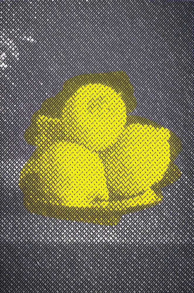
Chris Cran, Lemons, 2014, acrylic on canvas, 60 x 40 inches. Courtesy the artist and Wilding Cran Gallery, Los Angeles.
The humour in the self-portraits was decidedly self-reflexive. Cran created a persona whose good-natured ineptitude became a visual signature. (In Self-Portrait Practicing Signatures, 1989, it was an actual signature; we look over his shoulder and see him trying out four different styles of handwriting.) In 1985 he is seen from behind plugging his ears to avoid the aftermath of witnessing a man shooting himself in the foot; two years later he enacts the same gesture watching a huge mushroom cloud forming on the prairie horizon line. An identical pose draws our attention to what is funny and what is final; the subject of his self-portraiture is comfortably nonsensical and nuclear.
Cran’s subject matter has been consistently wide-ranging; the painting called Diamonds and Hamburgers, 2005, accurately frames the possibilities. He paints humans and animals, sculptures and cartoon characters, halftones and whole forms, picture frames and muscled arms. He works through inherited pictorial genres, including portraiture, still life, landscape and abstraction, and he borrows unapologetically from artists he admires. That use can be direct (as in Warhol and Max Beckmann); or it can be tangential (as in Ed Ruscha and Gerhard Richter).
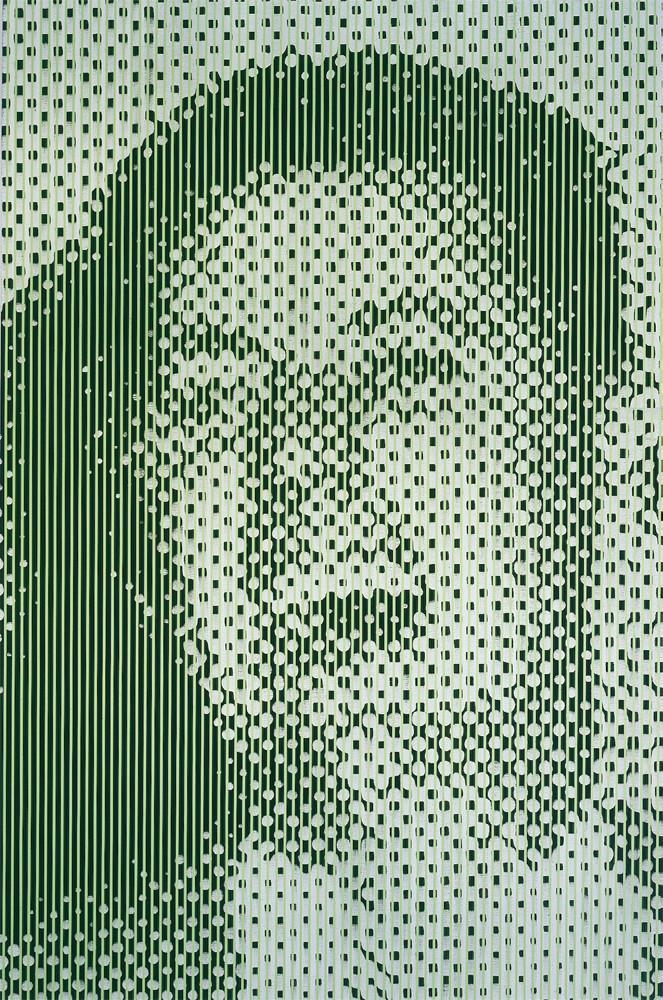
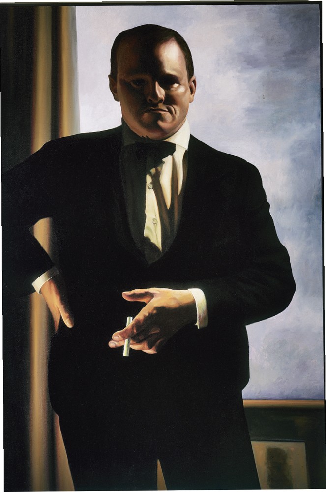
Large Green Laughing Man, 1990, oil and acrylic on canvas, 108 x 72 inches. Collection of the National Gallery of Canada, Ottawa. Photograph: Doug Curran.
Cran’s practice is to take what he calls “those old, square ways of making pictures and try something new with them.” Boat Face, 1993, an oil and acrylic on canvas, shows a simple yellow-lined schematic of a sailboat drawn over the head of a man. The nine lines that make up the boat also form a face, registering a portrait in two modes. A dozen years later in Boat on Still Life, 2005, he places a black-lined, slightly more complicated schematic sailboat over an orange still life, which is already situated behind a screen of stripes. This boat has a pair of gulls above it, turning the boat into a childlike drawing of a smiling face. The painting is an exercise in layering: a simple child’s drawing over a still life interfered with by a screen of narrowly separated vertical lines becomes a physiognomy. In House Head, 2009, he will exercise yet another variation: the windows of the house are eyes, the door a mouth and nose.
Similarly, he will make seductive, large-brush abstractions in Blue Abstract, 1993, and then return to the idea and the sensuousness 12 years later in Pink Abstraction, or in his Untitled Abstractions, 2005. His toggling back and forth in time invites us into what he has elsewhere characterized as “the delicious pleasure of noticing.”
While Cran encourages us to look, he rarely helps us in our perceptual gambit by letting us know exactly what is it we’re looking at. He is committed to what he calls “the simple principle of confusing the eyes.” Of course, he is aware that what we see shapes what we think, so while the principle might be simple, the effect is not. Yawner and Singer, 2004, offers a simple example of this intentional confusion. The painting is comprised of two identical circular panels in which a man wearing a hat is doing one of the two things identified in the title of the painting. Or he’s doing both. Cran creates a situation in which as viewers we are inescapably implicated in a playful epistemology of doubt. He relies on us to read the work. He regards a painting as a “mute apparatus,” the meaning of which is imminent but not declared. It is our role to decide what the work is saying. We give it voice; we make the apparatus speak.
Locating the best place to see that voice is one of the tasks Cran’s work sets for us. Because of the perceptual ambiguities embodied in his work, the devices of interference he employs and the scale of the larger works, we are obliged to move around the gallery in search of the location and perspective from which the paintings can be read. We keep asking ourselves, what are we looking at; what do our eyes tell us that our head questions? The answer is simply a question of the image coming into focus. For Chris Cran, “focus is equivalent to meaning.”
Chris Cran will have two major exhibitions in the fall: “Chris Cran” at the Art Gallery of Alberta, co-curated by Catherine Crowston and Josée Drouin-Brisebois of the National Gallery, from September 12, 2015 to January 3, 2016; and “Inherent Vice” at the Southern Alberta Art Gallery, curated by Ryan Doherty, from September 26 to November 22, 2015.
The following interview was conducted by phone to the artist’s studio in Calgary in June of 2015.
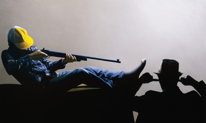
Self-Portrait Watching a Man About to Shoot Himself in the Foot, 1985, oil on canvas, 54 x 89.75 inches. Collection of Glenbow Museum, Calgary. Photograph: John Dean.
Border Crossings: How did you become a painter?
Chris Cran: When I was 19 a friend of mine, Herald Nix, encouraged me to try painting and I got hooked by the smell of turps. I had never been interested in making art when I was a kid. I was more interested in writing. But I had moved from Salmon Arm to Toronto and had started what I thought was going to be a career in film-making. I got a job as an assistant cameraman which I did for three years, but I realized if I was going to do something creative it wasn’t going to be with other people. All that time I was painting on my own as well. Then I came back to Salmon Arm, got together with an old friend who had three kids, we got married and had another child. Then in 1974 another friend of mine who was going to the Kootenay School of The Arts came through and saw my paintings and said I should go to art school. So I did.
Did you develop a quick facility for being able to render images?
I did. I had a friend, also in Salmon Arm, named Steve Mennie who was a painter in the manner of Alex Colville and he showed me some techniques about how to do realist painting. When I was in art college I had six kids and needed to make extra money, so I began doing portrait commissions. In my second year Elvis Presley died and some people I knew contacted me to do a cover for a quick book they were writing called Elvis, A View from the Stands. I had two weeks to make a portrait of Elvis, so I put an image of him singing at a microphone with the crowd behind him in his hair. The book came out and immediately the message got out that if you touched an Elvis image you would be sued, so the book disappeared. But I had some good training doing that kind of stuff. I also tried a lot of other things all through college. I remember in my final year Ted Godwin came through. I had three canvases on an easel and he asked, what are you going to do with these? and I said, I’m going to write on them with a cake icer. His response was, take me to the next person.
Self-Portrait as Max Beckmann, 1986, oil on canvas, 54.5 x 38 inches. Collection of the University of Calgary at the Nickle Galleries, Calgary. Photograph: John Dean.
What kind of work were you doing when you were in school?
My second year was an important one. I had an instructor named Frank Verwoert who taught a perceptual method of painting. It basically used your entire scopic field, almost like a paint-by-number method, where you first reduced everything to large, flat shapes. Then in 1978, just before my fourth year, I was lying on the beach in Salmon Art and I envisioned a simple kind of graphic image: two white horizontal strips close to the top and bottom with written information about what was in the picture. The first one was Two smudged yellow twos and a bright light; another was A mystical seven, an ink splash and an ordinary seven. The mystical seven had white lines around it like a halo. They were pastel drawings. I did a whole number of things like that, but when I got out of art college life overtook me and I had to get a job, which I did, reading electric meters for about four years. I tried to have a studio but it didn’t work. My marriage broke up and my wife moved down to the States with the kids and I was alone. At a certain point I decided I was trained to be an artist, so I better get on to it. Again, I was lying down with my eyes closed and I envisioned the first two self-portraits. I realized I could make paintings using that realist technique I had developed and finally understood. The first one was Self-Portrait With Large Audience Trying To Remember What Carmelita Pope Looks Like, 1984.
Where you’re already wearing your trademark Panama Hat?
That’s right. I had bought it at a thrift store. Then I did Self-Portrait Watching A Man About To Shoot Himself In The Foot, 1985.
Joseph Beuys wore a hat and Eric Metcalfe in Vancouver wore a top hat as Dr. Brute. Did you think of your character as a persona?
Not in the beginning but it developed into a persona. For some reason, a friend of mine who was a year behind me in art college had taken a picture of me with that hat on. It was the pose I used in the first painting. I already had the idea for the “Large Audience” self-portrait so I used the photograph and decided to continue with the idea of the hat.
The self-portraits, which you did for five years, represent a crazy range, where you even join a platoon of Combat Nymphos of Saigon in a raid on the Viet Cong. What your work engages early on is a sense of play.
I think that just comes with the territory for me. Those kind of ideas amuse me and I thought they were sufficiently amusing to work as a painting. There wasn’t really a lot of pre-planning. So I wasn’t thinking of hats in art history; it was something that was a convenience.
Indigo Autograph, 2006, oil and enamel on canvas, 66 x 66 inches. Private collection.
You may not have been thinking of hats in art history but you were thinking of artists in history. You’re carrying a faux woodgrain machine pistol in the Combat Nympho painting, a kind of comic riff on Cubism, you make self-portraits that reference Warhol’s Mao, and then you do that amazing self-portrait as Max Beckmann. So you’re filtering through contemporary art and using it as a point of departure for your self-portraiture.
Partly. But the wooden gun in the Combat Nymphos painting was purely in contrast to what was in the image. The original image came from a 1965 men’s magazine and it occurred to me that I could insert my own image in the picture. I could be watching, or I could be in there with a real gun. Then the idea came to me that if I had a wooden gun, I would be completely ineffectual. For me, that painting was a lesson in readership because when I first showed it at the Off-Centre centre in Calgary an artist I knew took such offense at how the women were represented that she didn’t talk to me for two years; another artist from Vancouver told me she thought the painting should be destroyed; and someone else used it as a wrap-around cover for her magazine because she thought the message was these were powerful women, and even though I was sympathetic, I wasn’t much help.

Purple Gold Crowd, 2014, acrylic on board, 30 x 18 inches. Courtesy the artist and Wilding Cran Gallery, Los Angeles.
You get a lot of mileage out of Warhol, including the Self-Portrait Just Two Maos Down From Some Guy With A Goddamned Tea Cozy On His Head, 1985. Were you playing with the whole idea of fame and our 15-minute-long purchase on it?
That painting for me had to do with the distraction of the guy wearing the tea cozy. I’ve got my hat in my hand almost reverentially, whether it’s for Warhol or Mao, and my reverence is being distracted by this guy with a ‘goddamn’ tea cozy on his head.
Why the Self-Portrait as Max Beckmann, which you painted in 1986?
Early on I was very enthusiastic about the German Expressionists and while that faded as time went on, my affection for Beckmann didn’t. I love his paintings.
Then in 1987 you did an acrylic and oil on canvas depicting Archie consuming Reggie in the form of Goya’s Saturn Devouring His Son.
I had planned to make a ‘Spanish’ painting based on Francisco de Zurbarán’s Still Life with Lemons, Oranges and a Rose. Behind the objects sitting on the sideboard I was going to put wallpaper with the pattern of Goya’s Saturn Devouring His Son. But when I did a drawing of Saturn he ended up looking like Archie, so I skipped the initial project and made the comic one.
Did you feel you had exhausted the idea of self-portraiture and had to move on to a different way of making paintings?
I had another 30 ideas for self-portraits but what happened was I would go to a party and people would talk to me like I was the character in those paintings. It was kind of odd. Also, the paintings took anywhere from two to five months and I needed a change. So in 1989 when I decided to quit, I wanted to explore stencilling because it was a pleasure. I could make something, paint it, pull off the tape and bingo, I got the hit right away. That was the pleasure in the studio. The “Stripe Paintings” came out of an image I had found in a pulp magazine of a really graphic version of some diamond rings, and behind them were these lines. I decided to try out my stencilling technique, so I painted a board yellow and put down the tape evenly, cut out the image of the rings, and was going to paint black over it. Just as I was about to do that I thought, what would happen if I painted a black and white image? I tried it and although the painting didn’t work, something happened because there was space behind the lines. The lines came to the surface. So I made another one, using that same Zurbarán still life, with a little logo at the centre that said “Z” in a circle, and I blurred the image like an out-of-focus photograph. I pulled the tape off and it worked. That was the beginning of a body of work, which led to blowing up a halftone image, painting all the black halftone dots by hand, and that further led to a whole other phase that ran into the big “Heads,” 1990–92, and the “Hand Series,” 1992.
Yes, 2012, ink on fine art paper, edition of 6, 38.25 x 27.5 inches. Courtesy the artist and TrépanierBaer Gallery.
You were engaging a problem that painters were dealing with everywhere: the relationship between representation and abstraction. Were you working within that critical structure or was your interest primarily optical and manual?
I’d say it was optical and manual because that’s where my real pleasure lies. My enthusiasm for Expressionist figuration had long since passed and what I was really after through the realism, through the halftones, even the blurred black and white images, were the qualities of the photographic.
What began to happen is that the interference you run on the surface became the issue, and viewers are obliged to figure out just what it is that they’re looking at.
That’s correct. It happens, for example, with the big heads. They are 9 x 6 feet. If you’re standing close to them, you’re just looking at abstract paint, but if you move away from them, they come into focus. For me being in focus equates with the formation of meaning. I am really interested in that whole territory; how we form meaning and why we’re inclined to form meaning. I have said that humans are “meaning-making machines.” One of the things I wanted to know was what would it be like if I started to make a painting with no idea in mind. I posed myself the question, does my hand have its own intelligence? I went up to a surface with a marking tool and made this asymmetrical interior shape on a rectangle. I made hundreds and hundreds of them. Lots didn’t work out but what kept getting repeated was this asymmetrical shape, which I called the framing device. It was an interior device, which dismissed the rectangle it sat on. I showed the work at Sable Castelli Gallery and Jared said, what is this stuff you’re doing? It’s vague, it’s unresolved. Nothing sold and he wasn’t very happy. There are still a few of them around and a number have gone into collections. They look better now.
When you say we are meaning-making machines you’re addressing the question of epistemology. What do we base any knowledge on? Were you raising doubts about the stability of perception itself? Is the act of perception also unreliable and is it up for grabs?
What’s up for grabs is the read. As I mentioned earlier, the Combat Nympho painting got a series of different reads. It’s my experience that people will see whatever they want in an image.
But in that painting the content is what allows for the negotiation of meaning; whereas in the works where you run lines of interference, what causes doubt is perception itself. It’s a different way of not knowing what it is we are looking at.
That’s true. Nevertheless, we still try and make sense of it. I always tell my students if they make a very messy sort of painting, they have to put something in the painting that indicates this messiness is absolutely precise. Then the tease makes people look more.
Cleft Chin, 2012, ink on fine art paper, edition of 6, 38.25 x 27.5 inches. Courtesy the artist and TrépanierBaer Gallery.
One of the other things you figured out pretty quickly is you could take the genres of conventional picture-making, like the still life and the portrait, and play with those as well.
Absolutely. When I started doing the self-portraits realism was at a low ebb. There were some good realist painters, like John Hall here in Calgary, but generally the art world held that kind of painting in disregard. So I thought it was useable. It was almost like going to a thrift store and finding stuff that is no longer valued, which you can then do something with. I looked at all those old, square ways of making pictures, including portraiture, still life and landscape, and tried something new with them.
In Purple Still Life, 1992, you have the dignity of a Fantin-Latour still life but a year earlier you do the goofy face of the puppet, Charlie McCarthy. Obviously, your subject matter was also pretty free-ranging.
It was. The puppet face came about because I came across it while doing portraiture. I actually used it in a stage piece for One Yellow Rabbit, the theatre company. It was a complicated idea of a ventriloquist and his dummy. I found this fluorescent paint that shines blue when you put a black light on it. So I took an eight-foot square panel and painted it black. Then I took this fluorescent paint which is clear—it looks like Roplex or Matte Medium—and painted one coat over the whole thing and then frothed it up. Basically I made a giant Claude Lorrain landscape with the sky and lots of layers, so when it hung onstage you could see this grisaille landscape. Then overtop of it I painted halftone dots of an image of a man and a puppet with invisible UV blocker paint. It fit the play, which was about the State listening in to the whole situation that was happening on stage. The black light went on for about 30 seconds and all of a sudden you saw the man and the puppet.
Smile, 2012, ink on fine art paper, edition of 6, 36.5 x 27.5 inches. Courtesy the artist and TrépanierBaer Gallery.
In all these images is there always an optimum viewing distance at which point the image will come into a state of resolution and we’ll recognize what we’re looking at?
The viewer will find that whether they see it from acros the room or from an angle, which is what led me to the abstract work. The first one was actually not an abstract painting. I found a negative image of a monochrome portrait, and I made horizontal brushstrokes to catch light and vertical brushstrokes to release light. It was called Black Portrait, 1993. Then I went and did something else in my studio and when I came back I was going to move it off the wall. All of a sudden from the angle I was at, it was a positive. I had one light source at a 45-degree angle shining on it and as I moved back and forth, it slipped from positive to negative. From that I started playing with the paint, doing those big brushstrokes and running all those curves with a giant brush.
The sensuous beauty you get out of the gesture with the wide brush is very impressive in paintings like Blue Abstract or the Silver Paintings from 1993. Did you want them to be that delectably beautiful?
Yes, because it is about the pleasure of looking. I wasn’t interested in disturbing or disrupting looking, but I wanted to draw attention to the pleasure involved in that perception. I was drawing a foot-wide brush through paint that was already applied and if it didn’t work, I could just start over by dragging it through again. You did those works in the early ’90s and then a dozen years later you picked up the notion of abstraction again. Sometimes you combine it with the occasional interference as well, but in the Untitled Abstract, 2005, you repeat that sensuous abstract gesture. You were using your own past to make your present. There was a certain point where I knew I could start collaging different technologies that I had explored in a single work. For example, in The Metaphysics of Admiration, 2000, and The Physics of Admiration, 2000, the guy is looking at himself in the mirror. The mirror is from the framing device period and the guy is a Pop image. In The Physics of Admiration he is painting his self-portrait and the image in the mirror flips from positive to negative. So I’m playing with a number of different technologies, which I love. It’s a kind of collage.
The kinds of things you do in 2012, like Smile and Cleft Chin, look like they come out of a collage sensibility but they’re actually ink on paper.
Yes.
So when you say collage you mean combining technical skills rather than taking material, like pieces of paper, and combining them?
I have done that but it is usually on a scanner. Collage is something that I have done more in painting.
The Incredulous Hare at the Finish Line, as a Desk Ornament, 2001, acrylic on canvas, 40 x 30 inches. Collection of the artist. Photograph: TrépanierBaer Gallery.
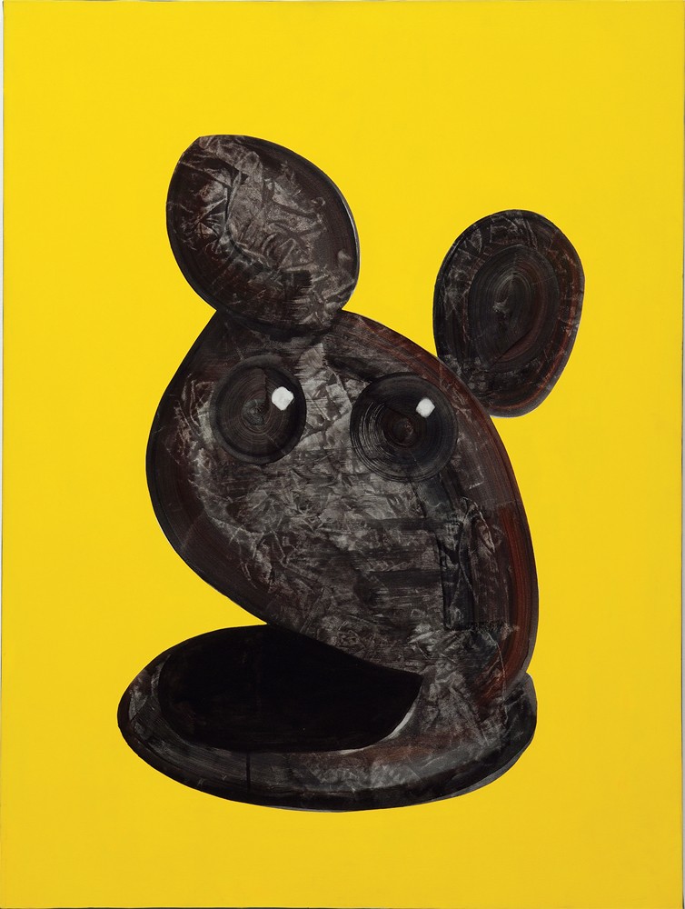
What is your interest in doing two-dimensional renderings of three-dimensional sculptural objects? Like The Disputed Sculpture, 2007, and Tiara, 2000. Are they based on actual sculptures?
The truth is none of them exist as three-dimensional objects. They are all invented. What happened over time was the “Framing Device Paintings,” with that interior frame, began marching towards the centre until instead of framing something in its middle, it became the edges of an object. As soon as it became an object, I started throwing some polish on them.
The Disputed Sculpture looks like a hybrid of Jean Arp, Jeff Koons and Mickey Mouse. It’s a pretty amazing object.
It’s true. It does look like a generic Modernist sculpture. I would say the Mickey Mouse thing is exactly right. I love that painting. I like the combination of the vagueness of the reflection and the precision of the edges.
What about the idea behind The Incredulous Hare At The Finish Line, as a Desk Ornament, 2001?
I was running the Emma Lake Workshop in Saskatchewan when they started it up again in 2001, and making the framing-device things. I’d made a number of those and had this one sculptural-looking thing that seemed to have ears. So I threw eyes on it and “Bang,” that was the end of that whole body of work. It dragged me back into the Pop world. I did a number of those; a similar one was called The Male Gaze As A Desk Ornament. It still had that same dumb look.
They return you to your early rendering chops. The Disputed Sculpture has a real presence about it. And all those other ‘sculptures,’ like Tiara, are also invented?
That’s right. I put on the polish just so. They appear to be real objects. It’s an exploration of what it is that makes something appear to be real. It takes only a few things, like edges and reflections. It’s what you pay attention to. You get the colour dead-on and you get the edges right. Not every edge is sharp. You can fool the eye by softening an edge here and sharpening one there. I remember someone saying that the mind cannot entertain two ideas at the same time, so in Red Man/Black Cartoon, 1990, if you look at the black lines you can see a harsh graphic face; if you look at the head underneath you see a slightly amused, slightly upturned mouth. So you travel between the two. If your attention is held and you are entertained in that travelling, then I’ve got you as a viewer.
Your source imagery, which may only be the catalyst that gets you going, is as likely to come from Caravaggio and Lichtenstein as it is from popular junk magazines. I assume the faces in the “Tondos” are nobody we would recognize for their fame or celebrity?
I found those in pulp magazines. Part of the reason is that I was looking for images that were very small and crudely printed, and I found a lot of those in country and western magazines. So the big green Head, 1990, which is in the collection of The National Gallery of Canada, was from a head that was half an inch tall. I took a macro lens, photographed it, and booted it up to nine by six feet.

Untitled Abstract, 2000, acrylic on canvas, 30 x 24 inches. Collection of the artist. Photograph: TrépanierBaer Gallery.
Untitled Frame and Landscape, 1998, acrylic and oil on canvas, 30 x 24 inches. Collection of the artist. Photograph: TrépanierBaer Gallery.
I look at a piece like Pretty Picture, 1998, and think you’re riffing on what is almost a cartoon version of a Lichtenstein frame, and inside is a nod to what looks like Synthetic Cubism. Is the pretty picture an art historical inheritance?
Again, I started my framing device and I painted the first asymmetrical shape and then piled on 15 of them, so they are a wash over a wash over some drawing, and they build up like that. In between, I dragged paint horizontally and vertically and what I wound up with was a cartoon frame. In the centre they look like vague photographs. I became really interested in the territory where if something appears to be photographic to a viewer, then it is. In other words, it’s a code to tell them how to read it. So they say to themselves, what’s this a photograph of? and even though it’s not a photograph, they’ll still ask that question.So the code of reading through that convention takes over, even though the making of the image has nothing to do with a camera lens?
Exactly. I was intrigued by that because it comes back to the territory of making meaning. I saw that Lichtenstein back-of-the-canvas painting in a show in San Francisco. I’m standing and looking at it and it did several things: it was a cartoon, it was a tromp l’oeil painting because it only had to describe that very shallow space, and from the distance where I was standing it turned into an actual shadow. It also turned the entire white wall around it into a cartoon. And it did it effortlessly. I immediately thought of Donald Judd, whose work I absolutely love but who specified this thing has to be exactly so many feet from this wall and so many feet from that wall in order to alter the architecture, and I thought Lichtenstein is doing it without effort.
One of the fascinating things about your work is how fluid it seems. So, out of something as destructive as the 2005 flood in Calgary you manage to turn digital prints of scanned Polaroids into art. You seem to have a capacity for constantly reinventing ways to make images have meaning.
First and foremost I am attracted to beauty. So, for example, those Polaroids were given to us by some friends who had dried out a whole box of photographs and there were nine Polaroids in this smaller box. I opened them up, looked at them, and I was gobsmacked. They were so beautiful and so weirdly tragic. There is one where the skin almost turned into an object, this is pure mortality, and yet you can still vaguely see smiles through the crazed surface.
The Staging of Caravaggio’s Conversion of St Paul as Seen From Above, 1998, oil and acrylic on canvas, 37 x 31 inches. Collection of the artist. Photograph: TrépanierBaer Gallery.
You clearly think that painting can continue to do new things. For you, it is in no sense a worn out art form?
Absolutely not. Because it is the perception of our consciousness. We’re the ones who activate it; we ignore it, or we pay attention. We’re the ones who mess it up, or make it incredible. It’s where your attention goes. I consider myself so lucky to be a painter. Here’s a story: I saw an Agnes Martin exhibition at the Glenbow in the ’80s. I didn’t know much about her but I realized, after being in the show for a short time, I could have walked out, fully satisfied, without seeing more. The feeling was unpredictable and inexplicable. By the way, I did carry on and see the whole show. The same thing happened years later at MoMA in New York. Denise and I walked into a gallery with 10 of her works and after two minutes, Denise, who had never heard of Agnes Martin, started crying and said, why am I crying? I felt the same way I had at the Glenbow. There is no explanation how some graphic lines and a little paint can produce such a powerful response. It’s why I value as the most intelligent response what I feel in front of art. And a final story: I was wandering through the Guggenheim’s secondary galleries and there was a little Cézanne landscape; it was an image of a meadow on a hot summer day, not a very large painting, which I have never been able to find again. I’m looking at it and all of a sudden I feel the heat of the meadow and the hot summer day. I was 10 years old again, standing in the backyard of my family home. I know how he did it; he looked and saw a colour, mixed that colour and put it down, and then he saw what the colour was next to it and he put that down. It was an accumulation of brushstrokes; so getting the colour right gets the light right, which gets the temperature right, and our nervous system knows through experience what the temperature of that light is. I looked at it for several more minutes and I figured it was time to go. So I turned to leave. My body turned but my neck didn’t and I painfully wrenched it. I hadn’t extracted my gaze from the space of the painting. I never will. ❚
Order Issue 135 here.