
Simon Hughes
Several thoughts upon viewing the exhibition: “Man Cave,” at Lantern in Winnipeg, brings a fairly wide assortment of works to a hometown crowd. As the title suggests, the works in the exhibition set up a controversial, if not tongue-in-cheek dynamic of the artist’s studio as man cave. I’ll give Hughes the benefit of the doubt in assuming the man in Man Cave is the much-maligned male artist-asgenius. However, it is also possible to imagine that this artist occupies a cave like a misanthropic yeti, spending his time being inspired by his immediate environment, the only real contact with the rest of the world being a pile of old magazines, stolen from an abandoned Winnebago, which he uses for collage material.
The reduction/idealization of natural forms relating to harsh northern climes thereby makes the chaos of nature more palatable, stylish, tasteful and happy. Keyed-up colours and crispedup lines. The attitude is trim and neat, maybe a bit pinched. Perhaps an allusion to the sterilized ideal of ‘modern living’… a ‘living’ that is only sometimes populated. Nostalgia permeates both the collage elements of old magazines and the geometric, Bauhaus-like units of colour, standing in for the North’s natural phenomena— aurora borealis, truncated glaciers, ice grottoes and floes.
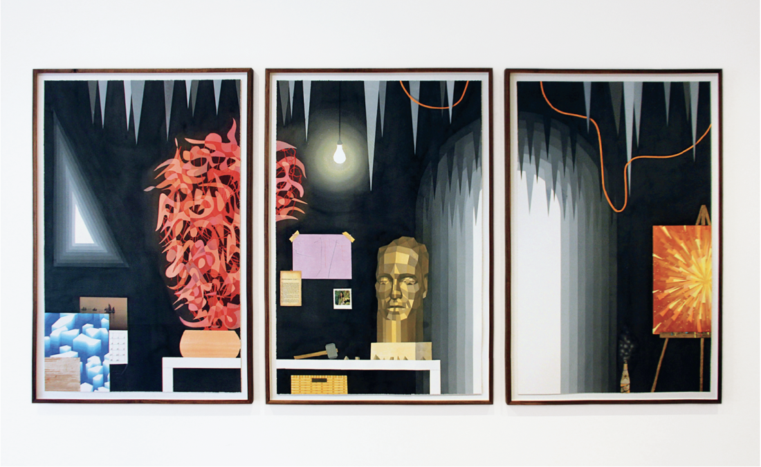
Simon Hughes, Black Studio #1, #2 and #3, 2016, watercolour on paper, dimensions for each watercolour: 57 x 37 inches. All images courtesy the artist and Lantern, Winnipeg.
Compositionally the paintings present themselves in a taxonomical way; every object, every colour seems held in place by an invisible pin. Each image is still, almost frozen, yet these landscapes have no indication of weather. Various colour strategies collude with abstracted shorthand to further illustrate Hughes’s Arctic sublime. Overly concrete tessellations of the northern lights divulge their masking-taped geometries under raking light. Two newer paintings of ice caverns, made from a gradient of ceiling stipple popular in the ’70s (I lovingly remember it called popcorn), present an inside/outside conundrum. In fact, many 1970s and early ’80s notes float throughout the show. I also sensed a relationship between geometric drawing style and the hard-edged computer graphics synonymous with this bygone era. Nature as interior design joins other nostalgic strategies when abstracted nature is presented as retro-’70s textile art/wall-hanging…not macramé but some kind of alternative hippy quilting.
Everything is presented in a somewhat mannered way. Even when natural chaos is presented it is meticulously diagrammed. These paintings are not really nature, as we know, but the process of making them does follow some of the same natural laws. Dry pigment becomes fluid paint, back into dried pigment upon a surface. Something about sublimation seems relevant. When a solid turns into a gas without first becoming liquid, as when the surface layer of snow or ice turns into fog or steam without melting, is an example of sublimation. The verb “sublimation” is from the Latin word sublimare, meaning “raised to a higher status,” i.e., to divert the expression of an instinctual desire or impulse from its unacceptable form to one that is considered more socially or culturally acceptable. To sublimate is to change the form, but not the essence.
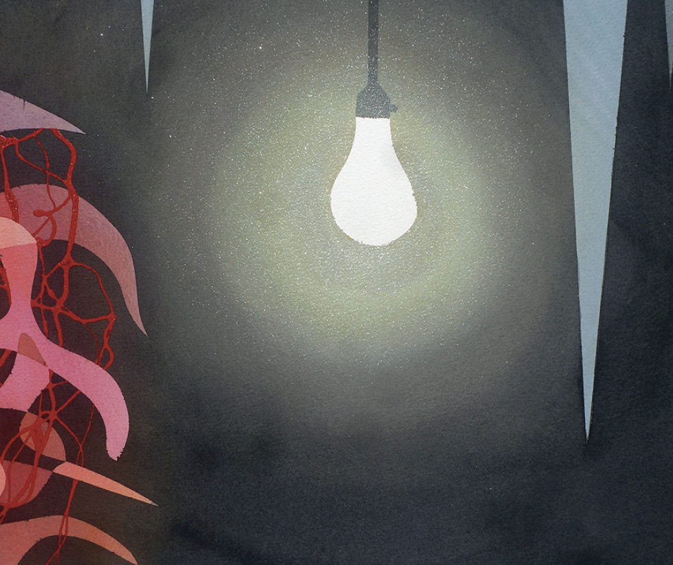
Black Studio #2, detail, 2016.
Although I don’t think Hughes is interested in process-based formal ideas related to Jackson Pollock’s claim “I am nature,” it does lead me to think further along this American trajectory to Jasper Johns, who, like Hughes, might be toying around with certain ideas of sublimation. Hughes makes me think of Jasper Johns in that he manipulates similar motifs in multiple media, in this case watercolour, watercolour collage, acrylic paint, acrylic and collage, acrylic and oil paint, etc. The subjects of both artists are emotionally neutral and are rendered in an emotionally neutral fashion. Hughes takes his notion of the sublime and transforms it into art, without ever letting it touch nature. Johns chooses common objects like the American flag, numbers, maps, i.e., things that represent cultures, and leaves behind their base secular identities and usefulness, transforming them into high-art objects that are simultaneously a confluence of absurdist enigma and painfully dumbfounding facticity.
With a Generic Sublime comes a Generic Romanticism. The generic is an abstraction, which, in this case, presents itself without any detail. The depiction of these fragments is from afar, not details or close-ups. These fragments relate to language as visual stand ins for what may be termed ‘exotic’/‘unknown’ or ‘non-experienced’ objects. We are shown tidy depictions of phenomena that we may have never experienced first-hand but we fill in the blanks. Is there a relationship between what I am terming generic and hearsay? The mediation of awe is another subject worth considering—I mean, how could you even know what you are awe-ing about? Has the awe been culturally built-in to these generalizations? This speculative zone is where the artist, the viewer and the critic are one and the same, asking ourselves, what is this jagged shape of transitioning colour, what is under the surface of the assumed (dark blue) water? How large is that glacier? How deep is your love? How deep is your commitment? How deep are the depths of your soul? I know it sounds as if I am going overboard here, but there is a nascent Romanticism at work in Hughes’s paintings that prompts such a response, but more often than not this Romanticism is served with a side order of smirks, snorts and giggles. The kind of snorts and giggles you make when you have your cake and are eating it too.
At this point Simon Hughes earns highest praise playing the role of nostalgic absurdist. He painstakingly crafts his pictures to great effect. The odd clumsiness or enigma is quickly overlooked as we are reassured by his cool, geometric, orderly structures. This leaves the viewer with not so much an emotional understanding but simply the notion that ‘culture’ is at work. Similar to how Johns’s flag assuredly confirms that we made something, we all make culture and maybe nature, too. ❚
“Man Cave” was exhibited at LANTERN, Winnipeg, from September 30 to November 20, 2016.
Craig Love is a Winnipeg-based painter.