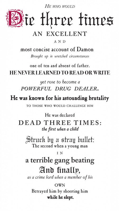
Necrology Series
In 2015, on the sesquicentennial of Abraham Lincoln’s death, the Philadelphia Inquirer reprinted its front page as it had appeared on April 15, 1865, a day after the American president’s assassination. I was struck by the appearance of the page, how differently it looked from today, with what seemed like illogical spacing, kerning, eclectic use of fonts, all encapsulated in a highly florid language. Running down the entirety of the left-hand column was a series of what appeared as mini-headlines, each announcing a significant moment in Lincoln’s life, from birth to death, with the final one reading “A Nation Mourns!”
I recalled studying the 19th-century designs for theatre plays frontispieces, and especially a frontispiece for Matthew Brady’s portfolio of photographs of the American Civil War. The language was equally florid, often over-the-top sensational, and again accompanied by an unexpected use of different fonts and odd kerning and spacing. While the sheet for Matthew Brady was meant to sell the buyer on the experience of the photographs, I was interested in what has since been lost in the ways of imagining life and death. I saw, too, my interest in the Lincoln broadsheet page as a continuation of my long-standing interest in the fluidity between pictorialism and textuality. Like Deleuze and Guattari’s famous example from A Thousand Plateaus of the wasp that becomes an orchid and the orchid that becomes a wasp, an image engenders a multitude of texts just as a text can produce innumerable images.
My series titled “Necrology” was impelled by the idea of text as an image machine, to borrow from Deleuze again. In fact, the Lincoln page taught me that pictorialism begins with the unit of the alphabetic letter itself, well before its amalgamation into text. I developed the “Necrology Series” for another reason, as well—as a substitute for an actual picture, which could restore a degree of our imagining process and remove it from having been territorialized by current image reception.
The “Necrology Series” takes the form of monumentally scaled posters on fine archival watercolour paper. Each work tells of a possible life lived. Like much of my work, this series is oriented toward the banal, the ordinary and the everyday. I do this not as a statement of anti-art but anti-establishment art, which has always inhabited quotidian forms such as the popular print and the genre picture. The “Necrology” works chronicle lives of people such as an African-American woman of faith who led a decent lower-middle-class life as a keypunch operator; or a mysterious tattooed lady found dead and identified only by chance through Facebook; or Yasir Khorshed, who fought on behalf of garment workers’ rights only to die at an early age of benzene poisoning, at one time a not uncommon cause of death for garment workers. In the case of Yasir, I included, or wove in, my own garment-worker mother’s death from benzene-generated leukemia.
Each of the lives depicted in this series is neither fact nor fiction; they are amalgamations from various collected obituaries as well as personal recollections of dead relatives and friends. They read as real rather than as fact. In so doing, the works are expressive rather than illustrative, didactic or instrumental in the way that documentary photographs of a person may be. As in all my work, I am interested in the question of identity and its formation. But mostly, I hoped for a reader lost in both the language and look of the overall image of the text.
Gallery
-
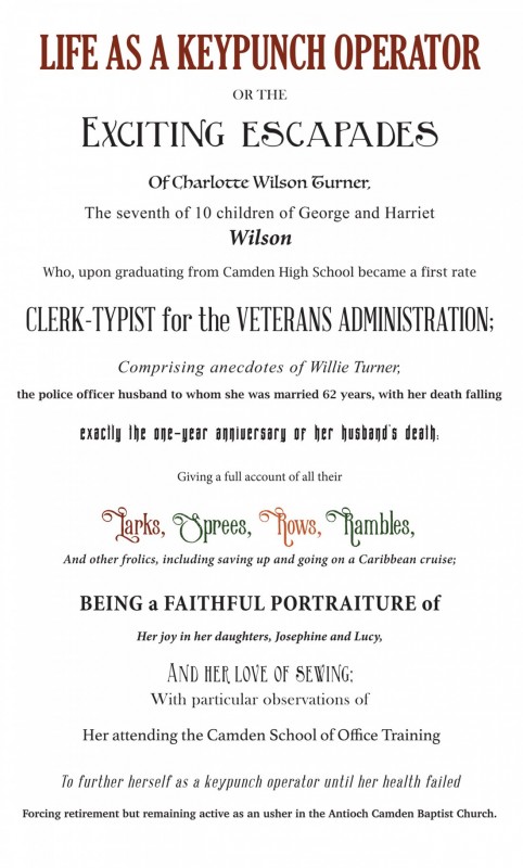
Ken Lum, from “Necrology Series,” 2017, archival inks on Hahnemuhle Rag Ultra Smooth paper.
-
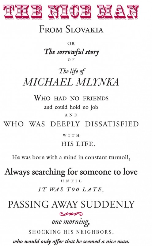
Ken Lum, from “Necrology Series,” 2017, archival inks on Hahnemuhle Rag Ultra Smooth paper.
-
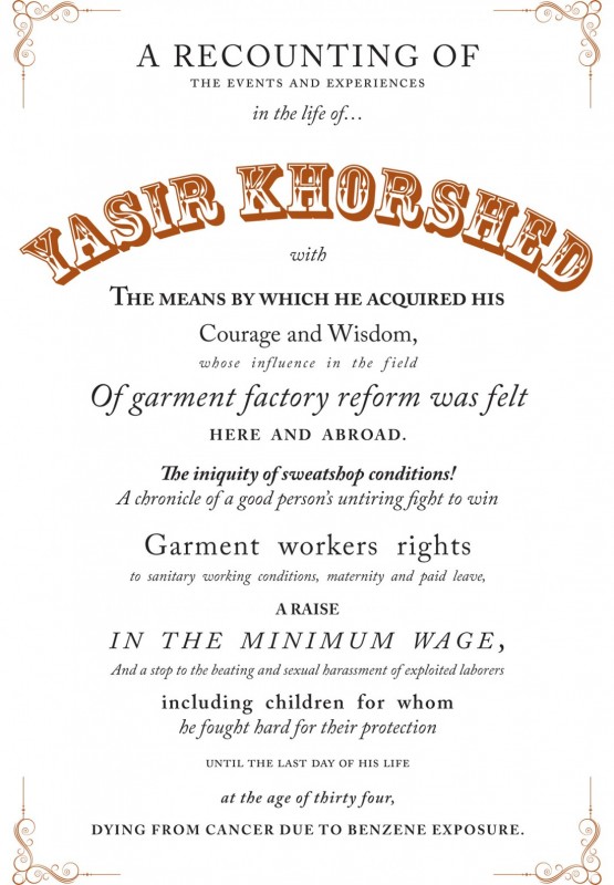
Ken Lum, from “Necrology Series,” 2017, archival inks on Hahnemuhle Rag Ultra Smooth paper.
-
Ken Lum, from “Necrology Series,” 2017, archival inks on Hahnemuhle Rag Ultra Smooth paper.