
Codes of Vulnerability
An Interview with Paul P
An ember flares briefly and flames before it falls back with a hush, receding to soft grey ash. A luscious apricot glow—blue, gold and crimson at the edges. Then dove-grey white ash. Heat, then still. A century comes to a close, the Belle Époque testing the edges and flaring, too. Some freedoms, some tentative loosening and a crazy heat at the centre. The drink of the period first enjoyed only by artists and writers and the like; too risky, too louche, but suddenly everyone was drinking it. Absinthe, la fée verte, the green fairy, in bars and cafés in Paris and everywhere. The are, the energy, the heat then fatigue, insufficient air to draw a vivifying breath. Pallor, a soft slouch and the chartreuse-tinged fog drifting in and over. Absinthe, the hue of sleep and dreams colouring everything.
Paul P, Untitled, 2020, oil on linen, 81 × 60 centimetres. Courtesy the artist, Maureen Paley, London, and Cooper Cole, Toronto.
From 2010, an oil painting on canvas, 41 x 27 centimetres. An ecstasy, adrift, what I read as a sole journey. The green fairy wraps her wings around the shoulders of a young man. His face is pale, coloured lightly by the chartreuse blush. His eyes are closed, his head is tilted and angled slightly forward, resting against the drift of sleep, or an unearthly elsewhere, or drugs, or pleasure. His mouth has fallen open in peaceful sleep, maybe childlike trust. It could be a soft prayer—please lift me. The portion of the painting around the figure’s head and shoulders is the wash of colour a re throws on a facing wall—orange with pink and mauve, some grey, and in places, more heat. Against the wash is the figure’s almost sooty black hair, falling over his forehead, against his cheek, cupping his neck and, at the crown, lifting as though drawn into the updraft of the fiery ground against which his head seems to rest. Soot, pale skin, the peach and red glow, the downy green wings, a bit of the heat smudged around his open mouth, and only the smallest dust of pale green on his cheek. It is an ecstatic reverie, a gift of state and tone. To look at it is to enter briefly into that very private place.
Others of Paul P’s works allude to this lifting off, not a removal from the present but, instead, a perfect containment. The works are all Untitled so we rely on dates, dimensions and media for identification, and above all on how the pieces look. In a painting from 2016, oil on linen, 27 x 19 centimetres—a young man’s head, neck and a portion of his shoulders fill the canvas. His body tilts to the fore, but his head is angled up, just a little, the angle such that the image could have been taken by a photographer in a squatting position. A hue like dried blood but more wine than blood suffuses the subject’s face and the canvas around him. His straight dark brown hair stops at the base of his neck. His eyes may be closed, his lips may be parted, and we see the underside of his nose and nicely shaped nostrils but this is in part speculation because we view the canvas through a blurred haze. Again—a reverie, a transport. Another painting, from 2019, Untitled, 26.9 x 22.3 centimetres, an oil on canvas—this one in the collection of the National Gallery of Canada and included in Paul P’s recent exhibition, “Amor et Mors”—is a vertical wash of coral pink and blue mauve. Emerging from and withdrawing behind this screen of colour is the bust, in profile, of a young man. His head is thrust back, his neck is taut, his shoulder pulled up. His dark hair brushes the top of the shoulder we can see. The coral pigment emerges from the blue to show a portion of his nose and parted lips. He could be under a light fall of water or ascending into a blue ether. The painting, 2018, oil on linen, 24 x 19 centimetres, is a Black figure, his head well shaped, hair close-cropped. His head and the tops of his shoulders fill the canvas, showing a light blue background only at the margins. His skin is lustrous, his neck powerful, and here, too, his shoulders are lifted, rounded shapes at the painting’s foreground. The subject is almost full face, only angled a bit to his left. His eyes are half closed, the lids heavy with impending sleep and his full mouth and nose are so near he could be Narcissus pressing his image to a mirror. The four paintings just listed are an ecstatic quartet only by my describing them together but not unique in the extensive corpus of Paul P’s work.
Paul P, Untitled, 2019, oil on canvas, 26.9 × 22.3 centimetres. Courtesy National Gallery of Canada, Ottawa. Purchased 2020 with the generous support of Diana Billes, Toronto. © Paul P. Photo: NGC.

Paul P, Untitled, 2018, oil on linen, 24 × 19 centimetres. Courtesy the artist, Maureen Paley, London, and Cooper Cole, Toronto.
The past is a store for Paul P, particularly the fin de siècle with artists like James Abbott McNeill Whistler and John Singer Sargent and their subjects, and their painterly treatment of these subjects, moving into the 20th century, to gay erotic magazines from the 1970s, housed in the Lesbian and Gay Archives of Canada, in Toronto. The artist was born in 1977, coming to sexual awareness after the AIDS crisis but carrying fully a sense that his generation was “doomed from the beginning,” he told us in the interview that follows. He was attracted to the films of Gregg Araki in the ’90s because they “expressed something about that beautiful, nihilistic, doomed, pointless, yet exuberant feeling that someone of my age had at that particular moment in time.” The artist speaks to the subsequent sense of freedoms and safety being provisional, that any gains and liberties had to be maintained through vigilance and reiteration. Repetition has always been present as an intention and a tactic in the artist’s paintings and writing. It colours as the tone of elegy. You see it, too, in his echoes and pairings; repetition fixes things, makes them stick, holds them in place.
One such place is Venice, a city and a condition, a state of mind. Always in danger of being washed away, an outpost at the end of things by every measure. Beautiful, seductive, crumbling, some decay—mouldering like rare old brocades, like stucco softening in the damp salt air, like frescoes, their colours muted and fading. Irresistible, melancholy and elusive. Writers went to Venice. Painters went to Venice. All wanting to enter into—because it couldn’t actually be captured—and represent in some medium the light refracted from the water onto buildings, the fractured glimpses caught when one is passing a narrow canal, a draped cashmere paisley-patterned shawl, the sound clattering from building across to building and the people who came to fill it and drink it, absorb and reflect back the light, the luxe and the voluptuousness, the exoticism of all the edges a place surrounded by water has. John Singer Sargent painted it, loved the glamour of the gondoliers, admired their grace and strength. His The Bridge of Sighs, 1905–08, is, suitably, a watercolour. A canal narrowing perspectively and smudged—in blues and greens with highlights of sun touching buildings here and there, and in the foreground a gondola with two gondoliers, one at each end, and in the middle—a tumble of tourists, two, it seems from the two white parasols visible, the gondoliers almost leaping from the page with their startling white costumes and muscular action.
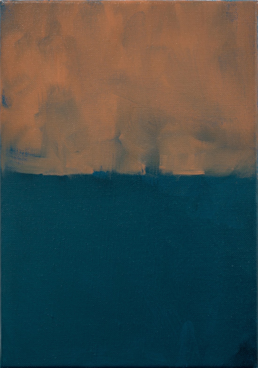
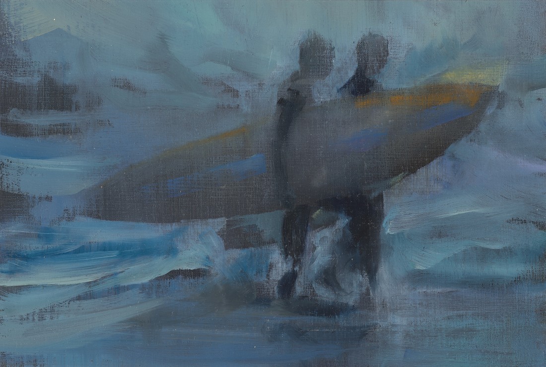
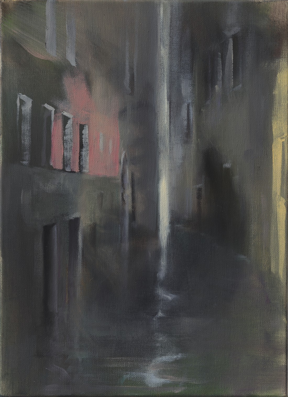
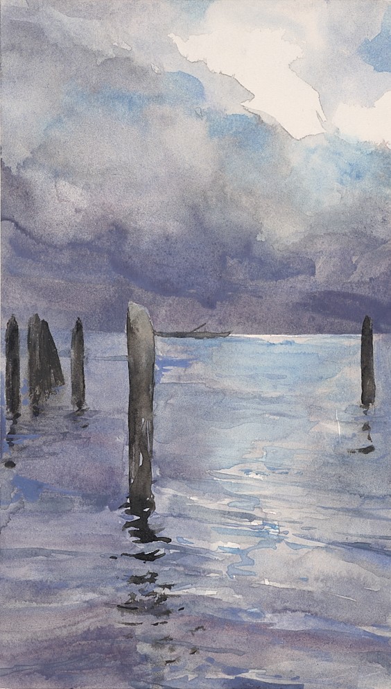
Paul P reads Venice twice over. There are, for him, two, one an echo for the other, a parallel repetition. Satyrs or fauns have, from time to time, been a subject for the artist and he finds a correlation between the satyr and the surfer. “To me, the surfer is the Venice Beach equivalent of the Venetian gondolier.” Both are intuitive, lurking, in the know and almost mythological. He told Border Crossings that Venice represented “a place of freedom, abandon and exile,” and that he felt its namesake, Venice Beach, was the same: an active porn industry in the 1960s, ’70s and ’80s, and a place where outcasts could be at home in its permissiveness; and, like Venice, Italy, there was the light that called to artists. In both he found subjects to paint and he noted that his travels to the Venices led him to landscapes and, further, that these became abstract. A 2011 watercolour, 28.9 x 16.6 centimetres, shows Venice in the palette of mother of pearl, nacre—grey, mauve, blue. In the foreground, the heavy posts to anchor small craft; at the horizon line, a gondola slim as an eel; overhead, lowering clouds full of rain. Another painting, this one oil on paper, 16 x 23.8 centimetres, from 2011, is two surfers on either side of a surfboard, being carried by one. They are walking at once in deep blue water and deep blue sky, each the same element. They appear to be moving slowly, at ease but tired from a day of activity, read in their heads dropped just some, from fatigue. This is the other Venice. From 2010, oil on canvas. 33.2 x 24.6 centimetres, is Venice again—a narrow canal, houses close up on both sides, night, all verticals, buildings and light, reflections split and mirrored, peach and blue, ochre and a slash of light like a pole, from the canvas’s top—a slit at the end of the canal ending in a rippling line where it touches the water. This watery abstraction, which has, as its referents, light and lack of distinction, is, in this setting, a precise and realistic rendering and not abstract at all. An oil on linen painting, 27 x 19 centimetres, from 2019, is a landscape divided in half, top to lower edge. A scumbled Turneresque sky in orange, the dark water below in ink blue. Where the two halves of colour meet, the blue rises to the sky showing, maybe, the loose silhouette of a bulky steamship; and the orange descends to the surface of the water in small clouds and dips of weather. The Venices leading to landscape and abstraction.

Paul P, Untitled, 2016, oil on linen, 27 × 19 centimetres. Courtesy the artist, Maureen Paley, London, and Cooper Cole, Toronto.
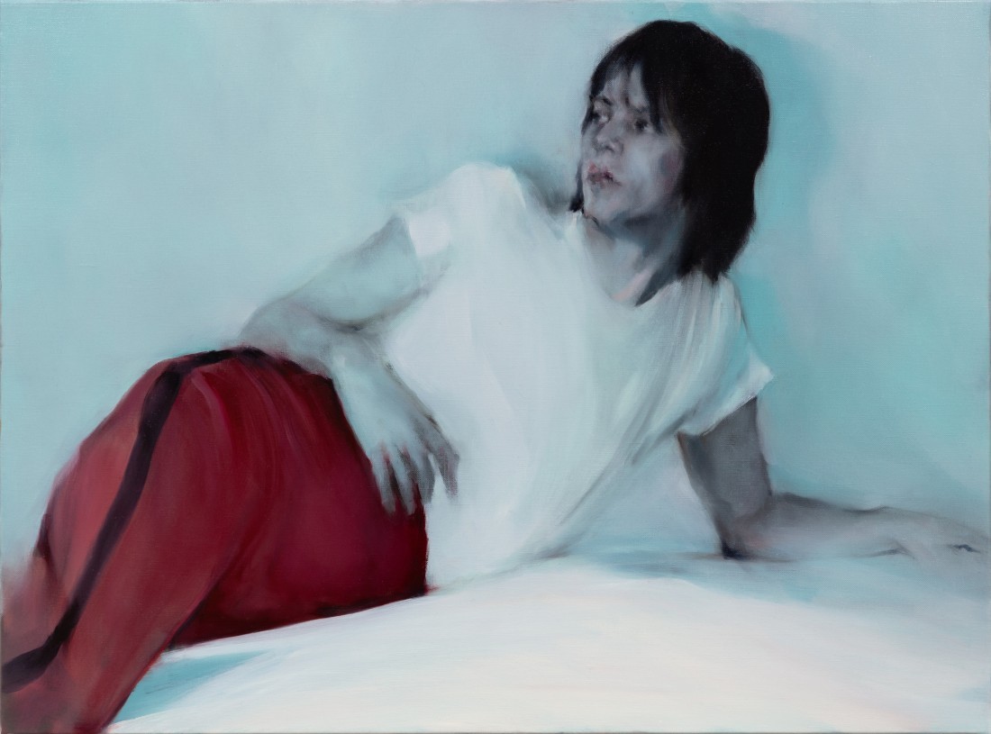
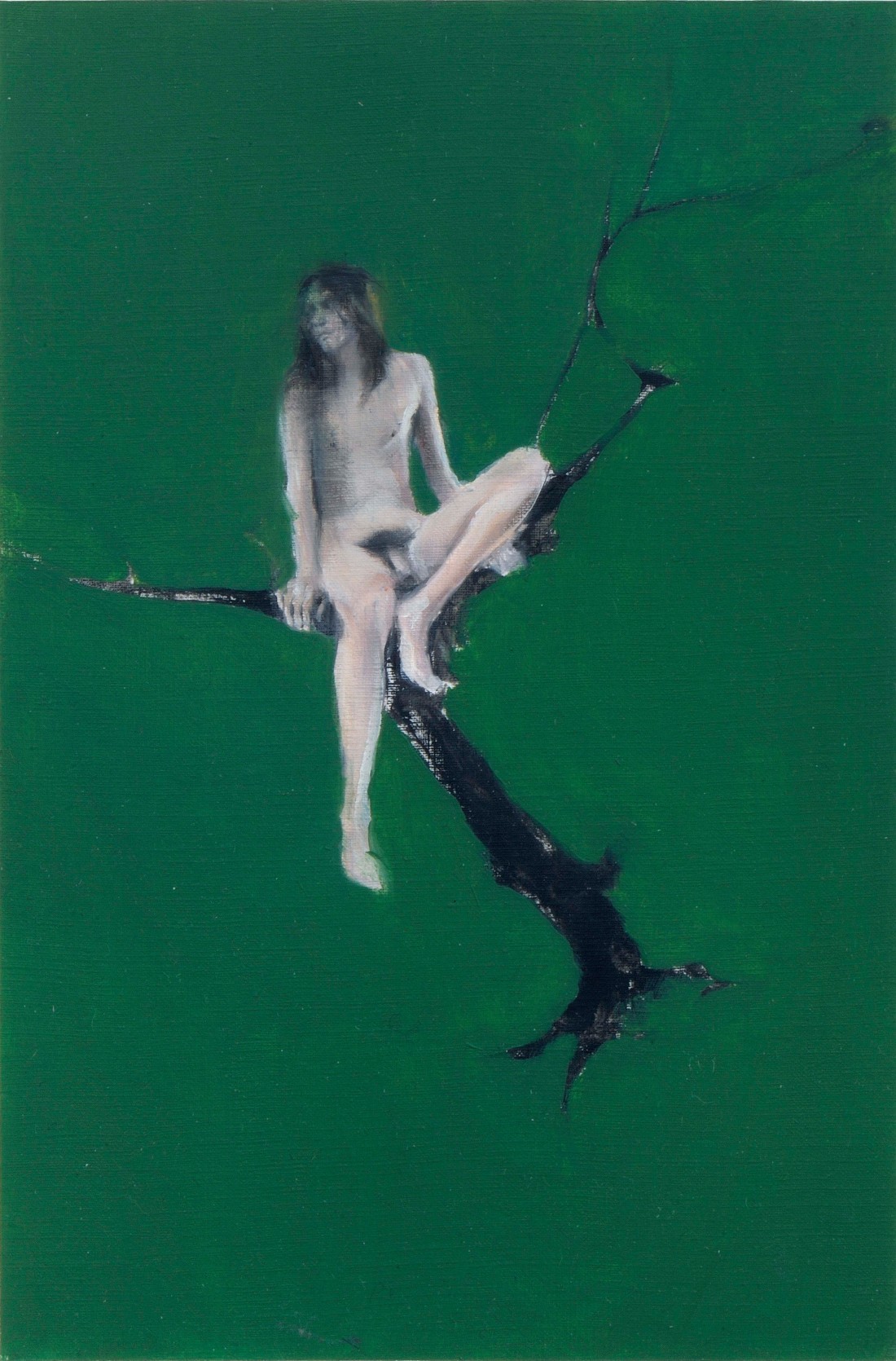
Elizabeth Peyton is another painter of small figurative work. In her sensibilities I see some parallels with Paul P. The scale, for one, but in her work from the early 1990s to around 2005, an approach that has me think of Paul P: to present through the implicit, as he says, rather than the explicit. A slight reticence, a delicacy, regard, mannerliness, but clearly—there. There are two paintings that, if on facing pages, could be mirrors one for the other in a credible way. Elizabeth Peyton’s painting is Tony, 2002, oil on board, 9.25 x 12 inches. Paul P’s painting is Untitled, 2020, oil on linen, 81 x 60 centimetres. Each shows a young man reclining but not entirely prone. Peyton’s figure is raised a bit at the shoulders, one arm is bent behind his head, elbow only visible. The other arm is at his side. He wears a short-sleeved green t-shirt and is lying on a green spread or cover. What we can see of his trousers is a dark pattern with green. He leans, one hip raised toward the viewer. It seems from his positioning that his knees are bent. Paul P’s figure reclines but is propped on one elbow; his other arm, also bent, rests against his hip. He wears a white short-sleeved t-shirt and appears to be on a bed with a white cover. Directly behind him is a pale blue wall. He wears red trousers, and running from the waistband, over his hip and down his leg is a black stripe. Anyone reading art history thinks immediately of Manet’s The Fifer, 1866, but here the red military pants are just sport pants. Peyton’s subject may be in a reverie; his look is interior. He makes no eye contact with painter or viewer, looks away to another space. Paul P’s subject also looks away as though his attention has been called off-stage, away from artist and viewer. Both have dark hair with locks falling over their forehead and both have clearly defined, nicely shaped eyebrows. They also share that one hip thrust, contrapposto, if they were standing.
Paul P speaks about what was visually encoded in art at the turn of the last century, the period of Whistler and Sargent (and writers, too, like Marcel Proust and Oscar Wilde), and the dangers inherent in forthright expression of any kind. He says today a code is almost redundant but the function had been to generate a necessary language of resistance. Not seconds pass before an addendum is offered, recognizing the current political tenor shifting—to menace. To secure this visual language and the freedoms it represents has been the artist’s resolute goal. The other area to which he wants to call attention is still a place of awareness. He speaks on behalf of intimacy again—finding its right and contemporary critical recognition, bringing into the critical realm what could be described as small, subjective queer work, intimately rendered, of figurative subjects, with a proficient handling. His work.
This interview was conducted by phone with the artist in Toronto on June 1, 2023.
Paul P, Untitled, 2010, oil on linen, 41 × 27 centimetres. Courtesy the artist, Maureen Paley, London, and Cooper Cole, Toronto.
Border Crossings: I get a sense that your approach to the archival sources of your images is almost scholarly, or it certainly displays a close attention to art history. Are you as thorough as the work seems to imply?
Paul P: My approach is very much an artist’s and not an historian’s. I go through archives and make my own archive from that material. I don’t necessarily retain all the information— for example, the names of magazines or pseudonyms and stage names of models—in the way a scholar might. I let all that slide from my memory. What I know is that they belong to a certain era, otherwise I gravitate towards certain types and the repetition of those types. I’m very systematic and I have a methodology. But I’m less concerned with the hard details and more with intuition and atmosphere.
Your fascination with the fin de siècle is pretty clear and then you situate your research focus in the period between gay liberation and the AIDS crisis. In that time frame, Eros and Thanatos are inescapably mixed. You call it an ingrained link between sex and death, and the title of your show at the National Gallery, “Amor et Mors,” underlines that connection.
I think the AIDS crisis made apparent to everyone the inescapable connection between sex and death when it concerned gay men. But if you look at history, you see that to different degrees, this has been a constant of gay life. So, looking to other interstitial periods in time, different high points that came crashing down, and periods when freedoms were retracted, allowed me to find further analogies for my overarching concern: the articulation of the transience and reoccurrence of queer cultural tragedy from the vantage of my rather small generational aspect. Having been born in 1977, I came out after that moment when so many men were ensnared by the disease and its chaos. The world I entered as I went through puberty was one where sex, as I understood it, was connected to death.
Paul P, Untitled, 2020, oil on linen, 46 × 61 centimetres. Courtesy the artist, Maureen Paley, London, and Cooper Cole, Toronto.

Paul P, Untitled, 2020, oil on linen, 38 × 46 centimetres. Courtesy the artist, Maureen Paley, London, and Cooper Cole, Toronto.
It’s interesting how any sense of nostalgia in your work turns to elegy and then elegy drifts towards warning because the freedoms are so provisional. Is that a fair trace of the trajectory of possible meanings inside your practice?
I think so, but I can’t honestly have nostalgia with respect to the pre-AIDS era of gay liberation I look at because nostalgia requires direct experience and as I said, since I was born in 1977, my sexual awareness formed very much in the midst of the crisis. Those who have nostalgia for the time before AIDS are 10 years, or a generation, older than I am. I’m cautious about using the word “nostalgia,” but I do use its sensibility. I’ve always been attracted to the faces of the young men I find in these gay erotic magazines as types of heroes, unnamed heroes. Elegy, definitely. What I do has always been elegiac. I’ve been working with these images since the early 2000s and what you see as the notion of warning in the work has steadily increased. Over those years I have witnessed circumstances change, particularly acutely in the late 1990s when the AIDS crisis was still a very real and mortal one; then suddenly the availability of life-saving drugs rapidly gave way to a different era. People likely view that time as more distant than it actually is. I see my work as a type of warning about the cyclical nature of freedoms and how tenuous they are.
Maybe we thought we could aestheticize nostalgia, which leads to the question about the aesthetics of the other period in which you are so interested. You look at artists like James Abbott McNeill Whistler and John Singer Sargent, and you recognize Whistler’s “mist and murk” and “the panache and glamour” of Sargent. Is that a frame that you also like working within? It’s wonderfully phrased, but it is also a disposition towards aesthetics and the way things look.
I think queer artists who traffic in aesthetics, or the aesthetes who consumed their art, found a way to express themselves at a time when any explicit declaration of homosexual desire was not allowed or could even be fatal. I’m fascinated with two historical modes for the expression of queer desire in art: the implicit and the explicit. The most enduring historical strategy is that of implicit expression, which has gone hand-in-hand with the development of aesthetics, with a capital A. Sets of visual codes were developed by queer artists to dazzle and confuse using beauty, which ultimately had a defiant and insolent function as well. It may seem that I am preoccupied with the past, talking about Whistler and Sargent, or the 1970s, but they are my means of speaking about the present. This is perhaps somewhat tangential, but Whistler and Sargent are very good examples of contrast. They’re similar artists in that they’re operating in the same era, and are both Americans living in Europe, yet each is stymied and exuberant in opposite ways: the mood and murk of Whistler’s art versus the adroit brilliance of Sargent. Their stylistic and temperamental difference could be seen as another irreconcilable parallel alongside the schism between the implicit and the explicit, which I’m interested in. Although he wasn’t homosexual, Whistler’s ultra-dandyism gave him a queerish spirit with a defiant, provocative attitude. He was a genius at portraying mood and atmosphere, but he didn’t have the innate talents that Sargent did for verisimilitude—a lack that haunted him. Sargent had an almost diabolical ability to get everything right on the first try, which was the opposite of Whistler, who laboured and rubbed out and tried and tried and tried. Besides his uncanny talent, Sargent had his reasons for being insular, superficial and not defiant. He was a closeted homosexual and of a very different disposition from Whistler. Whereas Whistler was small and animated, Sargent was solid and lumbering and not exactly at home in Wildean drawing rooms. Together, Whistler and Sargent are a two-sided device for expressing the urgency and the MO of aesthetic work at that particular time, one that was soon cut short by World War I and the repression and homophobia of the next half-century that followed.
There’s a hauntingly beautiful line in John Keats’s “Ode to a Nightingale” where the poet admits that he’s “been half in love with easeful Death.” You also seem to be a participant in that love affair. Is that because of the historical moment you inherit when you come into consciousness as an artist? Death was so present in the gay community, and that line haunts everyone, whether gay or straight, who watched the tragedy of those years unfold.
How do I put this? Because of my generational aspect, which I described, it almost seemed as though my generation was doomed from the beginning. It seemed that whether you were HIV positive or not, you were entering into an inescapably tragic scenario, and there was a kind of making peace with that. You want to live and you want to love and you want to dance till dawn, these are the conditions of youth, but in this case it seemed as if there was no conceivable future. I was very attracted to the movies Gregg Araki made in the ’90s: Nowhere (1997), The Doom Generation (1995) and Totally Fucked Up (1993). He expressed something about that beautiful, nihilistic, doomed, pointless, yet exuberant feeling that someone my age had at that particular moment in time.
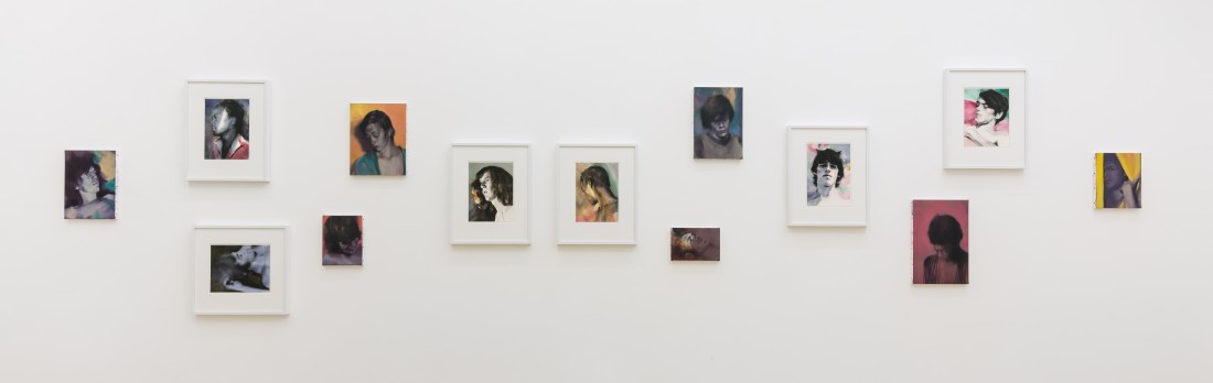
Paul P, installation view, “Vespertilians,” Maureen Paley, London, 2022. Courtesy the artist, Maureen Paley, London, and Cooper Cole, Toronto.
Let me alter the balance in the Keats quote and say that your work shows you not to have been half but fully in love, I might even say obsessed, with graceful beauty. To the degree that it embraces beauty, your amorousness is not wholly determined by doom. Is that a fair way of thinking about how you render images?
This is the appeal that the figure of the Dandy has for me. I’ve talked and written a lot about the—primarily—English Dandy from the late 19th and early 20th centuries. I’ve come across a definition in Martin Green’s writing about the Dandy, calling it an enterprise that is doomed to fail, and I always felt that was a very important point. The Dandy champions, even embodies, aesthetic sensitivity in the face of prevailing disinterest and, in periods of criminalized homosexuality, could be placing their very life on the line in doing so. Whistler was a Dandy, but he was foremost an artist, whereas most Dandies were mere admirers and arbiters of aesthetic modes. In that sense they were consuming and venerating, rather than creating. They embodied the vulnerability and fragility of works of art or poetry. But underneath their ostensible frailty and ephemerality was an incredible paradoxical, often enduring, strength. Many of the characters that I’ve discovered from my interest in the Bright Young People and the fin de siècle have also been ultimately defined, in times of emergency or war, by extreme acts of heroism or bravery. This idea of something frail yet strong or resilient is behind the furniture pieces that I make. I found a way in which I could meticulously construct something that looked improbable or incapable of standing up but that was in fact functional.
Your talking about the heroics of the young men who are your sources makes me think of you as an archaeologist of desire. Are your subjects objects of desire for you, not just in their initial apprehension but once they’re made? I’m trying to make a distinction between what you see when you look at your archive and whether you view them differently once you’ve rendered them.
I’ve saturated myself with this erotic material for such a long time that I have a completely different way of looking at them. I am cultish and assign hero status or make a hagiography for these young men purely because they existed in a particular period of time and experienced what I imagine to be a collision between their psychological state and the circumstances of homosexuality when it was still semi-outlawed. I don’t look at them in the same way as a consumer of pornography would. Since the early 2000s, my primary resource has been the Lesbian and Gay Archives of Canada in Toronto, which is now called the ArQuives: Canada’s LGBTQ2+ Archives, which has an enormous collection of periodicals. The periodicals remain on-site, so over the years I’ve always returned to my studio with only black and white photocopies. I jettison much of their context: the colour is gone, I crop them and then I’ll file them away for use in a painting or drawing, which can sometimes be years down the road. My way of looking at them is not dispassionate, but it’s certainly somewhat unerotic. I tend to reinvigorate them with colour and context and mood—and I suppose some passion—only at the point when I’m finally about to paint them.

Paul P, installation view, “Bacchante with lowered eyes,” Queer Thoughts, New York, 2021. Courtesy the artist, Maureen Paley, London, and Cooper Cole, Toronto.
Let me ask about a couple of pieces in “Amor et Mors” in the context of retinal memory. When I look at Glyn Philpot’s drawing of a young Black man from 1912–13, and then at your Untitled (2017), a portrait of a Black model on a blue background, I see a tributary connection between them, as if looking for you is a way of activating memory.
All of my work had been selected by the National Gallery of Canada’s curators for their collection several years prior to the exhibition, so the resonance between my work and the historical works is serendipity and not premeditation. That beautiful Glyn Philpot piece came to the National Gallery only very recently, unlike some of the other works in the show, which had been in the vaults for a century. The gallery has a significant Philpot painting of the same model, and it turns out that they had been interested in acquiring the companion drawing of this person, known only as Billy. The drawing had also been exhibited in a Glyn Philpot retrospective at Pallant House Gallery in Chichester in the UK last year. So before it ever came to the National Gallery, it had been in a fantastic show, curated by Simon Martin, who did a lot of work identifying the models and the contexts in which the paintings were made. So “Amor et Mors” connects elements from my work with parallels in historical works from the collection: placing seascape alongside seascape, satyr alongside satyr, portrait alongside portrait.
I want to ask about the hirsute. It comes out in the satyrs and even in Paul César Helleu’s drypoint of de Montesquiou. The legs of the boy carrying a bag in your 2011 drypoint look slightly furry, as if he’s an embryonic faun.
My drypoint is one of the images of surfers that populate the show, and those furry legs are his wetsuit pants. But there is a correlation between that strange lower half of the faun or satyr and the surfer. To me, the surfer is the Venice Beach equivalent of the Venetian gondolier. He is the person who is intuitive, lurking, who knows the territory and takes on an almost mythological quality. My use of satyrs, in my own practice and in the selection of other artists’ work gathered for the show, is to point out their role as devices used in neoclassical art by queer artists searching for sanctioned ways of representing male bodies: Hermes or Mercury or a satyr. Sometimes even biblical scenes have the potential for homoeroticism, as Simeon Solomon demonstrates. I’ve always thought these ingenious strategies were the wellspring of queer aesthetics. They appear to focus on youth, but we have to remember that youthful nude bodies were the only allowable types in art. It would have been too obvious, too ardent, to show men who were 35 or 40 or 50 in such evocative situations without hairy satyr legs. It’s their ability to stand in for queer desire more broadly that makes them so fascinating to me. In Helleu’s drypoint of Montesquiou, there’s this wonderfully velvety barbed line, which catches the ink during printing and is most noticeable in the rendering of the hair. It’s one of the most attractive aspects of his work. Fortunately, haircuts from the 1970s looked much like haircuts from the 1870s or the 1670s. They were sort of non-haircuts. If I drew models from the mid-’80s, which I don’t, the haircuts would be much more recognizable as a part of their time period. There’s something out of time with that shaggy, unkempt, almost satyr-like grooming that I find in 1970s gay magazines.
Paul P, Untitled, 2009, oil on paper, 23.5 × 16 centimetres. Courtesy the artist, Maureen Paley, London, and Cooper Cole, Toronto.

Paul P, Untitled, 2009, oil on paper, 23.5 × 16 centimetres. Courtesy the artist, Maureen Paley, London, and Cooper Cole, Toronto.
You found a common frame in the two Venices, one in Europe and the other in California. When did you realize you could use the surfer and the gondolier to establish a narrative across history and geography?
In the early 2000s, when I first started to develop these head-and-shoulder portraits from magazines, my approach was very systematic. I was lifting motifs from Whistler’s work for use in my own backgrounds, especially motifs that Whistler had lifted from Japanese decorative design elements, which he and his contemporaries were fascinated with. It later became apparent to me that I was studying Whistler in a similar fashion to the way he was studying the blue and white pottery he collected and admired. First emulating superficially, and then later arriving at a unique style through the process of study and subsumption. I was almost operating as a conceptual artist. I would work at my desk with two appropriative sources, the magazines and the art history books. I began to research more fully those two particular time periods; I read Proust and about Whistler’s exile in Venice; I read Frederick Rolfe and of his sense of Venice as a place of freedom, abandon and again exile. It was the outskirts of Europe; it was as far as you could go. I felt the same thing was true with its namesake Venice Beach, a place central to the American porn industry of the late 1960s, ’70s and early ’80s. It was a place where outcasts and young men just off the bus would inevitably go. In both places, there was a carnivalesque spirit of permission, as well as a quality of light that attracted artists. Both cities shared a water-bound end-of-the-continent or end-of-the-world quality. It seemed natural that I should go there. When I did, I was compelled to make drawings en plein air, which was a radical shift from the tactics I had been using in my laboratory-like studio conditions. Mostly I would draw in pastel, making environmental recordings of murks and mists, sunsets and twilight, pale skies suffused with light and shadow and glaring light on black water. In Venice, Italy, I became intrigued by the shape of laundry hanging in the breeze, casting dancing shadows along darkened alleyways, and the mise en abyme of water and light that pervaded the city. Obviously both Venices were no longer as they had been described in the accounts I had read. It was interesting to me what had vanished, but I felt there were still echoes and I sought to draw them out as much as I could. For several years when I was living in Paris, I was also regularly exhibiting with a gallery in LA, so it set up conditions where I could go back and forth. This led to a general interest in the landscape and a dissolution of the figure within the landscape. My work started to appear more abstract at times. Although it was never abstract per se, I was working with extracted elements of architecture and landscape sometimes, even leading me to paint solid monochromes.
What’s clear is that you don’t filter Venice Beach through Ed Ruscha or the Beach Boys. You filter it through Europe’s Venice and the atmospheric and ghostly haze of Whistler. I’m reminded of Stephen Spender’s notion that the miracle of a just civilization is evidenced in the fact that it’s capable of the complete folly of building a Venice.
Yes. I know that quote well. It’s a necessary component for a just civilization to have a capacity for this type of monumental folly. The city as doomed Dandy.
I want to talk about what you call the secret language of coded homosexuality. You locate it in the fin de siècle, but didn’t that code exist from the time that humans made images of what they desired? I don’t know if the Lascaux cave paintings had a code, but by the time you get to Saint Sebastian in the Renaissance, don’t we have coding in his perfect suffering body, his loincloth décolletage and contrapposto stance? He can do double work: deliver the message of Christian sacrifice as well as the notion of queer desire. He’s a gift to coding.
Yes. The history of coded homosexuality is much more complex than I can encapsulate, but I know that some strong shifts occurred in the mid-19th century when the concept of homosexuality transformed from an act that could be committed by anyone to a specific type of personality, who then was criminalized regardless of their acts. That’s when things got particularly interesting in terms of its development. Certainly coding has been used for centuries. I think of Benvenuto Cellini and his Perseus with the Head of Medusa (1545): the myth is pure pretext for building Perseus’s superlative bronze body. Today, however, a coded language of queer desire in art is almost redundant. There is almost no need to speak in code. In fact, it’s not politically desirable because there’s more demand for outspokenness. Gay liberation and the AIDS crisis certainly faced these exigencies with demands for clarity. The world of clandestine gay cruising is maybe an exception that still resorts to codes and symbols. What I want to call attention to is not what the codes specifically are themselves but rather how they evolved as a language of resistance. Subtle defiance and insolence are two of my favourite queer characteristics and they have been weapons of choice for a long time, not only to stealthily achieve queer aesthetic beauty but to surreptitiously undermine and destabilize oppressive structures.
Paul P, Untitled, 2022, watercolour on paper, 11 × 21 centimetres. Courtesy the artist, Maureen Paley, London, and Cooper Cole, Toronto.
Salman Toor’s response would be it may be easier in a North American context to recognize these things. But for combined familial and cultural reasons, he coded many of his early paintings out of a sense of physical fear and emotional rejection. His cover was to develop a special kind of coding and a special palette.
This is interesting, a very contemporary example of queer coding. I like the idea of the queer palette. We’ve been talking about western European and neoclassical traditions, but with every queer code there’s a fascinating question of its legibility to other queer people, cross-culturally, and how these codes are maintained and shared. My own paintings can be read as homoerotic paeans, but they’ve also been misunderstood as portraits of people I’ve known personally. Sometimes the male figures I’ve painted have even been mistaken for women, which is particularly insightful. A code, which aims to telegraph a specific hidden desire, can sometimes open up unimagined avenues of meaning, a whole new spectrum of ways in which people can interpret the work. I deliberately excise my subjects from the material of desire in which they appeared so that they can be mis- or newly interpreted. They’re intimate decoys in a way, ciphers, but also culturally declarative articles—I still consider them very much aligned with the identity politics and identity art of the 1990s, which was what I was immersed in as an art student.
A two-volume, almost 2,000-page collected poems of WH Auden has recently been published and it is revelatory. Homosexuality was still subject to criminal sanctions in Britain until 1967, so when he writes “Lullaby,” with its exquisite opening “Lay your sleeping head, my love / Human on my faithless arm,” the poem had to be genderless. The poem goes on to say that “Soul and body have no bounds,” but they did have bounds, and they were legal and moral. It’s astonishing to think that Auden, one of the greatest poets of the 20th century, was still subject, only five years before he died, to the necessity for a verbal code. It wasn’t just about representation and images; it was also about how language functioned.
When working with metaphorical language, isn’t the poet always developing a type of code? I think sometimes style can be predicated on lack. There are so many examples of queer artists and poets dexterously twisting images and language in an amazing evolutionary way, managing to still be clear to those who are tuned in but to also protect themselves, their lovers, and give their work safe passage through time by confusing people with a stylistic indeterminacy.
Maybe a poetics of confusion is a necessary strategy?
Poetry has always been confusing. It’s perfect territory for that.
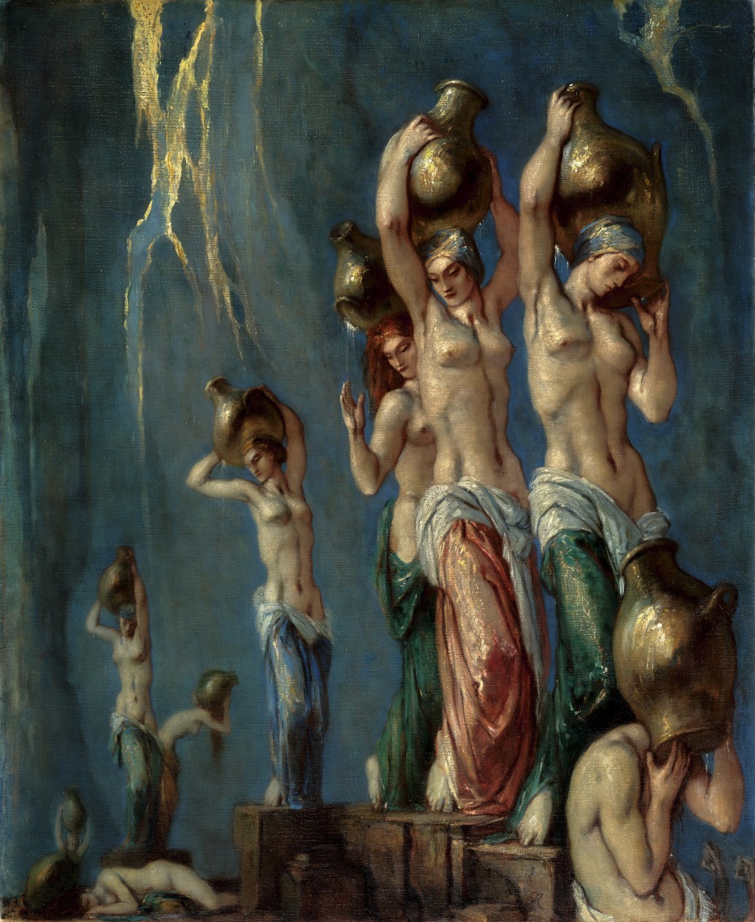
Charles Ricketts, The Danaides, circa 1900–22, oil on canvas, 100.2 × 83.2 centimetres. Courtesy National Gallery of Canada, Ottawa. Photo: NGC.

Paul César Helleu, Robert de Montesquiou, 1913, drypoint on wove paper, 71.5 × 51.3 centimetres. Courtesy National Gallery of Canada, Ottawa. Photo: NGC.
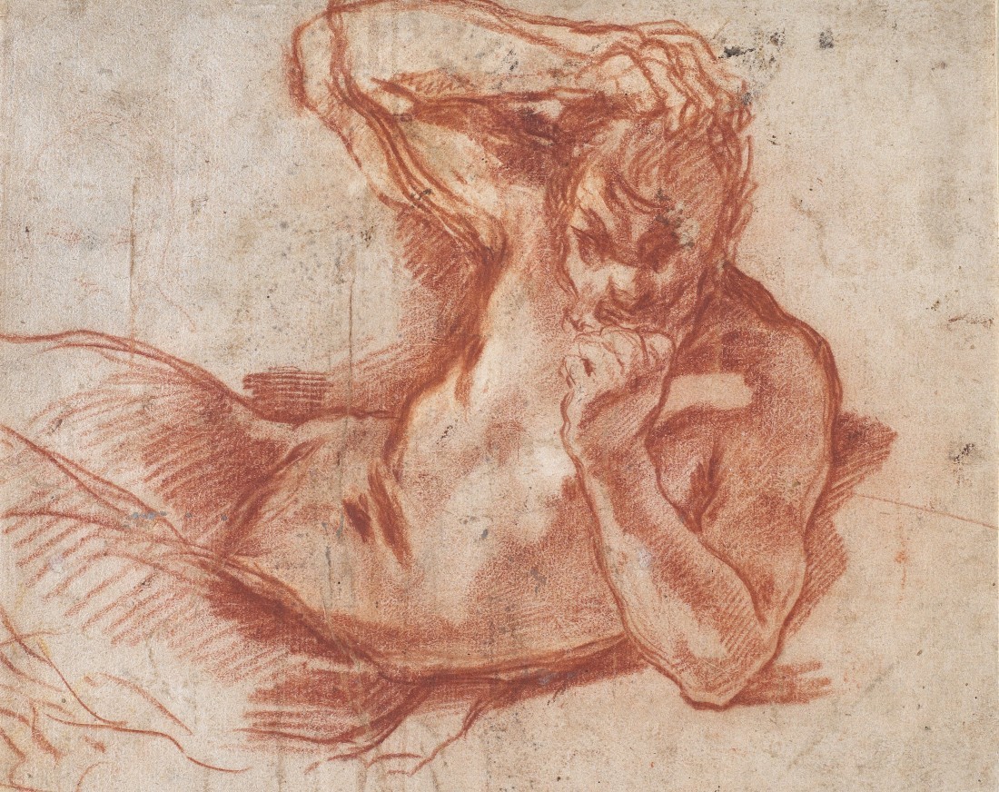
Annibale Carracci, Study for a Satyr or Faun, circa 1590, red chalk on laid paper, 20.2 × 25.2 centimetres. Courtesy National Gallery of Canada, Ottawa. Photo: NGC.
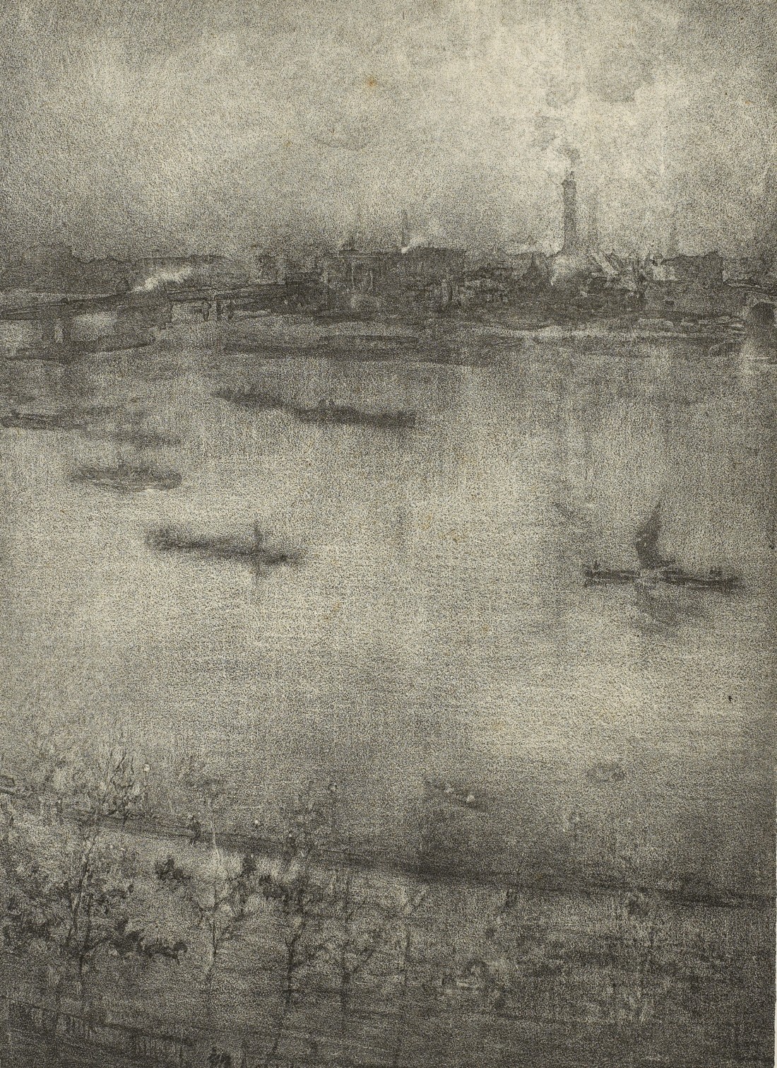
James McNeill Whistler, The Thames, 1903–04, lithotint on laid paper, 36.9 × 24 centimetres. Courtesy National Gallery of Canada, Ottawa. Photo: NGC.
You have talked about “the vocabulary of postures and gazes” in the late Victorian work you were researching. Has your aim been to develop an equivalent vocabulary and pictorial language for your own time? Is an aspiration to become your own history painter, so that in reflecting one history, you’re making a history of your own?
I had noticed the postures and gazes in late Victorian art recurring in vintage gay erotic magazines. The images of women by artists such as Sargent, Whistler and Helleu presented an attitude of collapse or languor, a nonchalance or exhaustion. That was their poetic device, but it also probably spoke of their moment in time. It was indicative of changing roles for women. There was a rebellious freedom in being seen as relaxed or louche in a fashion typically reserved for allegorical painting. These women had touches of angst and antagonism but were also aloof, voluptuary and self-knowing. This came across as a weariness, weariness as a form of representation. I saw those attitudes again in images of nude young men from early ’70s porn. Their fin de siècle poses felt like a type of foreshadowing for the AIDS crisis and the physical and psychological weariness that would come with it. Certainly, not every image I painted was marked by those gestures, but in my research, I would invariably come across images whose elements seemed recognizable as belonging to art of the past. This was also due in part to the particular type of gay men who were producing these magazines in the 1970s. It was a labour of love before it was a profitable enterprise, and the men often seemed to have a sophistication and erudition, even if it was self-taught. They knew their art history and their New Wave cinema. They knew how to select and pose models and design a whole mise en scene.
This question of knowledge and representation is a critical one and makes me think about Robert Mapplethorpe’s collaboration with Lisa Lyon, the performance artist, in Lady, Lisa Lyon. The appeal she had for Mapplethorpe was her ability to be a pansexual object of desire. So I wonder if beauty can be ungendered. The reason I raise this is because in Charles Ricketts’s painting of The Danaides, the beautiful thinness of the women’s bellies and upper body make them look androgynous. That image seems to cut across gender and desire boundaries to become pansexually attractive.
Mapplethorpe certainly was able to work within the realm of the explicit. But working within strictly implicit modes of representation as Ricketts and his partner Charles Shannon did, I see all the stylization or inflection that begat what became known as a camp sensibility. I think you see some of that pansexual body in Pre-Raphaelite drawings by Simeon Solomon and Aubrey Beardsley, and the androgynous male figures beloved by the Decadents.
I see the same thing in “Amor et Mors” in the watercolour of the young girl holding a cloth behind her as if she’s about to wrap herself in it. She has an androgynous beauty and seems to be a conscious rendering of a body type that plays inside gender.
Yes, my watercolour is a reprise, or copy, of one of Whistler’s lithographs, and I often wondered if that’s what interested Whistler in that model, too. This dancing girl with the cloth, like Ricketts’s Danaides, are flexible bodies, aren’t they? They’re nimble and can be seen in many ways.
As a writer I always look to earlier representations as permission and sometimes as homage. There is a device in medieval rhetoric where you define by negation. I can place you by what you don’t do. You don’t move in the Tom of Finland direction, and you don’t go with Mapplethorpe into leather bars in which he can document rough trade sexuality with the same delicacy as a calla lily. You make distinct choices about where you’ll go. This partly addresses the question of developing your own language for what it is you’re doing.
The explicit, in the context of Mapplethorpe or Tom of Finland, makes implicit gestures seem like negation, which is always interesting to me. Of course, in my writing, in the texts that accompany my exhibitions, I continually reiterate the role of pornography and the horror of the AIDS crisis, but this is not immediately apparent in the works themselves. I’m dependent on the explicit, and the kinds of intimacies it bestows, as part of my work’s conceit.
There were periods where your picturing of desire was more direct. There’s an image in your exhibition at Maureen Paley in 2008 of a young boy who’s pure noir glamour. He’s wearing what might be a pearl necklace and the look on his face is come-hither concupiscence. It’s not withdrawn at all. Your faun in “Amor et Mors” is pretty sexy, and your Narcissus has a butt that makes him a figure more interested in us looking at him than in him looking at himself. What I’m getting at is there are moments when you haven’t relied on implicit desire but have made it more explicit.
What you are reading in the gaze of the painting from 2008, and I know exactly which one you’re talking about, is purely eye contact, however provocative. There is nothing there for the censor. And the Narcissus, drawn from a statue in the Musée d’Orsay, is indeed turned away from you. You’re not shown his penis. So yes, my work is certainly erotic and meant to have tension but not in a way that can be circled in red pen.
There are a pair of boys in trees against a very rich green background from an exhibition at Thaddaeus Ropac in 2009 that made me think of George Platt Lynes and the work where he creates mythological figures. Is Lynes anybody you looked at for inspiration?
Not in a direct way. I have catalogues, I’ve seen exhibitions and I admire his work. The influence photography has had on me has always been limited to magazines and periodicals. I’ve admired photographers who express desire, like Wolfgang Tillmans, Nan Goldin, Jack Pierson and Jimmy DeSana, but I don’t think they were directly inspirational in how I might make a painting or a drawing. Those artists were part of that explicit energy and change in tempo that occurred after Stonewall and throughout the crisis-ridden ’80s and ’90s. Their influence is part of the equation but also very off-scene. The only artists whose work I do glean something from are painters.
Paul P, Untitled, 2019, oil on linen, 27 × 19 centimetres. Courtesy the artist, Maureen Paley, London, and Cooper Cole, Toronto.
Paul P, Untitled, 2011, oil on wove paper, 16 × 23.8 centimetres. Courtesy National Gallery of Canada, Ottawa. Purchased 2020 with the generous support of Diana Billes, Toronto. © Paul P. Photo: NGC.
Paul P, Untitled, 2010, oil on canvas, 33.2 × 24.6 centimetres. Courtesy National Gallery of Canada, Ottawa. Purchased 2020 with the generous support of Diana Billes, Toronto. © Paul P. Photo: NGC.
Paul P, Untitled, 2011, watercolour on wove paper, 28.9 × 16.6 centimetres. Courtesy National Gallery of Canada, Ottawa. Purchased 2020 with the generous support of Diana Billes, Toronto. © Paul P. Photo: NGC.
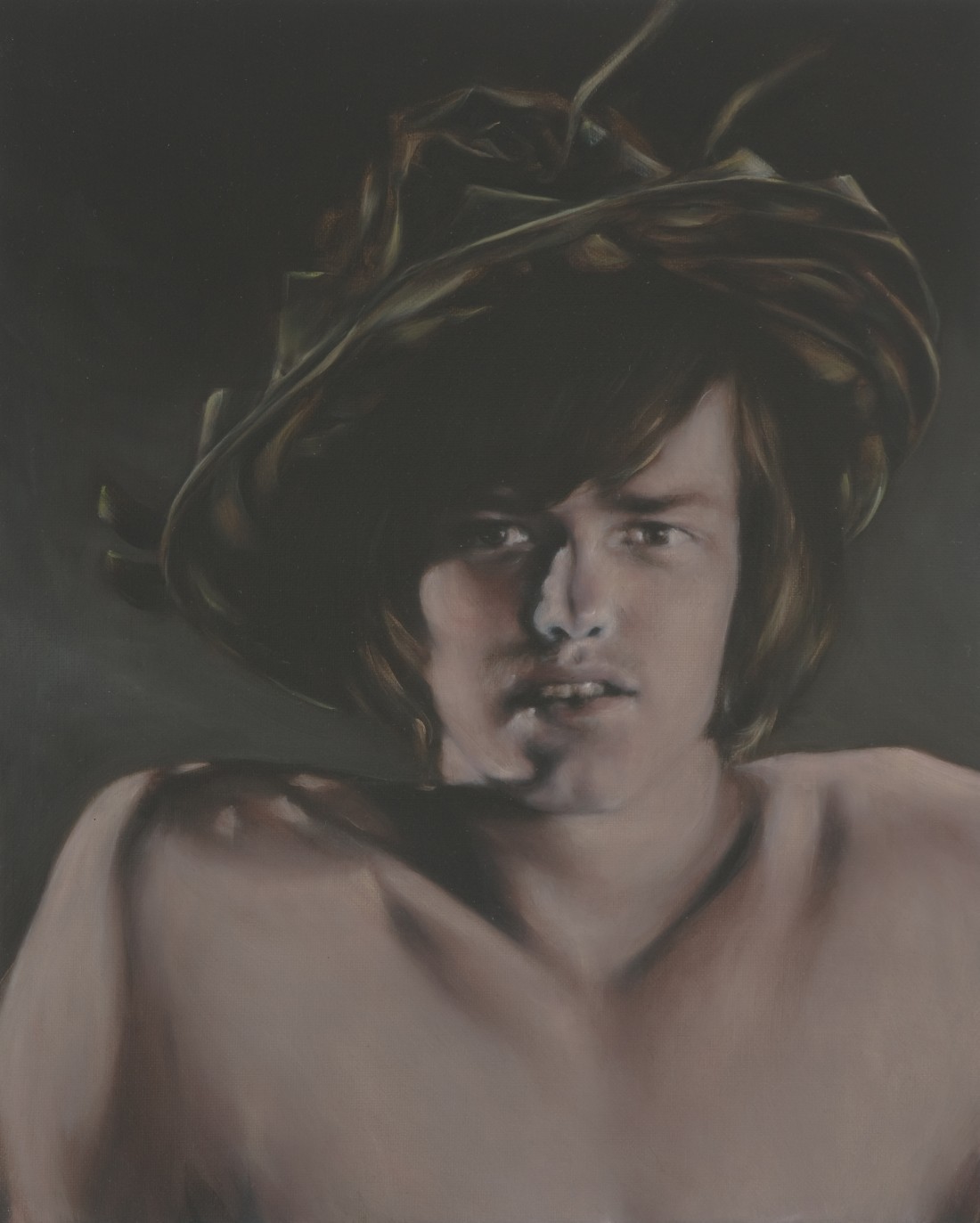
Occasionally I would see in your work echoes of artists not in your preferred period. In “When Ghost Meets Ghost” (2008) at Maureen Paley’s, you’ve got a pair of sparsely clothed fencers who have the oppositional posing of the two sides in Degas’s Young Spartans Exercising (1860). In the same exhibition there’s a boy with an elaborate Elizabethan hat and a toothy, gorgeous smile, who has about him a touch of Caravaggio. Are those accidental hints that I’m picking up on and not intentional ones?
In the case of Caravaggio, I can’t discount his influence. I’ve always admired the shadowy interiors of his paintings, and in particular his spaced-out hustler-like Bacchus with dirty fingernails. I’m sure so did the pornographers who supplied me with many Carravagesque images of similar toughs. They were probably well aware of that particular Degas, too. But apart from Young Spartans being a relatively well-known homoerotic work, it also behoved them to have art historical knowledge generally, if only to provide a form of cover if the police came knocking. Physique magazines were often explained away as “artistic.” And these traces of art history remained even into the ’70s when circumstances were more liberated. The tremendous hat you noticed is in fact a broadleaf woven hat and must have been a photographer’s prop. I remember feeling that it looked like a large picture hat, of the kind women wore in the 1880s, the fabulous creations you find in many of Helleu’s drypoints.
There is one image of a very dark-haired boy swathed in black who looks like your version of Franz von Stuck’s woman in The Sin (1893). My problem in looking at your work is that I’m always making associations with a trajectory coming out of art history.
You’re picking up on a long-standing tradition of homosexual aesthetic awareness of which I’m just a point in the relay. Whether I can put my finger on the anterior influences at work in the images I source or not, I can tell that something is there worth reprising, something active, something that reminds me almost immediately of painting and art. The armature is already there for it to become a painting; I just have to render it, give it a new cloak.
Paul P, Untitled, 2007, oil on linen, 41 × 33 centimetres. Courtesy the artist, Maureen Paley, London, and Cooper Cole, Toronto.

Paul P, Untitled, 2019, oil on linen, 61 × 48 centimetres. Courtesy the artist, Maureen Paley, London, and Cooper Cole, Toronto.
Your work has a tendency to almost foreclose criticism. Here are examples of critical responses to your work: “His conjured moments of golden luminosity”; “His figures tap into yearning more profound than lust”; “The drawings are seductively romantic, at once restrained and voluptuous.” People get so totally seduced by your work that they can’t say anything critical about it. They’re in some drug-induced phase of phenomenological appreciation.
I don’t know. Critics saying nothing at all happens just as often. Maybe my work ends up provoking too much poetry as a response. But I feel that it might not get the critical dissection or examination that it should, or the benefit of cool, measured analysis.
It’s interesting that you use the phrase “too much poetry.” Can you overaestheticize? In the exhibition “Bacchante with lowered eyes” (2021) at Queer Thoughts you include a thin Black man lying down. He’s got turquoise on his nose and mouth and chest. In the Oakville exhibition, you highlight the face, forehead and neck of the boy with the long red hair and smudged lipstick. In the rendering, how do you determine how much highlighting is necessary and how much might be too much?
So much of my painting is done intuitively and furthermore in layers, which show through from underneath—that I don’t understand its construction until later when someone mentions, as you do, the too-red lips or patches of turquoise skin. The moment is very reactive: one brush stroke or smudge, or unfortunate wiping away, or fortuitous line, can affect all the subsequent actions that take place. I don’t have a mental image of what the work is going to look like. Sometimes I rotate the canvas and begin again with a different image, or change course and overlay a portrait onto a landscape work, or a landscape over a portrait, so that an underpainting comes through like a palimpsest. I think of myself as a painter only when I’m actually painting. The rest of the time I’m not thinking about the role of the painter or puzzling out how a painting will look. If a figure I paint has a teal nose or coral cheek, that decision comes out in the process and is unpremeditated. My very early works that Border Crossings published 20 years ago were very red, everything—background and figure—was pink and flushed. Green had been banished from my palette. Over time my palette opened up. It’s so subjective and I don’t know how to explain it; neither do I really think about it.
Your studio practice is intuitive, but it occurs to me that when you install your work, you make very careful choices about the relationship between and among images. In “Vespertilians,” you’ve got a wall with 13 works and in Oakville and at Lulu, you locate single works that hold entire walls. Then you combine works in combinations that force a conversation among them. Do you have a strategy for installing each show, so your intuitive studio process is more consciously thought-through in getting presented to the world?
When I install a show I enter a different mode entirely, and it’s a similar mindset that is active in the production of the furniture sculpture pieces. It’s one that is concerned with how the viewer circulates or wanders or cruises the various works. There are always circumstances that define the content of each exhibition and I tend to not fight them.
The furniture pieces are discrete objects, but then they act as sculptural components in an exhibition. They always perform more than one function.
Yes, exactly, it’s their discretion that gives them an allegorical function. In a way they are as queer and as libidinal as any work I’ve made. How this can be true is perhaps due to my ongoing belief in coded language, and how it can be increasingly more meandering and referential. I’ve had exhibitions where people completely disregard them because they thought they were the gallery’s own furniture. Or sometimes they’re highlighted in ways that are unmistakable, like the yellow niche built for a desk and stool in “Amor et Mors,” which can make their function even more inscrutable.
In one of my favourite pieces, you place bats in the sky with pink smudges, and the bats and the smudges become synonymous. It’s as if subject can dissolve into medium and content dissolves into form. What’s the deal with bats?
The bats are a reoccurring motif, seen most recently in “Vespertilians” at Maureen Paley. However, some of my earliest works from 2000 to 2003 were pink monochromatic cloudscapes with flitting bats. The bat came to me as an emblem of the French Decadent poet Comte Robert de Montesquiou, who was the model for the Helleu drypoint, which we spoke about earlier. The Frick Museum had a phenomenal exhibition in the late ’90s called “Whistler and Montesquiou: The butterfly and the bat,” and I’ve treasured the catalogue since my early 20s. It paired the emblems of these two extreme Dandies and explored their friendship. Whistler’s butterfly, which was also his signature, mutated over the years to become as defiant as he was. It had a thin, long, weapon-like tail, like a stinger, or barbed like a devil’s tail. Montesquiou was a very misunderstood man. He was unmistakably homosexual and infamously immortalized in Marcel Proust’s In Search of Lost Time (1919) as Baron de Charlus, and as Jean des Esseintes in JK Huysmans’s À rebours (1884), both of whom painted unkind pictures of him. He was a count and he was preoccupied with bats, but it had nothing to do with vampire lore. He saw them as strange and rare nocturnal birds (as he called them), which he paralleled with his own existence as a maligned, extravagant individual who didn’t live by normal diurnal rhythms. Their impossible upside-down, night-as-day quality seemed perfectly suited to him. In the early 2000s I was also looking at Goya’s The Sleep of Reason Produces Monsters, which features sinister bats that are figments of an imagination. For me, bats became allegories for queer energy and of queer clandestine encounters. I usually portray them in the half-light of dusk.
Early in this conversation you mentioned Sargent’s diabolical ability to get it right. How diabolical is your intention?
If there’s anything diabolical about my intention, it’s my insistence on repeating, ad infinitum, the same forms as a means to convey my message. It’s really a compulsion, as if these ideas are dependent on accumulation for survival. ❚