
The Story So Far: An Interview with Stephen Andrews
Introduction by Robert Enright
Stephen Andrews has an affinity for stories. To find them he has gone to Plato and his Cave, the Bible, the Brothers Grimm, Goya’s “Disasters of War,” the Wizard of Oz, the Beats, Susan Sontag (meditation on pain) and the poet Anne Carson, to list only a few. From these sources, he has spun a collection of visual stories as compelling, intelligent and rigorous as any in contemporary Canadian art.
Not only has he sought out stories, he has become one himself. In 1985 he was diagnosed as HIV positive and his life was turned into an entropic waiting game. He also witnessed the ravages of the epidemic in his own community, and in 1993 (what he calls, “the most lamentable year”), 15 of his friends died, including his partner, Alex Wilson, and Rob Flack, his studio mate, both in the same week. He was living a narrative of death, and he saw himself as another ending point in the long sentence of loss that AIDS was telling.
Stadium, 2009, oil on canvas, 72 x 96”. Collection of the Royal Bank of Canada, Toronto. All images courtesy the artist and Paul Petro Contemporary Art, Toronto.
Then in 1996 he began taking drugs and the story changed dramatically. Brought back from death, he became Lazarus. Andrews’s read of that story was not a conventional one; in his version Lazarus is subjected to a mind-altering event and is then left behind when Christ, the master narrator, takes the story in another direction. “Lazarus got totally scooped. He was just a trailer,” Andrews says in the following interview. “I really dug his story, and it was a way of talking about my own subjectivity in a poetic way.”
For Andrews, who describes himself as a “son of the feminists,” the personal had always been political, and any self-expression necessarily contained a social dimension. It also suited his personality to push things as far as he could; Andrews’s art has consistently shown both a sense of courage and an appreciation of the contrary. In his first mature work, the Adam Suite, 1989, he makes man self-generating, his own god; a group of drawings from the same year, called “Sins of the Fathers,” re-imagines Cain and Abel in a queer, pre-patriarchal narrative; in “the Apostles, even,” 1999, his images of only the faces of street hustlers from physique magazines in ecstatic moments make us think of head in another way; and in “Safe,” at the height of the AIDS crisis in 1993, he puts pornographic pictures on rubber. In all this work, there is an inseparable commingling of the aesthetic, the political and the autobiographical, sometimes recollected in desire, at other times in rage.
Stephen has said that one of the characteristics he most values in his art is the “ability to fail miserably.” He has used that phrase as a mantra, propelling himself from one body of work and medium to another. With that aspiration as a measure, he has failed miserably, in that he has produced work in a number of media (drawings, paintings and animations) characterized by beauty, brilliance and, occasionally, belligerence. Stephen Andrews has taken a life-in-art that could have been easily (and understandably) cast as dark and depressing and made it defiantly life affirming. In living so intimately with death he has transmitted, to us all, through his art, a profound sense of life. His art is a contagion; his images have become viral. They have moved the story from the melancholy of elegy to the celebration of eulogy.
The following interview was conducted by phone to Toronto on September 28, 2011.
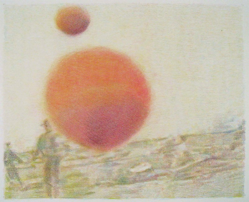
The Remains of the Day, 2010, oil on canvas, 96 x 72”.
Border Crossings: Your background is culturally hybridized, isn’t it?
Stephen Andrews: I prefer mongrelized. I’m part English and my mother is half Chinese and half something nobody seems to know. Someone brown, anyway. My family is a family of mongrels; I have half black, half Chinese cousins; I have pure Chinese cousins and South Asian Chinese cousins. When I see really mixed race kids I go, “My people, my people.” I grew up mostly with the Chinese side of the family because my father married a bastard, which didn’t go down too well in the ’30s and ’40s. When my Chinese great-grandmother saw that I had a dick and two arms and two legs, she was perfectly happy, and I ended up getting dumped with her quite a bit. Chinese is my mom’s first language and I did speak baby Chinese as a kid. Because I was the first-born great grandson, I had this privileged position in the family, even though I didn’t really look Chinese. My great-grandmother didn’t die until I was 14 and I was also my grandmother’s pet. She didn’t die until I was 50.
Was art something that figured in your family?
No. I think my mother had an artistic disposition. She went to school for interior design, but it really wasn’t an option. Strangely enough, the Asian aesthetic seeped in, in my sense of composition and handling of paint. My grandmother’s apartment was a real mishmash; it had all that tacky pop-culture stuff through the ages, plus all this Chinoiserie. So the visual environment was quite hybridized, too.
The title of Floating World itself makes reference to Japanese aesthetics, which you also do in naming the Pillow Books. Were those conscious evocations of an aesthetic that you felt some familiarity with because of your cultural background?
Well, I’m not Japanese but it didn’t seem so foreign to me. The folding books—they were actually Chinese and not Japanese folding books—were mostly a solution to being able to work on larger works while travelling. As a format, Chinese landscape painting unfolds in such a way that it allows for these long narrative sequences, so it was something I had already internalized. It didn’t seem like I was just finding something and glomming on to it.
When did it occur to you that art was going to be something you had to do?
I always wanted to be an artist. I was one of those dyed-in-the-wool types. I’m an autodidact who never went to school for art. I studied photography, but it was more of a compromise on my part. I wanted to do something creative, so I decided to go to photography school because at least I could make a living. I was a practical cat and wasn’t interested in dying of starvation. But after two years at Ryerson I realized I didn’t want to photograph weddings or catalogues, so I threw that off and said, “I’m just going to be an artist.” I kept saying it and saying it until I became one. For a number of years I was telling people I was going to have a show even though 2011one wasn’t set up; it was as if it were going to happen through force of will. I’ve never been very good with no. Maybe it’s that Asian patience; I can out-wait you and I will get what I want.
Your artist’s statement refers to a hierarchy in which hand wins out over machine and your way of measuring that is “the ability to fail miserably.” Is that ability central to your aesthetic and, in a larger context, to being human?
Yes. It’s my little sound bite. There is something about failure that is philosophical and also a rationalization of the self in the face of perfection, which is this unattainable goal. My mother always used to say, “You set your goals too low.” My sense was, “Then at least I can achieve them.” You know, I try my best with the renderings of photographs by hand, but it never comes out quite like the photograph.
So the degeneration of the image is less intentional than a failure of technique?
Exactly. I’ve learned to recognize these things as successes. For me, the entire scientific process is being able to recognize your mistakes and then repeat them. In this sense, the studio is similar to a laboratory. It is an environment where you can repeat your mistakes in a controlled manner. It’s happened a number of times. The whole fingerprint thing came out of a complete accident. I was doing these oil-and-pencil drawings and the phone rang, and when I got up, I tripped and put my hand right on the drawing while it was still wet. It was like silly putty; I just picked up the drawing and I went, “Oh, my god.” I did a monoprint with it onto another piece of paper and it was one of those eureka moments. When I talk about failure, it is not really failure. It’s about recognizing something that needs exploration either in the process itself or in the materials. So with my oil paintings the beading was a complete accident. I had gone away and the surface of the painting had dried quite glass-like. I ended up putting a very thin coat of a glaze on top and it looked great, but when I left the studio, it had beaded up. I had to lie on the couch for an hour because it was a nightmare. Then I got up and looked at it and realized it was so fucking cool. I’ve been able to repeat that on any number of other canvases.
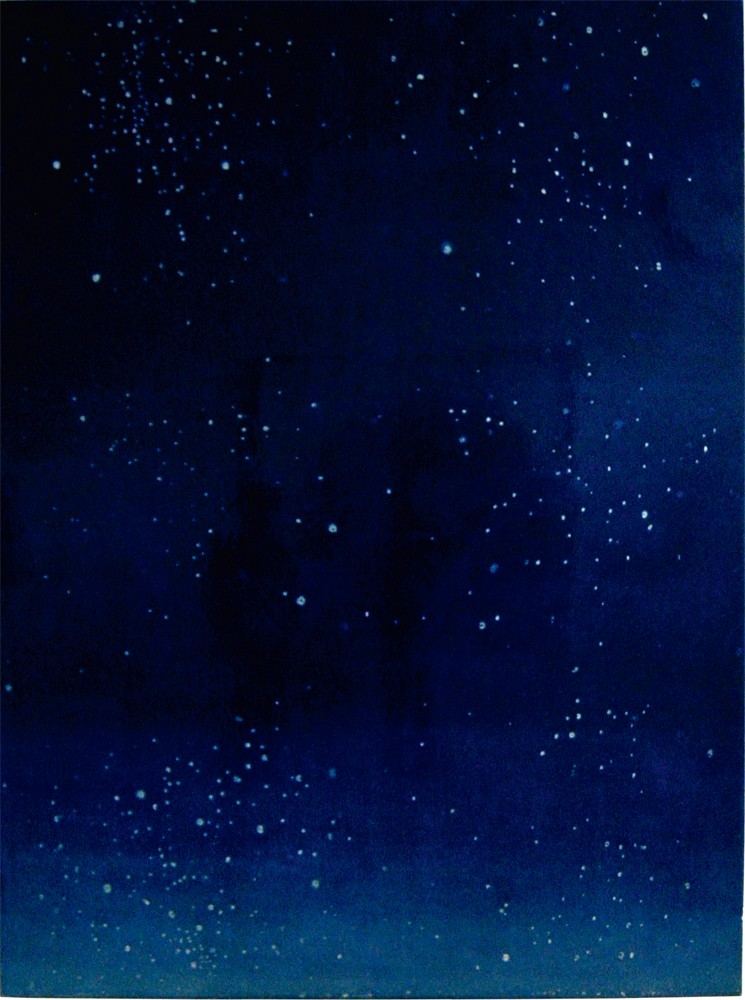
In your statement you say “our being is constellated” around failure. I like that phrase because constellation is a grand, almost a celestial, aspiration. Your language locates itself within an epic frame. Is that the way you think?
For me poetry has been a key. In a lot of ways, words come before pictures in my work. What gets me thinking is if I come across something in a newspaper or I read some poetry. My titles have a certain poetry to them, and when I write about what it is I do, I probably use a more rarified language than when I speak. When I think about “constellated” now and connect it to the lights and star paintings I’ve been doing, I realize these things repeat themselves. In your 20s and 30s you charge through a lot of different things, and then in your 40s and 50s you start to mine the vein you discovered in your early career.
Quick and the Dead #139, crayon rubbing on mylar, 11 x 14”.

Quick and the Dead #159, crayon rubbing on mylar, 11 x 14”.
Quick and the Dead #169, crayon rubbing on mylar, 11 x 14”.
There is a line in Whitman’s Leaves of Grass that combines a question with a declaration. He asks, “Do I contradict myself? Well, then, I contradict myself.” I get a sense you would find that attitude pretty congenial.
Exactly. There is a real beauty in imperfection, and contradiction is a kind of imperfection. I often think out loud, so I try things out and I don’t know that I necessarily believe everything I say. Some of the time, especially when I’m giving talks, I think I’m speaking in tongues. I really have no idea what I’m saying.
I sense that you reference Duchamp in naming the Apostles, even, and what you are calling up is the bachelor, minus the bride and the undressing?
Right. There was an iteration of that work as stained glass, and I used the cracks in Duchamp’s Glass as the basis for the leading. So we transferred the drawings onto glass, and then I had the glass cut in the shape of the cracks from The Large Glass. Then I had it leaded back together again.
One of the things that informs your work is a recognition of what artists have done in the past. You say you’re an autodidact, but your self-education seems to have been fairly extensive.
I’ve never been able to resist either my emotions or my influences, so it is always a question of barrelling through. I can’t get around them so I might just as well incorporate them into the work. We learn things from other people’s work, but it comes through our own filters. In the AGO the Album drawings were put in a room with an Agnes Martin and some things by Gerhard Richter. They had been big influences, but when I looked at them in the gallery, I realized the incredible differences between us. My own subjectivity filters had translated those ideas into my own voice.
Is it ultimately a question of taking what has been done before and finding a way to make that narrative, or the rendering of that experience, deeply personal?
The interesting thing about subjectivity is trying to find connections between yourself and others because we are in the communication racket and we do want our ideas to be received. I feel very much a man of my time, so my subjectivity has some correlation to larger narratives, like the AIDS narrative, the identity narrative or any number of things. So it is about trying to re-contextualize those ideas. Those are Ur ideas that you find in Titian, or Picasso or Richter. They are the great themes, and it’s interesting to look at history to see how those iterations have changed because of their context. In running similar sets of ideas through my own subjective filter, I’m trying to connect my subjectivity to a larger contemporary narrative.
Annette Hurtig uses the myth of Narcissus to locate your work inside a transformative gay aesthetic. It made me think of Attila Richard Lukacs and his intention to re-gender the garden, to find a way to re-tell inherited stories from a queer perspective. Is that an aspect of what you’re doing as well?
It is certainly part of the project. For a lot of artists from the ’70s and ’80s, there was a real searching for meaning and ways of representation and looking to world cultures for examples and answers. By the late ’80s I had decided to stop rummaging thorough world cultures and started rummaging through Western culture. Biblical stories seemed a concrete way to start. What I think of as my first mature work, the Adam Suite in 1989, was about man making himself. I was working with Evan Penny at the time and he was doing this large sculpture of my head. So it was god as a sculptor and the artist as a god creating images of themselves. From there I went to a group of drawings called “The Sins of the Fathers,” and it basically re-told the Cain and Abel story. I always thought that Cain was a queer. Basically Cain has women’s jobs—he tends the garden and he works around the house—and Abel is the guy who goes out and does the animals. So when God goes, “Oh, Abel you’re just so great,” Cain just can’t help himself. That was my way of queering that story. Lilith is a kind of pre-Genesis story, and she had been completely written out of the Bible because by the time they get to Genesis, they had figured out how to make it all about a patriarchy. I call these kinds of narratives—like Shakespeare or the Bible—Ur Narratives. I think people know them intrinsically, so they can be alluded to without being rendered in their entirety. People get the idea. When Derek Jarman finally jettisoned the narrative, he made his best work. His Garden was the best; it’s the Garden of Gethsemane, it’s the Garden of Eden, it could be a number of different gardens. You can run a multiplicity of reads from whichever one you choose to interpret.
General Idea was remarkable in inhabiting other forms and filling them with subversive content. Were they influential?
I was one of the boys who was never chosen. Friends were, but I was not. Of course, there was an acknowledgement of their position in the scene here and, as gay artists, they were very important for me and I certainly wanted to be a part of it. But I don’t know if I learned many lessons from them. I know AA used the title “The Quick and The Dead,” but for me, the name was a re-tooling of a series I did back in 1992 called “Quick.” “Facsimile” was portraits of the dead and then I did these boys kissing. I was looking for what would really make people cringe. In that day and age, people could wrap their heads around the idea of men having sex, but intimacy between men was shocking. So it was a series of pictures of men kissing done in the style of “Facsimile.”Only they were blue. The colour seemed lively.
You also talk about images being “viral,” a word strongly associated with General Idea.
Certainly it has come to mean that. But I was a big fan of the Beats and the idea of language as a virus had been re-iterated by Laurie Anderson, who was re-doing Burroughs. I think that is probably more influential.
You were implicated personally in the AIDS crisis? How much of what you were doing was generated out of something that was much stronger than resistance?
I’m the son of the feminists, so the personal has always been political. My power was in making pictures, so that’s where I found a place to address the political issues in an aesthetic manner.
Scott Watson talks about “the ceremony of grieving” in your work, which raises the question of aestheticizing a difficult subject. How were you thinking when you turned grief into something that could literally be rendered?
It wasn’t art therapy or anything like that. There was no place to grieve. In this culture there isn’t really a mechanism for dealing with grief, and if there is, it’s often hackneyed. I wanted to create a place for my community to grieve and that’s why I did “Facsimile.” At the time I actually didn’t think of it as art at all. It became this seminal work, which always struck me as strange, because I didn’t make it for anybody but myself and my friends. When I gave a talk, a friend of mine asked a question that was hard and funny at the same time. She said, “Stephen, why is your work always about sex and death?” It didn’t occur to me that my work was about that at all. I thought it was about life and living.
It’s certainly possible to see your celebration of beauty in an age of death as a defiant act. You looked at the situation and you went for beauty. Watson writes about your almost atavistic attraction to it.
The tools of the artist are aesthetic ones and I’ve never been afraid of beauty. Many people have been and worked against it, but I always thought that if you’re going to make these things, then let’s at least put some sugar in with the medicine. Let’s get people to look at this stuff. It’s like using pale, easy-to-look-at colours to render these horrific, graphic war images. I was trying to get people to look at things they would normally refuse to look at because, as we’ve acknowledged, images are viral. They go in to your psyche and they do not come out. We have to look at these images not for their shock value, but as a way of creating agency in the viewer so they might do something about a particular situation. I don’t know if that was what I was doing consciously with “Facsimile,” but intuitively I did understand that beauty was a great tool. I also understood that it was dangerous. Beauty is not pretty; beauty is the sublime; it’s at the brink of something; it’s at the edge, and when you stand at the precipice, that’s when it is most terrifying and most beautiful.
What you’ve outlined is the romantic concept of the apocalyptic sublime.
Yes. I guess because I never came through the academy I wasn’t schooled in anti-beauty. I didn’t know it was a bad thing.
Some interesting questions come up in your use of colour. The works from 2006 get radiant and almost transcendent or, to use your word, sublime. The subject matter can be a fawn in the forest or a head-on car collision, and both are delivered in the same pastel palette. Or I look at your wave and wonder is that a tribute to Hokusai’s woodblock or is it a devastating tsunami? The confusions seem built into your use of colour.
Maybe we should talk about when I started using colour in 1996. From 1985 to 1996 I only did black-and-white imagery, or black and beige or black and yellow, mostly monochromatic. What was happening in the world was that drugs ended up getting into bodies, so fighting for health care and rights around HIV and trying to force the medical profession to deal with the situation came to fruition in 1996. People ended up in a situation where they could live longer. What was basically a terminal disease was transformed into a chronic one. It came at this moment when I was burned out. I had lost so many people, had jumped up and down and screamed and yelled, and we had actually got some results. So by 1996 I was in this “Okay, now what?” moment. It was a threshold and I use the Wizard of Oz to describe it. There is this moment when you cross into the Technicolor 2011fantasy that is Oz and you leave behind the gritty black-and-white reality of Depression-era Kansas. Neither one of these things is tenable—the black-and-white reality or the Technicolor fantasy. It’s no place to actually exist. My investigation comes at that particular moment. I think, “I should start to use colour because suddenly everything is different.” I started using systems because I didn’t fully understand colour. I used CMYK, which is the order of colours in printing. Because it was a system, it was a way for me not to get lost. From there I began to understand colour and how it operates. By the time I’m doing the war stuff I’m literalizing the printing process and using colour in ways that people may not consciously understand but respond to subconsciously.
Friendly Fire (A BBC cameraman also received minor injuries but continues to film with his blood dripping on the lens), 2003, crayon rubbing on parchment, 19 x 24”. Collection of Salah Bachir.
How fine is the line between seduction that works to get the message across and making an image where beauty becomes the message? I’m thinking of works from 2006 that actually look like impressionistic paintings. So with your head-on car crash the question becomes, is it so beautifully rendered that I forget about the crash and only see this surface configuration of form and colour?
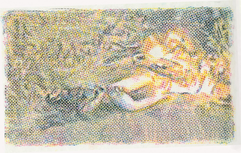
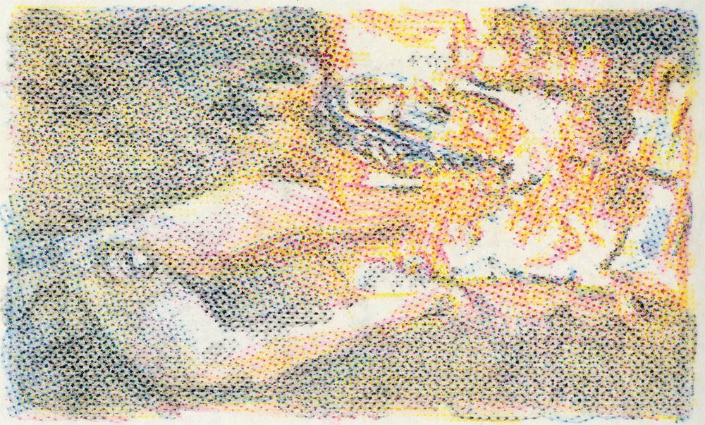
I’ve always been interested in that American thing where what you see is what you get. Make sure everything is on the surface. But I’m from Canuckistan, so I also claim something behind the surface. I’m interested in that guy behind the green curtain pulling all the switches. So it operates on two levels: you can appreciate it merely for its beauty and forget what’s going on, or you can take it a little bit further and think about the tension between the subject and the rendering. For me, it is about those contradictions in the process with the materials and the aesthetics and the content. The dot-matrix stuff starts right out of the gate. I started it right after 9/11, and by 2002 I had started rendering it using the frottage and the screens. But there is a trajectory that gets you to the car commercial; it’s that the war things are about the war for oil. As I moved through those images and the situation was evolving, I thought let’s bring this war for oil back home. The selling of automobiles was the pinnacle of North American culture at this particular moment in time and I had been tracking car ads for 10 years. I could see a real correlation between what was going on politically and how they were selling cars. You start out at the beginning with cars on buttes in Montana, the car in nature, where it’s an uncomplicated relationship. Later, when everyone realizes it’s a war for oil, the cars start driving through blank backgrounds. They have been removed from the context of the landscape because it is too problematic. I wanted to implicate the viewer and myself in this contradiction. So you’re both behind the wheel and you’re the road kill. The POV at the beginning is standing in the roadway as a car drives over you; then the second shot is a soldiering-age boy looking like a deer in the headlights; and in the last shot you’re behind the wheel and driving over the deer. It is done at the same length as a feature-length car commercial, so it’s 45 seconds.
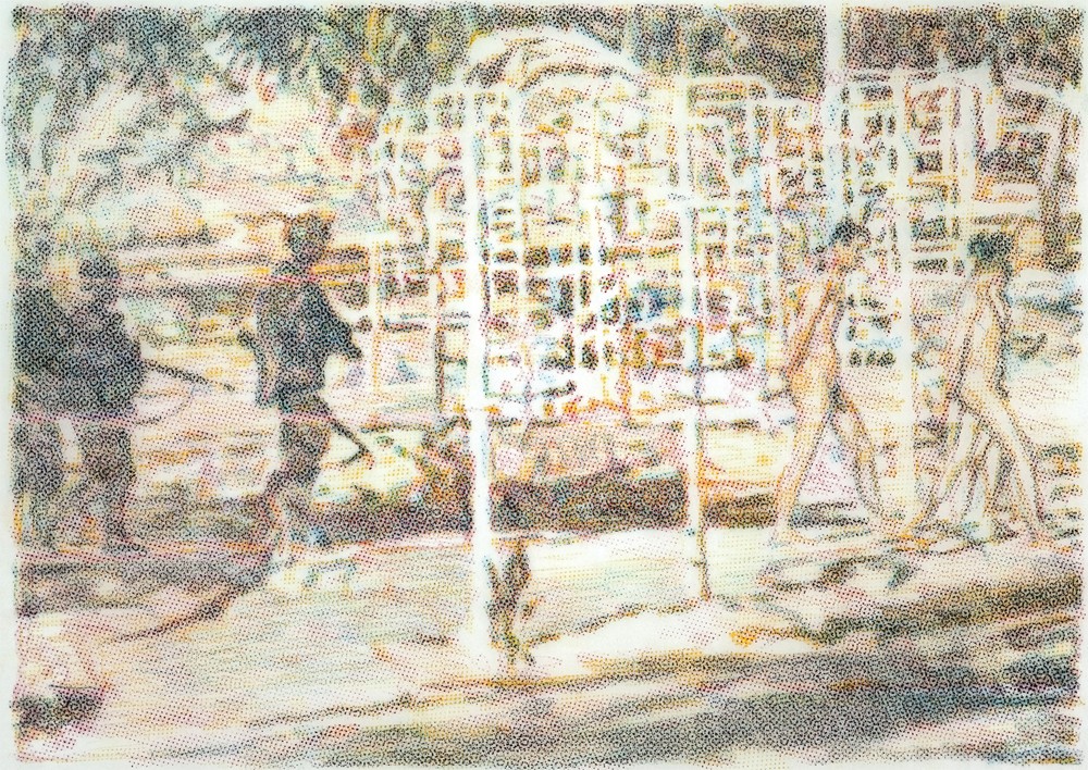
Untitled (US forces make Iraqis strip and walk through public park, after Tomm W Christiansen(, 2003, crayon rubbing on parchment, 17 x 20.5”. Collection of Salah Bachir.
A work like Collateral Damage looks like Bonnard, or maybe David Milne, but the subject matter is completely different. A horrific subject is lovingly rendered and creates a perceptual confusion. How are we to read what it is we are looking at?
I did a lot of soul-searching looking for and going through these images. If I was going to use them I had to create a permission for myself. I was reading Sontag and looking at Goya’s “Disasters of War” and thinking there is a political reason for showing these images and trying to get people to look at 2011them. That was how I rationalized the use of those images; the beauty aspect was simply a way of slowing down the image so that people would look at it. Accompanying all those works were very elaborate caption-like titles that describe the situation in no uncertain terms, like Untitled (US forces make Iraqis strip and walk through public park, after Tomm W Christiansen), 2003, and I noted the photojournalist’s name wherever I could. I did this kind of art history thing and called it “After,” like “After Tomm W Christiansen.”
You talk about the mechanical systems that you use to distance yourself from the material. Yet you also talk about openly weeping after doing some of the drawings for the war work. That distancing device clearly didn’t work in making the work?
No, but I’m a true believer in art. I think artists have a real purpose in the culture to examine things that people maybe don’t want to look at, or because they are busy raising kids, or going to their jobs, that they don’t have the time to look at. So they can go to a gallery and get a shot of it from someone who has taken the time, who has done the investigation and research and put a lot of thought into distilling these ideas into an image for them to take away. I spent hours and hours on the computer combing through images. People don’t have five hours a day to look at and select horrifying pictures. Part of that project was curation, in which I was trying to select images that would create sense out of this illogic.
Leaked Photograph, 2004, crayon rubbing on mylar, 15 x 20”.

Untitled (Abu Ghraib), 2004, crayon rubbing on parchment, 15.5 x 22”.
You’ve also talked about the co-existence in your work of the representational and the abstract. In Friendly Fire, 2005, those two things actually come together. It’s an image through the camera lens, and the red shapes that read as an abstraction are actually drops of blood from the cameraman falling onto the lens. Was that a happy circumstance?
It’s a frame grab, so it would have revealed itself as a moving image. It is only this perfect circle for the split second that the blood hits the lens before it starts to drip, so pulling things out of context is already a kind of abstraction. I was playing with that. You can’t tell what it is—it looks like a day at a beach; it looks like a beach ball flying around. There are movies that play up that same abstract, surreal thing where the soldiers are doing R and R in the old palaces of Saddam Hussein. It has that same disconnect. What I recognized in that image, in that split second of video, was an encapsulation of the contradiction of the situation.
Do you think of what artists do as moral? It’s an old-fashioned question but you talk about the Brothers Grimm as being “grim lessons with a candy coating.” The operative idea is that there is something to be learned. Is the artist a moral teacher who has to present these things to a public?
I think it depends on the individual artist. It’s important for me to engage with the world. I am a political creature by nature, but they’re just pictures, so they can’t really change anything. But if you can actually communicate with one person, it creates a ripple. I don’t think the work is didactic, so I’m not prescribing a particular position. I don’t want to proselytize. I don’t want to tell people what to believe, or to have some kind of philosophy around work that people can buy into or not. I really want people to engage their own agency. If that’s a moral position, so be it.
What is the ideal engaged relationship with the viewer, and can you do things that encourage that response?
I don’t know that there is an ideal relationship with the viewer; it is so catch-as-catch-can. The use of beauty in the work is a way of drawing in people to engage in a dialogue with the subject. I hope that can happen from an interaction with a work of art.
When I think of war and the way you use beauty, I also think of an artist like Thomas Hirschhorn, who attracts people in an opposite way. Do you think the difference is one of personality or strategy? Your use of beauty is about seduction.
Yes, it’s about trying to seduce people into thinking because it is a very pleasurable thing to do, and it could affect some kind of change. I have heard Hirschhorn speak and he wants to stay away from any overt political message; he wants to keep things open. When you look at my work it is pretty clear what side of the argument I fall on, but at the same time I want to create work that is open-ended enough that it isn’t going to shut down multiple readings. As an artist, I look at these pictures more than anyone else will ever, so I am encoding them and decoding them in the process of making them. I’m trying to determine how many possible readings there could be to these things before I let them out into the world.
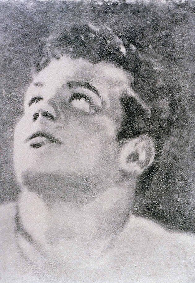
Narcissus, 1989, oil and wax on paper, 68 x 100 cm. The Bailey Collection, Toronto.
There would be much simpler ways to make the work than the methods you choose, but you decide to do 700 drawings. Why choose the most difficult ways to get what you want?
The problem is, I’m lazy. I try to find ways to cut corners. There is a cheat in “The Quick and the Dead.” I shot it on threes, so each drawing is three frames. I find that when I try to find simpler solutions to things, they don’t look right. For “The Quick and the Dead” I had read some interviews with soldiers who talked about their fear when they were walking through a field where the grass is all moving and death can come from anywhere. By doing the drawings by hand, you get that beautiful imperfection, the failure that we were talking about earlier, and that is something a machine couldn’t do. It renders the experience of a soldier in that space where every single square inch of the picture frame is activated. So it represents not just the narrative subject but also the subjectivity of the protagonists. If everything were smooth and even, it wouldn’t achieve the same end.
Clearly the human touch is integral to what you’re doing?
Pretty much. It would be great to have a studio assistant who could do everything. I’ll draw 400 drawings and you do the other 400. But I just produced a mosaic for a public artwork, and I had 15 people working for 13 months on this 14 x 70 foot mosaic. So I have figured out how to have other people do some of the work. But it’s not as satisfying personally. I love to make things. The reason I got into making art is because of the jazz you get from it. It’s such a high when it really works; it’s better than sex and drugs. If I do something that is really good, I start bouncing off the walls. I look at it and I think who did that? That’s amazing.
You still get the jazz after all these years?
It doesn’t happen all the time, but it happens. It is the reason I make work. I wouldn’t make it otherwise.

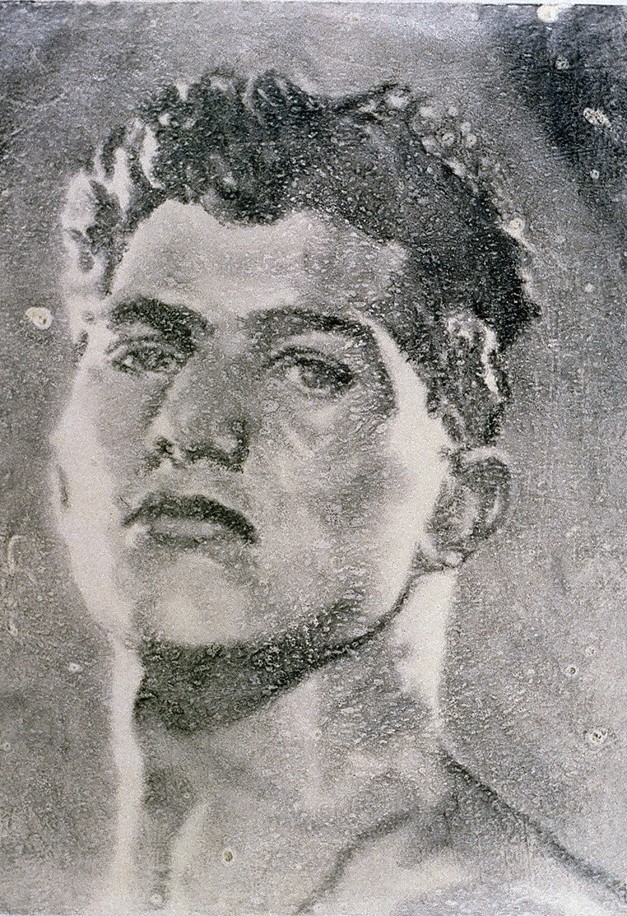
Cain in his Garden, 1989, oil and wax on paper, 68 x 100 cm. The Bailey Collection, Toronto.
Why was 1995 the most lamentable year?
It was actually 1993 because both Alex, my partner for 15 years, and Rob Flack, my studio mate, died in the same week, among 15 or 20 other friends. It was a pretty heavy year.
You have talked about being Lazarus. Thinking you had only a limited amount of time to live must have had a profound effect on how you approached your work.
It was pretty much no-holds-barred. I got the call early in 1985 and I picked up, which is to say, I realized that life is short and the future is now. There was an urgency to do whatever you wanted: live and love and make work and be the best you can in the time allotted. It was kind of freeing. Then, when I got on the drugs in 1996, I experienced this huge turmoil in trying to re-invent myself.
Because the narrative you had constructed was living hard and dying young and suddenly that wasn’t the story?
That didn’t work out. This other thing worked out, and it took me four years to come up with the Lazarus narrative. It came out of Anne Carson and a bunch of other people. She did a piece called Lazarus, Take 2, about making a documentary on the Resurrection. I was attracted to the Lazarus narrative because of my interest in biblical stories, and so I was looking at the Gospel and wondering whatever happened to Lazarus. Jesus calls him out of the temple, and then they cut to Jesus going into Jerusalem on Palm Sunday. Lazarus got totally scooped. He was just a trailer. I really dug his story, and it was a way of talking about my own subjectivity in a poetic way. I ended up making an installation of filmstrips called “The First Part of the Second Half.” But it was a very tough four years between 1996 and 2000. I was floundering. I was totally ready to go. I had looked at what I’d produced and I thought this is a good place to stop. I was okay with it.
Bartholomew (from “Apostles”), 1998, oil and graphite on mylar, 24 x 19”.
Since we’re in the biblical terrain, what was the nature of the apostolic calling of the Apostles, even?
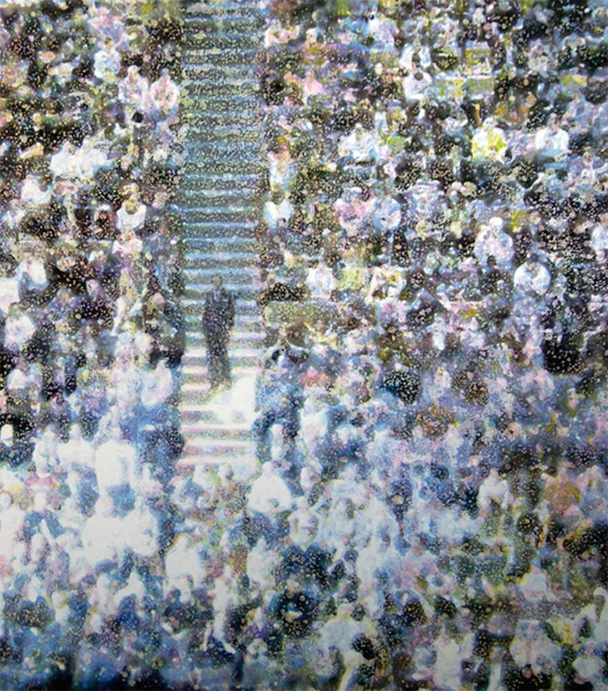
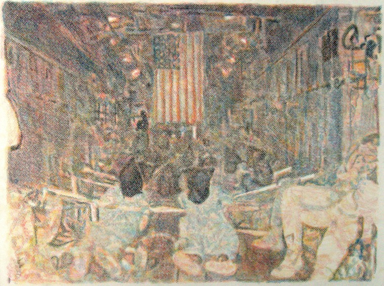
In 1995 and 1996 I was drawing crowds for the first time. The newspapers were full of pictures of crowds, the Days of Action were going on here. The provincial Conservative government actually did what they said they were going to do. “We’re going to cut education and we’re going to cut health. What was it about our platform that you didn’t understand?” Nobody believes that politicians are going to do what they say they are going to do; so when the Conservatives did, it was a shock. Everyone freaked out. The newspapers were full of these pictures, and I started doing drawings loosely based on them. On a personal level, I was thinking, “Okay, where are we now?” It’s 1996, we’ve got drugs in bodies, the political wind has gone out of our sails, and so I asked, “How do I represent this moment?” It was a “What next?” moment. So when we stand in front of these crowd pictures, even though they are small, the audience is looking at us, the picture is looking at us, and it’s expectant. It wants us to do something. That was the conceit from my point of view. But it was also the hoi polloi. Out of the hoi polloi Jesus selected the apostles, and so like Caravaggio, I decided to cast some prostitutes and hustlers. Those guys are from physique magazines and the subject of the photographs is not their faces.
It’s what’s happening below the frame. Warhol comes to mind here.
For sure. There were three bodies of work to the “hoi polloi” series, and the Apostles was one of them. I was riffing on the sacred and the profane and thinking about crowds in the ’80s. What I tend to do is really mash things—I look at Giacometti and I look at Bible stories—and then mix that up and see what happens. Accompanying the Apostles was a suite called Font, which was about the baptismal font but also about typography. It used a font to create a language with which to represent a political ideal. I did a bunch of drawings of demonstrations without anything on the placards, so the suite of drawings was a place where you could get letters, mix them up and make up your own slogan.
You discover a methodology that suits the content. You talk as if there are these ideas floating around and, suddenly, one of them makes sense for the work. Is that how it happens?
Yes. Process is everything and that’s where I find out what I’m doing. I don’t really have a clue. My other little sound bite is that my intuition is my seeing-eye dog and I just follow it around. That’s really the truth of it. There is something about the zeitgeist: you plug into it and there are these things going on; they affect you, you are concerned about them, and you start to work with that loose set of ideas. Usually, the materiality comes partly from a previous body of work and partly from just asking, “What is this about?” If we look at the work over the years, we have wax for the “Facsimile” portraits. Well, wax was used for death masks, and so it seemed like a very rich material that was going to speak to the content.
And to make lost bodies present by subtraction because the way you get the figures is by removal?
Right. A body of work called “Safe” was all these pictures on rubber. It was about the prohibition on sex at the height of the AIDS crisis, so it seemed perfect to put pornographic pictures onto rubber. I did a series called “The Weather,” which was about predicting the future, so it seemed interesting to look back at the way that entrails were read in Roman times as a way of predicting the future and thinking about weather reports. I put these two things together, making huge sheets of skin out of intestines, and then printed weather images on them. With the film work, the images were transferred onto Mylar, so that it actually imitates what it is you are representing.
So there is always a meta-dimension it seems in your work?
I guess. I mean a big change comes with the paintings because I never considered myself a painter. I refused the masterpiece for so many years. Never say never. I turned 50 and said, “Why don’t I do something I said I would never do?” Let’s do paintings and make them big. When I was in college, one of my profs said this thing that has stuck with me ever since. He said, “If you can’t do it right, do it big and do it in colour.” Which is to say make small black-and-white photographs or get out of town.
Thaddeus (from “Apostles”), 1998, oil and graphite on mylar, 24 x 19”.
So you come back into town with big, colourful paintings?
Exactly. There’s a certain perversity to it that I appreciate.
I look at the work and think Ross Bleckner and Peter Doig. Are these painters who have done things you can use? Finally, art making is a process of magpie-ing, picking the beautiful things and using them for your own purposes.
I have always loved shiny things and am forever bringing them back to my nest. The paintings are not necessarily coming out of Peter’s work but certainly his methodology. I was in Trinidad on a Canada Council Residency for a couple of months, and the studio is in the place where Studio Film Club happens. A Trinidadian artist, Che Lovelace, and Peter run that thing every Thursday night; Peter works there and Che also has a studio there. It was a pretty dynamic environment to be in, and I kept looking around at all these guys who were doing these big oil paintings and here I was doing these tiny drawings. What was I thinking? I needed to do some big-ass oil paintings. So it was less about what it was they were painting, or how they were painting, and more about the idea of painting. Basically what I did with the first few was I adapted the CMYK thing I had learned from the dot-matrix drawings and applied it to glaze painting. It’s like treating oil paint like watercolour; you’re relying on the subsequent layers to interact and create the jewel-like colours that come from the transparency of the medium.
You must be pleased. For someone who stayed away from painting, typically you went for the jugular of the medium?
It’s because I don’t know what I’m doing that I can be so self-indulgent. I was talking to a painter I really respect about colour, and when I mentioned I really want to use purple, he said, “You can’t use purple, only three-year-olds use purple.” I came home and immediately covered an entire painting in purple. It’s not that I’m contrary. I don’t assume a position just for the sake of being in opposition to something. It was a case of seeing what I could do and doing them big. So if I fail, I fail big. It was quite a surprise when they worked out.
You say the throughline in the work is identity, but I also see the body as playing a connecting role.
I think there is a moment when things shift. My work from the ’80s and the early ’90s is definitely about the body. Then it becomes more about the body politic than my own particular body. Certainly, these things aren’t hard and fast. I move back and forth, and desire sometimes rears its head and I’ll do a whole body of work about that. But mostly I’m interested in the social as opposed to the self and the body politic as opposed to the body.
Yet those binaries are not conclusive. There’s drift, a movement across them?
I think that’s the mongrel; it is this hybrid thing that is neither/nor. It is of both. It is perhaps a binary, but in itself it is more complex than that. It’s grey in the best way.
In your sense of making, you don’t even know where you’re going to go?
The work itself always has a gravitational pull and I really do follow it. I have ideas that get the ball rolling, but once it’s rolling, one thing leads to another. I can’t predict what it’s going to do, but I know it’s going to do something. And I am there to be nursing it along. ❚